Bröhan-Museum Kinder Committee

Must every museum be interesting for kids? No, but if a museum aims to diversify its visitor groups – a declared goal of many museums – a good place to start is engaging with children. After all, the following urbanistic insight can also be applied to the museum realm:

“Children are a kind of indicator species, if we can build a successful city for children, we will have a successful city for everyone.”
Enrique Peñalosa, Former Mayor of Bogota, Colombia*

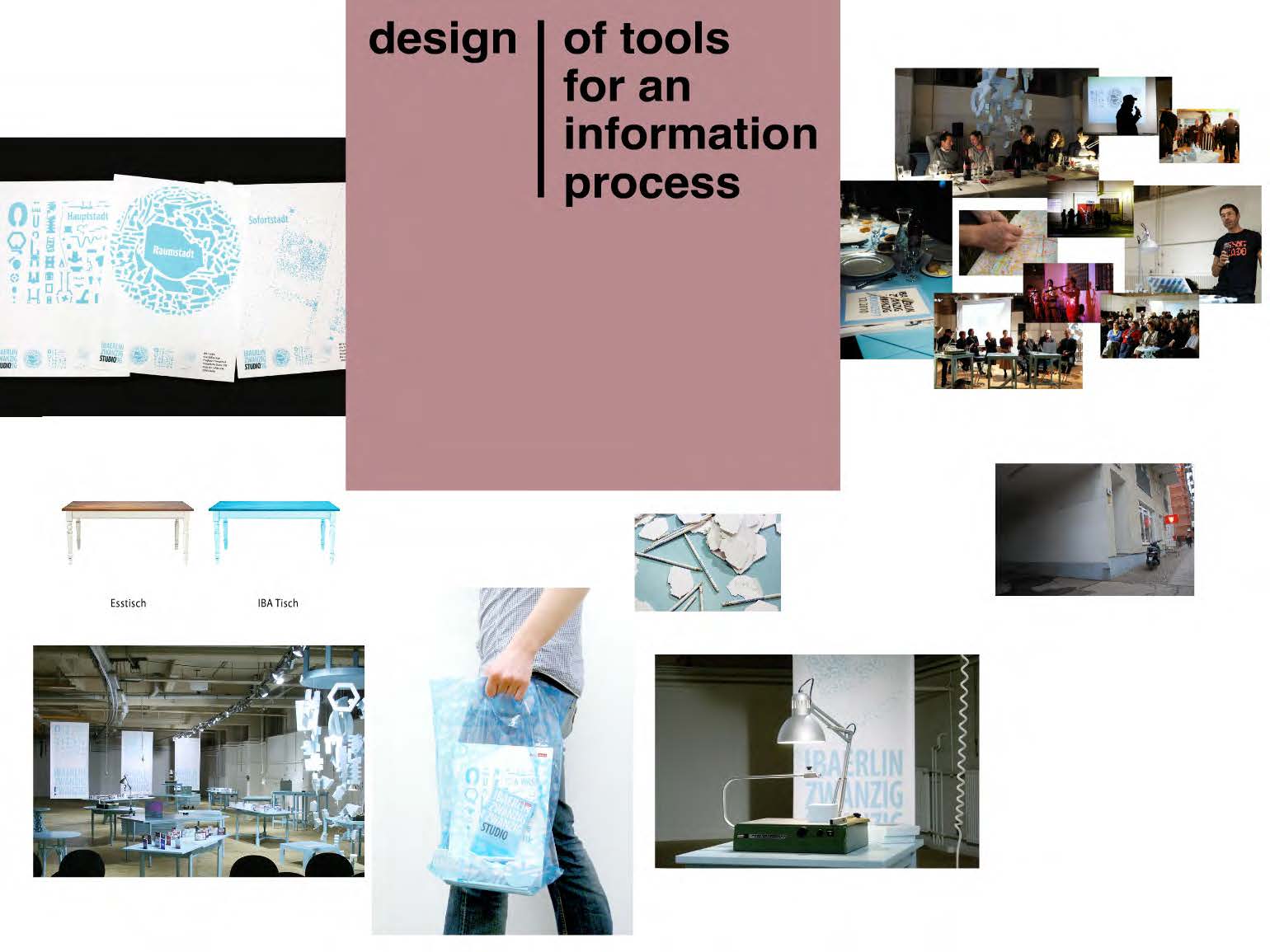
How do you make a museum accessible to kids? Ideally, by working with them: having conversations, observing them, developing ideas with them, building, testing, and improving prototypes with their help. This ‘Human Centred Approach’ has been an established technique in architecture and product design for a long time. In the German museum scene, however, it is taking longer to catch on.

While many museums offer guided tours and workshops for kids, they miss out on the chance to learn from their visitors. The experiences of the tour guides or workshop leads do not usually in turn influence curation and museum design. No wonder – offering a (specially funded) program is easier than questioning one’s own work.

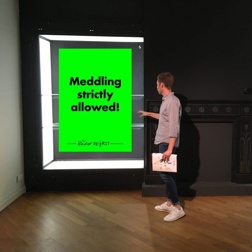
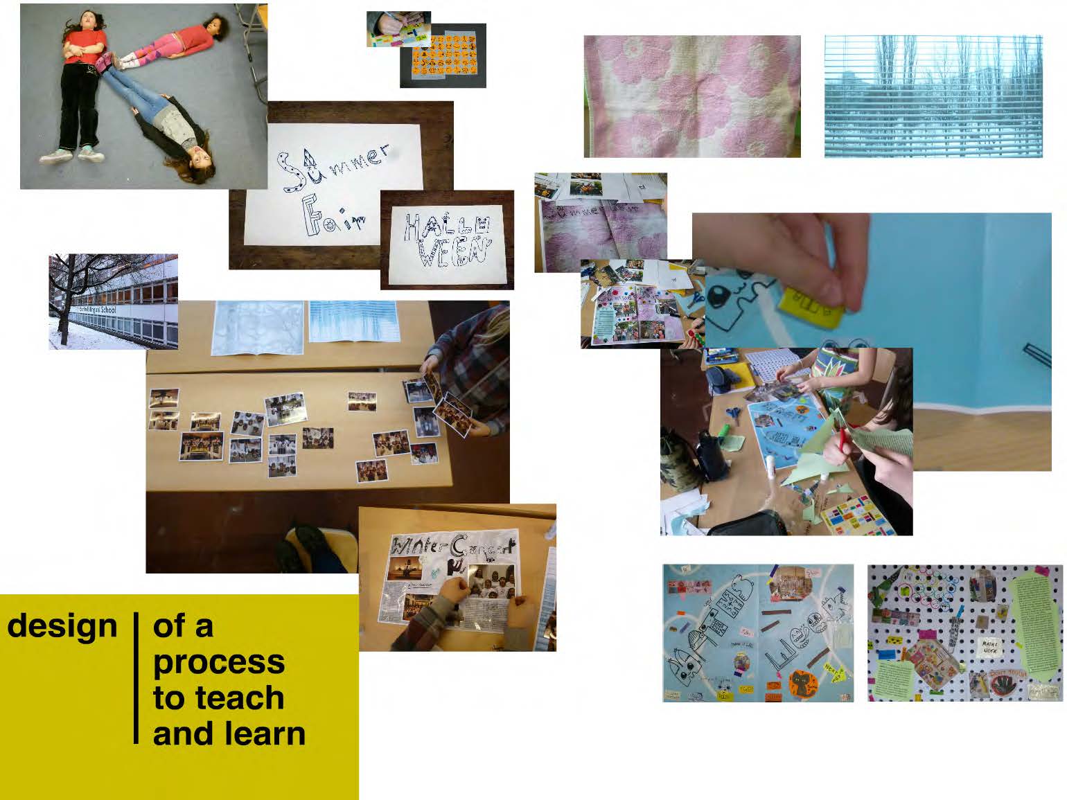
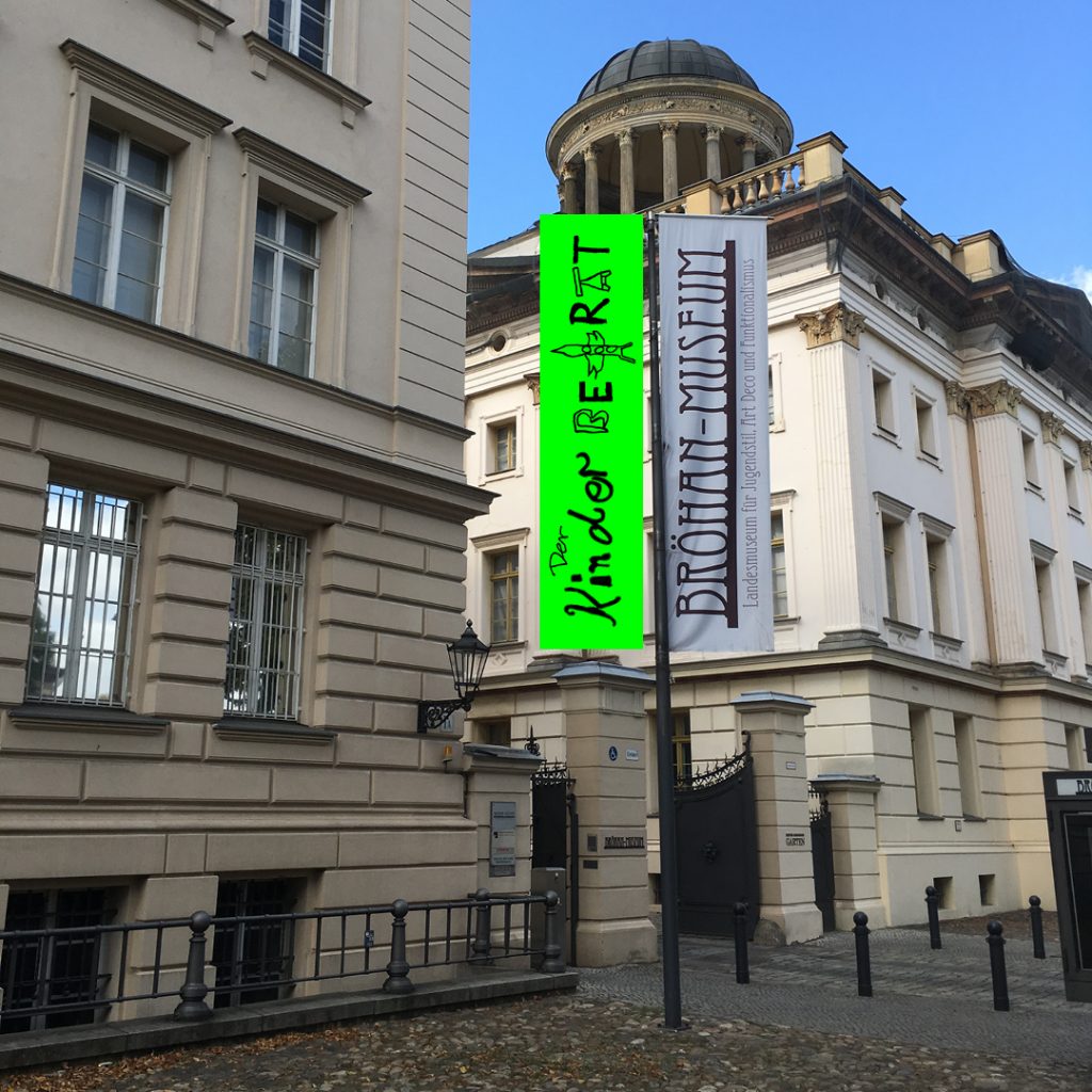
The Bröhan-Museum, Berlin’s museum for art nouveau, art deco and functionalism, on the other hand, was brave enough to ask: “How do children experience our museum, and what kind of museum do they dream of?”. In the summer of 2019, curator of outreach Nils Martin Müller started a Kinder Committee with the slogan “meddling strictly allowed”, which he asked me to lead.

I had the pleasure of working with twelve fantastic children from grades 5 and 6 and exploring the museum from their perspective, developing prototypes for a child accessible museum together. With the enthusiastic help of the teachers, the museum’s team and the cultural agents Berlin, the Kinder Committee met every Wednesday afternoon for a whole academic year.

A museum visit from the perspective of a child

Every change starts with stocktaking. First, the children explored the museum’s permanent exhibition as freely and peacefully as the museum rules allowed – no touching / no running / no loud noises. We asked them to photograph anything they saw that they would “talk about at home”.

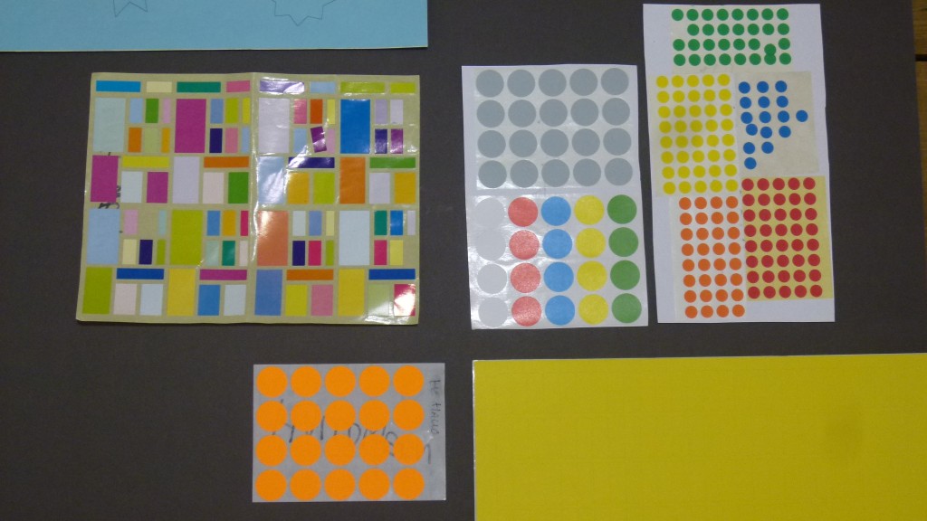
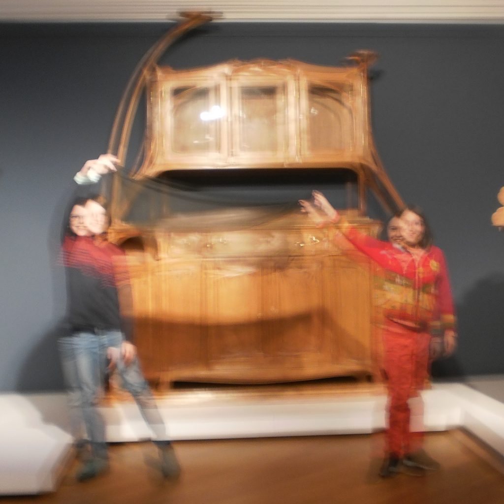
So what did the children take pictures of? Of the 110 photos, there were many shots (25%) of large and spectacular pieces of furniture, such as Hector Guimard’s Water Lily Buffet, and extravagant glass containers (16%) in an illuminated display case that were “twinkling so prettily”, as one child put it.

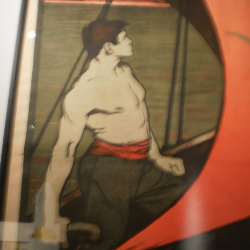
What surprised us was the large proportion of “pictures of pictures” (16%). Among the paintings, graphics, posters, tapestries and reproduced photos, figurative motifs were particularly popular. The more text was on the pictures, the less interesting the children seemed to find them; the exhibition texts were ignored completely. Are two dimensional pictures a more familiar medium? Are the children searching for a narrative? Either way, pictures seem to be a medium that speaks to children.

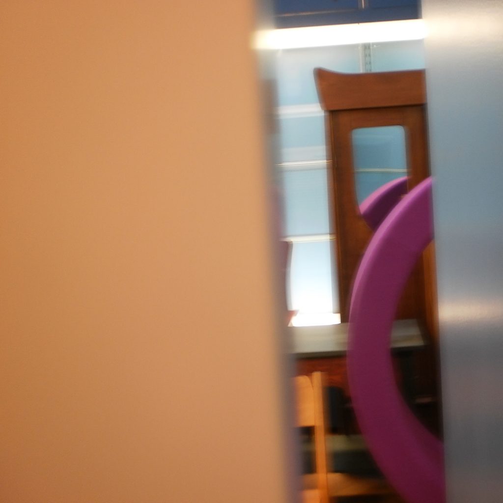
The children also photographed many things that experienced museum-goers might not even notice: the view out of the window or into the donation box. A useful hint: new visitors notice the periphery of the museum. Could we use it in a different way? Inspired by this observation, the children hid a miniature world in the museum: Welcome to Bröhania.

The mostly obstructed view into a storage room was especially intriguing. Perhaps sometimes exhibits could be hidden – discovering them for yourself is always more fun!

The items in the museum shop – although in display cases in the Bröhan-Museum and therefore not touchable – were documented just as eagerly as the exhibits. This supports my experience that museum shops can be a stimulating introduction to museums and their content. The Kinder Committee would probably have a lot of good product ideas for the museum shop.

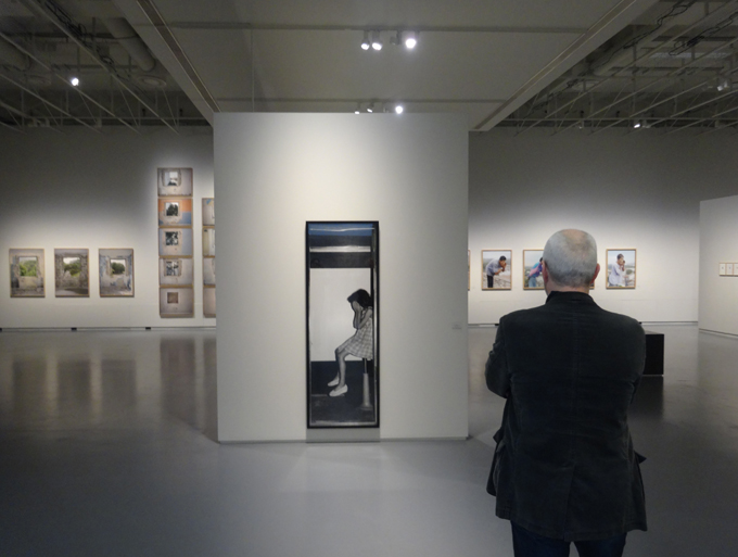
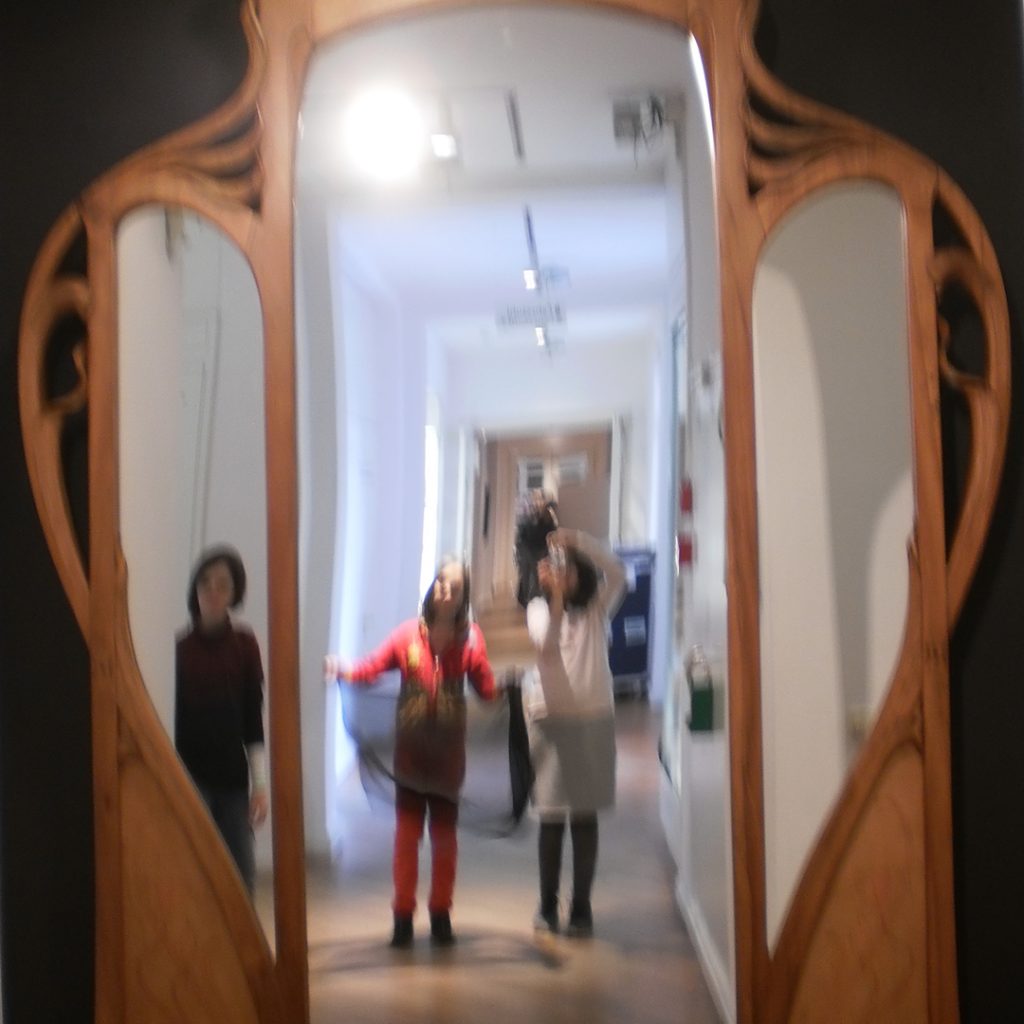
On their photo safari, the children quickly identified the only interactive exhibit in the permanent exhibition – the big mirror at the end of the long corridor. The mirror unites two possible attractions during a museum visit: the possibility of social interaction (messing around together) and magically drawing you into the museum world. The potential for mirrors in the Bröhan-Museum has definitely not been exhausted yet.

The interesting thing was not just what the children found worthy of documenting, but also what they did not: Chairs? We have those at home, why are they in a museum? A good question – that ultimately asks about the concept of the collection and might need to be answered more clearly for many visitors.

Some display locations, like the highest display shelves or table cabinets, are wholly unreachable for children. Could aids be provided for this? A periscope or something similar would surely be fun.

Categorising the findings

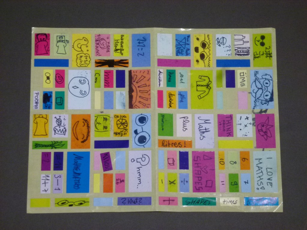
We were very curious about how the kids would categorise their own pictures. While the curators sorted the exhibits by style (e.g. art nouveau) or designer (e.g. William Morris), the children divided them primarily into typologies (e.g. cabinet or shelf). In doing so, we found that the vocabulary for types of furniture was very limited – even the word ‘furniture’ was, in part, missing. Wouldn’t it be exciting to “take home” a few unusual words like ‘chiffonniere’ or ‘Sussex chair’? When you consider the enthusiasm with which kids learn difficult dinosaur names, the idea does not seem too far-fetched.

The second most common way of sorting pictures was by function (e.g. home life or tool). Functionality is a central concept in design, but the function of individual exhibits in the Bröhan-Museum is often hard to determine (not only) for kids. For example, a Morris bench was often called a shelf. Other functions might be antiquated – who still needs a ladies’ desk these days? So, an object’s function can also have a direct connection to its historical context. Perhaps there could be more clues about this in the exhibition – and in that context answer the question about the chair?

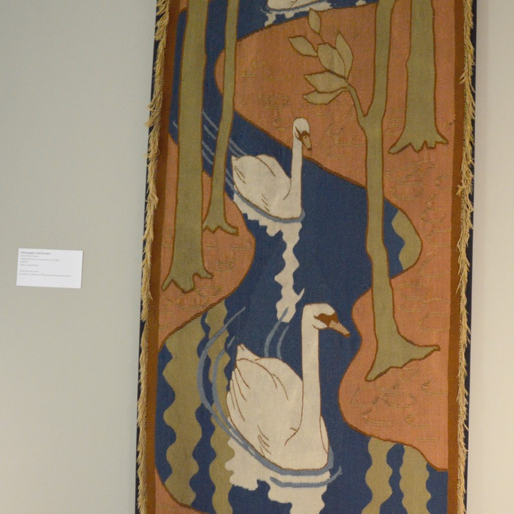
The subject matter of all pictorial artefacts was particularly dominant, regardless of material. The depiction of a swan on fabric was put in the category “people and animals”, and not “tapestries”. The fact that children really look at pictures and don’t just put them in a box according to style is a great chance! Could adult museum-goers learn from them to look at things directly, and not just compare them with prior knowledge? Mixed age “slow looking sessions” would surely be enriching for the adults.

On a side note, the children also seemed to enjoy forming meta categories like “scandalously pompous”. I would like to ask them to rename the rooms. I wonder what they would come up with for the collection “the social question”?

Children’s visions of the museum

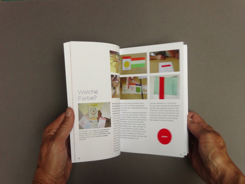
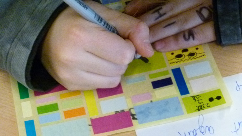
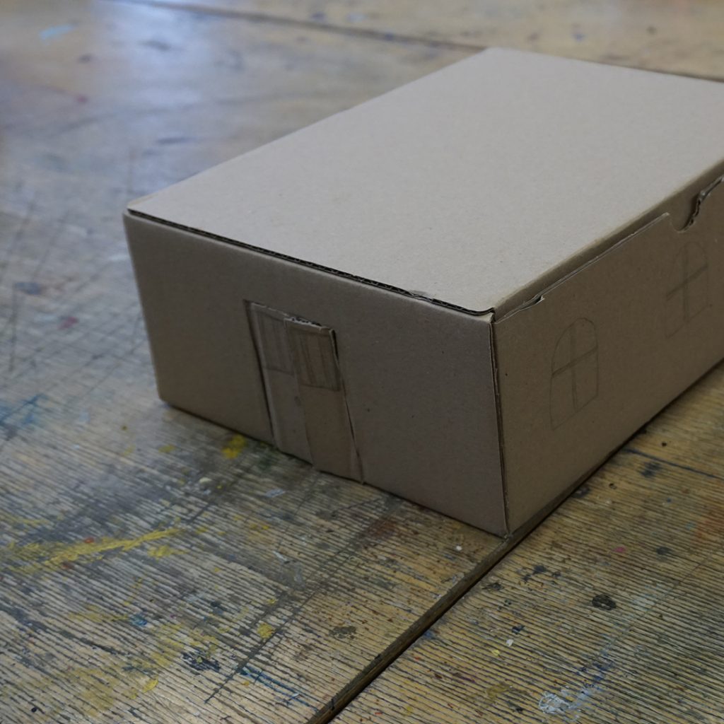
Parallel to the exploration of the museum, the kids worked on their own shoe box museums. Every child chose their own theme and designed a museum according to their wishes. Together, it looks like the children have already made a checklist for an ‘inviting’ museum:

  • A place where you can meet up
  • A place where you play together
  • A place where you produce something
  • A place where you can try things
  • A place where you can buy (take home?) things
  • A place where you learn something about yourself

We reframed the children’s wishes as our challenges, and started by exploring the idea of the museum as a meeting place: “If the museum was a place where you met up and maybe even stayed overnight – what would happen there?” The children imagined what it would be like to sleep over in  the museum and used glow-in-the-dark pens to illustrate the nightly activities. Their pictures are full of ideas and suggestions.

One drawing shows a doormat that reads “Welcome”. There’s no better way of saying it: new (and maybe shy) visitors want to feel welcome in the museum!

In another picture, Mr Bröhan himself is sitting in an armchair, greeting his guests. The fact that the man who lent his name to museum is not present within it, aside from a plaque at the entrance, bothers the kids. Using this mystical figure to create a welcoming atmosphere is a good idea.

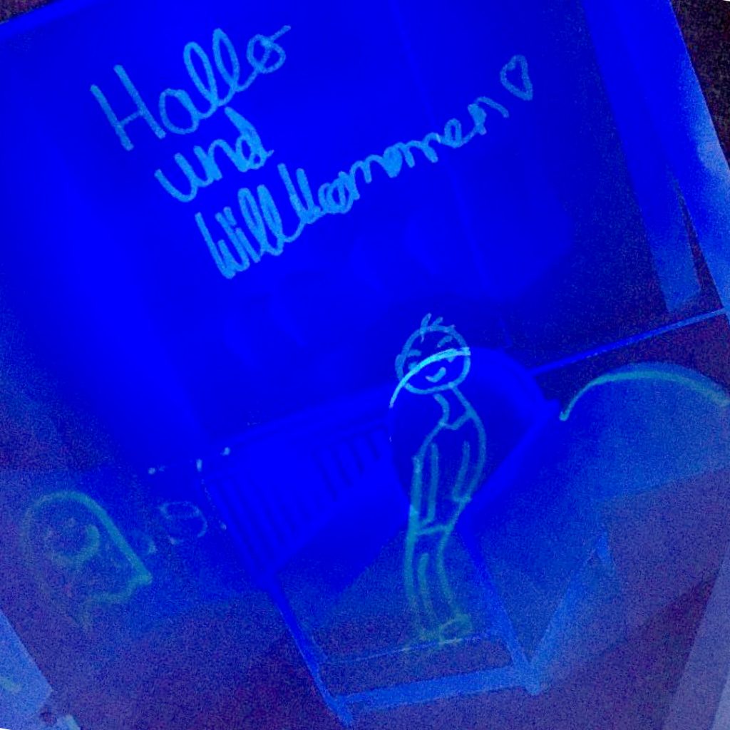
In the above-mentioned picture, Mr Bröhan explains to his visitors that there are not only old (in the sense of “shabby”?) things, but also lots of wonderful new things in the museum. An interesting hint that some visitors might be put off by the age of the exhibits. The children, who are not likely to read the texts accompanying the exhibits voluntarily, generally have no concept of how old they actually are.

Most of the kids completely furnished the museum in their pictures – curtains, houseplants, paintings, ornaments, rugs, and pets. This makes sense – furniture usually has something to do with home life. The current exhibition lacks this angle, even though home life is something which everybody is familiar with and which could therefore be an accessible entry point for new visitors.

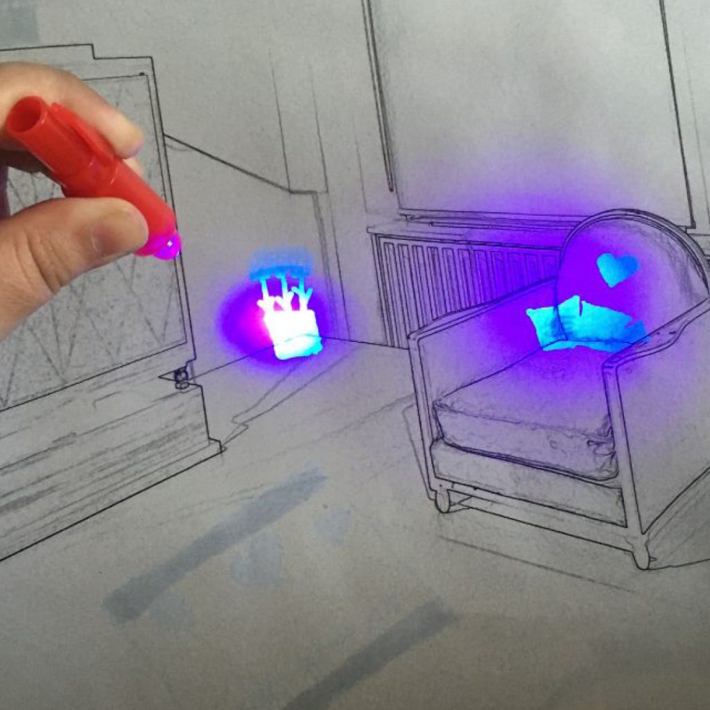
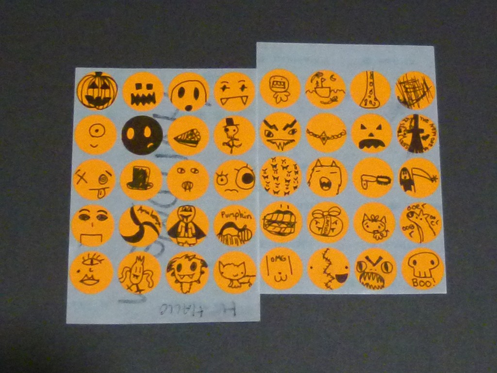
Some children were inspired by the Bröhan-Museum’s distinctive atmosphere to create fantastical parallel universes in its nocturnal rooms. Humans and ghosts living side-by-side and writing mysterious messages on the walls, skulls and crowns scattered around, doors leading to other worlds and magical books drawing you in. Children often have a sense of romanticism – think of Harry Potter – and the Bröhan-Museum’s magical aura is bursting with unused potential.

The next step was for the committee to consider how and what to play in the museum. But alas, the coronavirus stopped the Kinder Committee in its tracks. It would be wonderful to pick up where we left off next school year – there is so much left to do! Maybe together we can find a way to experience the museum, even with social distancing. In any case, we will be able to learn a lot from each other and have just as much fun!

The Kinder Committee is a collaboration between the Bröhan Museum and Nehring Primary School within the scope of the federal program “Cultural agents for creative schools Berlin” Berlin”. It was led by Rose Epple in the academic year 2019/2020.
Kinder committee: Adem, Alma, Belma, Charlotte, Jana, Krasimira, Luan, Mannat, Mehmet, Peer, Sevim, Sophie, Teba
Bröhan Museum: Nils Martin Müller / Curator of Outreach, Sylvia Hinz / Research Assistant
Nehring Primary School: Sabine Brehm-Hamm / Educator, Verena Nietruch / Educator, Katharina Stahlhoven / Cultural Agent
photos: Kinder Committee and Rose Epple
* The quote was taken from this TED Talk by Mara Mintzer: How kids can help design cities

Welcome to Bröhania

Every day lots of visitors come to the Bröhan-Museum in Berlin. Most visitors though only see beautiful old furniture and things. Good that the attentive children of the ‘Kinder Comitee’ took a closer look and discovered a whole secret world in the museum: Bröhania. The kids took time to listen to the Bröhanians and recorded their stories in a little booklet. As you can see, the inhabitants are quite a colourful bunch. Bröhania is a vast country with many different places and everybody can live the way they like. When they all come together, they always have a party. Next time you come to the museum, do not forget to look out for Bröhania!

 
“Welcome to Bröhania” characters and stories: Kinderbeirat
Concept, workshops, photos, layout: Rose Epple
The Kinderbeirat (transl.: Kinder Committee) is a cooperation between the Bröhan-Museum and Nehring Primary School as part of the Berlin program Kulturagenten for creative schools. During the school year 2019/2020 the committee was led by Rose Epple.
Kinderbeirat: Adem, Alma, Belma, Charlotte, Jana, Krasimira, Luan, Mannat, Mehmet, Peer, Sevim, Sophie, Teba
Bröhan-Museum: Nils Martin Müller / curator of outreach, Sylvia Hinz / scientific assistant
Nehring Primary School: Sabine Brehm-Hamm / teacher, Verena Nietruch / educator, Katharina Stahlhoven / cultural agent


Design Skills for All!

Design skills for all! Learning to take things into your own hands is useful – especially so in Berlin, where the Bauhaus Agents asked me to help a class of 10th grade students facilitate wayfinding in their school. Continue reading “Design Skills for All!”

How Do You Live?

At the Museum of Things, we hosted students of Jens-Nydahl Primary School in Berlin Kreuzberg for a jolly project week. Twenty-one kids from age six to eleven drew floor plans, furnished apartments, designed wallpaper and built dream homes. Best of all – they turned our white cubes into very colourful ones! Here are some impressions of a busy week in the D.I.Y. Home Advice CentreContinue reading “How Do You Live?”

Design Thinking Kids Club

What would a school look like if young people and children were designing it? That is what we were trying to find out in this project. For a whole term, I was working with students of the Berlin Bilingual Secondary School in our Design-Thinking-Kids-Club on making their school an even better place.

The Club aimed to raise the creative confidence of its members and teach them tools to enable them to shape their surroundings. Not only because this is useful for their future, but also because we were curious about their ideas.

Based loosely on Design Thinking methods, the open process steered towards a goal decided on by the students. My role consisted of structuring the design process and moving it towards  atangible result. The activities of the club were documented in detail on the project website www.design-thinking-kids.de (in German).

How can we improve daily life at our bilingual secondary school? The students of year eight and nine edged their way towards answers with practical exercises in weekly workshops. After intensive field studies, the students defined their own challenge: How can we create and run a food dispenser in the school, so that students do not go hungry anymore? And how can we make it useful for the whole school?

We bought an old dispenser on Ebay and the students started cleaning it and testing what items would fit into it.

Then they worked on designing the appearance of the automat and came up with a name for it.

The outcome of their work is called fOOd-i, a food dispenser and service based community tool for the school.

At the end of term, fOOd-i was presented to the general public at the annual Summer party to great acclaim.

The Design Thinking Kids booklet charts the ups, downs and outcome of working with students from grades eight and nine on a challenge of their own choosing. If you are interested in the booklet (in German), you can order in on my DESiGN KiDS website. For more details on the individual sessions visit the Club’s website www.design-thinking-kids.de.

The Design-Thinking-Kids Club took place at the Berlin Bilingual Secondary School in the Summerterm 2016 and was funded by the Berliner Projektfonds Kulturelle Bildung.
Concept, project management, workshops and photos by Rose Epple.

We Want to See Everybody!

“We are starting an initiative to bring actors with disabilities into German film and television and we need a visual identity. Are you up for it?”– “Yes of course, I said, but only if I get to work with these actors in the process.”

Continue reading “We Want to See Everybody!”

With SINT LUKAS at Fotomuseum Antwerp

The Fotomuseum Antwerp is always aiming to further improve their visitors experience. For fresh input, they invited students from the Media and Information Design MA of Sint Lukas Brussels to explore new ways of engaging people with their collection. I had the pleasure of leading the two-day workshop on-site.

Continue reading “With SINT LUKAS at Fotomuseum Antwerp”

Co-Designing a Yearbook

The plan: to co-design a yearbook with a group of kids between 8 and 12 years old in a weekly workshop. Introduce them to basic principles of graphic design and give them the feeling of empowerment that comes with doing things yourself. Get the book to print.

Did it work? Yes it did! And we sure had great fun with it.

How we went about it: Over a period of four months I met up with a group of 6-12 kids in frantic 50 min workshop sessions every week. To make the layouting possible without having to teach kids a layout programm, I opted for an analogue approach: cutting and pasting with scissors and glue. We started by producing display type, backgrounds and clip-art in individual sessions and then the kids assembled the layouts on their own or in pairs. Once the layouts were finished (stuck together), they were photographed and imported as full page photos in a layout program. The kids left space for texts, working with dummy text which I took off before photographing and added in the final digital document. 

Here are some impressions of our co-design process:

An easy way to create whacky letters: First, draw your letters simply in pencil as a guideline, then draw crazy lines in black marker around them.

Let the marker ink dry and then erase the pencil marks.

Tadaah! Each topic gets their individual type treatment.

Finally we copy all display type unto see-through acetate sheets, so that we can later place them in our layouts.

We also need some background images to make the pages more lively. So we are off to a photographic pattern hunt around school.

Once you start looking, there are patterns everywhere! Some seem to have come about by “accident”…

… others are found ready made!

Now about some clip art to flourish our pages. Before we start, I ask the DESiGN KiDS to range their desks into one continuous line, because they will be churning out clip-art in an assembly line today. I have assembled seven sets of stickers in different sizes and colours, so that every event has a different type of sticker.

Each student gets one sheet with a different theme. I explain to them that they will have one minute for every drawing, then the timer will go off and they have to pass the sheet over to their neighbour and work on the next theme. So each group of clip-art will be assembled by the whole group. Ready? Steady? Go!

They are all clip-art professionals – of course – that is what kids are doing all day at school: doodling in their exercise books.

Look at these amazing Halloween clip art stickers!

Now at last, we are ready to start lay outing! All the ingredients are ready: The photos ( taken by parents and teachers) are printed out on photo paper, our backgrounds laserprinted out on A3 sheets, the clip art on stickers and our type designs on acetates. Let´s go!

The DESiGN KiDS work in groups of two to threes on each topic. These two  are busy at work on two spreads about Maths Week.

diy yearbook in the making

The DESiGN KiDS leave space for the final text by working with dummy text which I take off before photographing.

Once the layouts are finished, they are photographed and imported as full page photos in my layout program. The real text was then added by me  in the final digital document. 

This technique works really well, the printed book has retained a three-dimensional feeling to it.

The co-designing experiment was a success: the Berlin Bilingual School Yearbook 2012 / 2013 got printed in time and quickly sold out. Apart from it being a very authentic document of a busy school year in this extraordinary school, it looks just fabulous. Thank you everybody!

BBS Yearbook 2013

Editor: Berlin Bilingual School · Yearbook workshops, art direction and art working: Rose Epple · Design: Katy Parker, Ava Eusepi-Harris, Alice Lyall, Khela Brophy, Ruby Good, Anne Mooshammer, Kaya Weissert, Trinity Ernst, Alexander Stump, Maytagorry Linshöft, Clara Koebberling, Leonie Gagel, Zoë Kreissl, Dana Mae Westerhoff, Paula Seemann, Jody Lee Albert Arison, Clay Kryst and Griet Verweij · Photos: Nora Kryst, John MacDougall, Anne Meurer, Pictura Foto GmbH · Picture editors: Stefanie Albert, Nora Kryst · Production: Stefanie Albert, Nora Kryst, Lars Borchert · Text and editing: Lars Borchert, Cornelia Donner · Printing: Brandenburgische Universitätdruckerei und Verlagsgesellschaft Potsdam mbH

From Bauhaus to Betahaus

My recent lecture for Shapeshifters in Brussels, provided me with a good excuse to look at my work from the last decade and try to make sense of it all. Am I still the same designer as ten years ago? No, I have changed and so has the design world around me. Roughly, I would sum up this change as a move from form to process.

shapeshifters_120313_lr_Seite_006

Since 2003, Johan van Looveren and Inge Gobert from Sint Lukas Hogeschule in Brussels, have invited graphic designers for their annual lectures to talk about their approach to information design. When they asked me, it was the first time I thought about my scenographic work and book projects as information design. Have I been designing information? If so, where did this information come from, what did I do to it and why? To answer these questions I had to go right back to the Bauhaus, because for me it all started with the Bauhaus.

shapeshifters_120313_lr_Seite_003

shapeshifters_120313_lr_Seite_005

One of the first exhibitions I ever worked on was Bauhaus Style at the famous building in Dessau. By the time this opportunity arose, I had already come a long way. Originally starting off as an illustrator, I was quickly frustrated by the limited scope of a typical commission: “Your drawing here, please.”. What about the rest of the page? What about the article, the magazine, the series, the brand? My constant urge to design an ever bigger context was finally matched by the design brief: create an environment. In an exhibition the things that are exhibited plus the exhibition design embedding them into a context, constitute together what you might call “the information”. It is transmitted over a range of different channels simultaneously. To design these parallel levels, you obviously need more than one design discipline. The idea that all design disciplines work together towards one vision, their “cathedral”, was first propagated and put into action at the bauhaus. One could say, that scenography or integrated design itself started with the bauhaus.


shapeshifters_120313_lr_Seite_009

shapeshifters_120313_lr_Seite_018

An exhibition is not a linear 3-D book that you read from A-Z in order to learn something. In the exhibition Andy Warhol. Other Voices, Other Rooms that originated in the Stedelijk Museum and travelled from there to Stockholm, London and Columbus/Ohio, that would have been an impossible undertaking anyway. In the spirit of “All is pretty” (Andy Warhol) the show combined 871 works in 33 media. In order to view all time based media alone, it would take a visitor close to 68 hours.

An exhibition is a world that you enter, and you experience information rather than reading it. A narrative space can convey meaning in a more direct and sensual way than a book. The defining difference seems to me the physical presence of the visitor and his movements around the space.

Information gets altered not only by what is exhibited and how, but also by the way the visitor moves around the space, the time she spends there and the way she feels while being there. Thus, the design of an exhibition is not comparable to designing a static object or a theatre stage, but is more akin to city planning or service design.

This is why information in exhibitions is context sensitive. Let´s take for example the filmscape in the same exhibition where 21 films run simultaneously in a sound absorbing camouflage landscape. The arrangement allows for a comparative filmic experience, very appropriate for Warhol´s highly experimental films, that range from short camp movies to nine hours footage of the Empire State building filmed in one night.

shapeshifters_120313_lr_Seite_024

shapeshifters_120313_lr_Seite_025

The physical sensation of walking and lying around in films is impressive enough, but an interested visitor might like to know what exactly he´s watching. This is usually solved by sticking a label somewhere, but here it is dark and you wouldn´t be able to read a normal label in the dark. That´s why we enlarged the information on each film and put it on those big panels on the walls. These panels show you title, actors and duration of each film. But one problem, that people usually have with time based media in exhibitions remains: how do you know at what point the film is right now? To solve this problem, we incorporated a timecode into each panel, showing you the exact position of the film.

 shapeshifters_120313_lr_Seite_031

shapeshifters_120313_lr_Seite_032 

shapeshifters_120313_lr_Seite_030

A different situation in the TV scape, which displays all 42 TV Shows by Andy Warhol on individual screens. Here the star seats hold the information. The visitor is literally sitting on the information, as only one person can watch one show at one given moment. People have to move around the room to view a different episode, they are switching channels with their bodies. The way information is presented makes them do that. Seen from the outside, the visitor almost becomes an exhibit in himself, luring other visitors inside the American Flag thus completing the exhibition design.


shapeshifters_120313_lr_Seite_010

To give a visitor information he needs at a specific moment is one strategy, another is to provide him with a tool that enables him to navigate independently around complex information environments. The exhibition Subjective aimed to portray a generation of documentary filmmakers from the Film and TV school in Munich in the neighbouring Pinakothek der Moderne, allowing for an interdisciplinary exchange on the nature of the documentary in art and filmmaking.

shapeshifters_120313_lr_Seite_036

The advantage of doing this in an exhibition as opposed to a film festival or a DVD set, is the possibility to let visitors see everything at once. The overview took place in the main exhibition room, where 88 documentary films were simultaneously shown, each film on its own white museum style socle. Projected by a mini beamer, the size of a pack of cigarettes, unto small plexi screens, each film thus had its own tiny cinema situation to itself.

shapeshifters_120313_lr_Seite_037

The visual floorplan shows the rigid grid on which the films were arranged. Vertically you have a number system, horizontally each row represents a curatorial group with titles like “conflict”, “border” e.t.c.. In the accompanying fold out map, the visitor can search for films by different categories, such as director, film title or subject matter. Just like on a city map, the visitor is given the coordinates of the particular film, he has thus chosen.

shapeshifters_120313_lr_Seite_038

shapeshifters_120313_lr_Seite_039

For younger people that were raised on the internet, the navigation of complex information and being offered alternative routes for personal explorations, seems natural. For the designer, the main feat is a usability challenge. How do you design an easy to grasp system that allows people to explore on their own? But this scenographic approach also has a wider impact, it subverts the hierarchical roles of curator and visitor, of expert and laymen to allow for a more democratic interaction between equals.


shapeshifters_120313_lr_Seite_012

shapeshifters_120313_lr_Seite_076

But there are different types of information. There is the type of information that spells “This way to the toilet” or “Max Ernst was born in 1891”. But what about how his works feel or what it means? In the comprehensive Max Ernst retrospective Max Ernst. Dream and Revolution at the Moderna Museet and the Louisiana Museum of Modern Art, the curators wanted to show that Max Ernst influence on contemporary aesthetics and thoughts, is much greater than commonly acknowledged. How can you make people get a glimpse of these curatorial ideas, beyond using textual means? How can somebody that only walks through an exhibition without reading a single label or text experience Max Ernst as a contemporary, not just as an exponent of the historic surrealist movement?

shapeshifters_120313_lr_Seite_078

To give the exhibition a contemporary feel, without scaring off the rather conservative (when it comes to exhibition scenography) art crowd, we worked exclusively with museum means: white walls and lighting. The freestanding walls form different types of rooms, connecting and structuring the works loosely, while coloured lights aimed at the ceiling indicate the four sections of the exhibition. Each colour represents one of the four different places where Max Ernst lived and worked: the early Dada works in Germany are signalled by green light, his French works hang under a pink sky, the American ones in a yellow aura and his return to Europe in the fifties glows blue. The labels emanate the same coded colours, achieved by simply sticking coloured paper on the back of the labels and attaching them in a little distance to the wall.

shapeshifters_120313_lr_Seite_079

Even the catalogue emits coloured light from the spine, subtly illuminating the different sections. Vague information needs artistic rather than rational means.shapeshifters_120313_lr_Seite_081


So far the information as subtle as it may have been, has had a reliable source. It was usually provided by curators, which are experts in their particular fields. But increasingly, the roles of information provider and information consumer in my projects have become more fluid.

shapeshifters_120313_lr_Seite_097

Examples are the Wilhelm Meister exhibition, where new knowledge was generated by the scenographic form. The exhibition books make information visible, that has not been visible before, even to the experts. They show aspects of the Goethe Book, which go beyond the usual literary objects of study and provide new entry points to the book, even to people that are not familiar with the text.


shapeshifters_120313_lr_Seite_134

Or take the book project Arbeitende Orte (transl. Working Places) with Angelika Fitz, where we first designed a process, in order to collect the information that would subsequently form the content of the book.


shapeshifters_120313_lr_Seite_105

Another exemplary project might be the planned International Building Exhibition IBA Berlin 2020, for which we designed the first public interface in the ongoing process. To enable this process, we designed artefacts that were not ends in themselves, but means to an end, such as the flexible and modular IBA Workshop platform and simple tools such as pens, sticky notes and plastic bags (to carry information away with). In the temporary IBA Workshop in the airport Tempelhof, new information was jointly generated, information that is then being fed back into the process to spark off new ideas and so on and so on.


shapeshifters_120313_lr_Seite_119

I would like to close this list of information frenzy, with the yearbook project where I am designing a book with school children. To enable them to do this I am designing a process to inform and end up learning as much as I am teaching. To find out more about this lively experience please refer to Co-designing a Yearbook.


shapeshifters_120313_lr_Seite_008

Having come full circle and finding myself back in the present, I can claim that looking at my work from an information angle proved fruitful. The filter allowed me to see more clearly how parameters, objectives and outcomes have changed and shaped my design perspective over the years. Not only the way information is created, handled and offered has changed in my projects, but also my working conditions as a designer. My latest endeavors all share some characteristics: fuzzy timespans with no clear start and finish, a collaborative process that has to be constantly adapted to meet its objectives and an evolving definition of the desired end result, a result that often triggers more questions rather than give definite answers.

I am not alone. All around me I see designers moving from commissions to questions. I see people reinventing our profession, working in changing constellations on self professed beta versions. Which brings me to the other haus that starts with a small b and to the end of my musings.

shapeshifters_120313_lr_Seite_135

The betahaus is a co-working space in Kreuzberg that rents out desk space to people like me – people that don´t like to work alone at home. Just like the Bauhaus almost a hundred years ago, it is a platform that encourages people from different disciplines to meet and work together on projects. It uses tools like weekly breakfasts, open office hours and maker weekends to facilitate exchange and create synergies. Like the famous school it is as well a place of learning.

But unlike the historic Bauhaus, you don´t have to master the “Grundkurs” first. The betahaus is open to everyone and the roles of teachers and students in the betahaus are interchangeable: one day somebody will show you how to create interactive textiles, the next day you can teach them screen printing or send your kids to a hackathon. The betahaus exports its concept to other cities and countries, creating an “international style” of co-working that is designed to be shaped and defined by its users. The “beta” in the name is programmatic, the betahaus sees itself as an institution in flux, a dynamic prototype where ideas are tested, refined or thrown out again.

The betahaus seems to me very much a child of its time – just like me.

Andy Warhol. Other Voices, Other Rooms, Subjektiv. Documentary Film in the 21st century, Max Ernst. Dream and Revolution, Wilhelm Meister exhibition,  IBA Berlin 2020: scenography by chezweitz&roseapple · Wilhelm Meister Bücherkörper curated by Rose Epple
Talk for Shapeshifters on March 13, 2013 at Beursschouwburg, Brussels.

Scenographic Field Studies

Brief: Find the most auratic object in the museum and make a sketch of the way it is presented.

Indeed – there seems to be a consensus among students in choosing the Nofretete as the most auratic object in the New Museum Berlin, which I count as proof that something of that kind of phenomena exists. Although I personally still have my doubts…maybe the testgroup was still too small?

The seventeen students of the Technical University’s Master in Stage design and spatial composition produced these drawings as part of the data collected in three scenographic excursions. Franziska Ritter, the course coordinator, and myself devised these field trips in order to raise awareness for the different levels scenography is acting on and also because we were curious if this combination of research and education would work.

For the first trip we set out to compare two very different exhibitons about the Berlin Wall. One being the newly opened Berlin Wall Memorial along Bernauer Straße and the other the Mauermuseum Checkpoint Charlie. Each researcher had a different task on hand: counting and categorizing exhibits, following people and timing them looking at exhibits, measuring text lengths, testing orientation and navigation, listening with their eyes closed, collecting soundbites, smelling and touching the exhibition, observing their emotional reactions to the exhibits, sketching floorplans and mapping the curatorial structure. In the following round up these findings were presented and combined to a comparative study, obviously with no real scientific credibility, but packed with surprising observations that made the ensuing discussion very lively.

Would you have guessed that people spend less than one minute in front of an exhibit and maximum three minutes in a whole section? That original audio recordings score very high on the emotional scale? That a hard floor covering creates an aggressive noise and that small stuffy rooms produce smelly people? Another astonishing miscellany being that the Mauermuseum has the highest number of visitors in Berlin, although it scored very badly in the study. One student called it “a giant newspaper”, a tabloid rather, and everybody was very confused about the curatorial structure.  Still, if you´ve never been there I can highly recommend it as a memorable experience – it has an endearing naiveté about it, you could say a museum brut. 

On the second trip we focused on the object, comparing the display of and the attitude towards the objects displayed in the New Museum Berlin and the Museum of Things respectively. The former houses the Nofrete and yes, there is an auratic object in the latter as well. Go and visit or buy the new Lou Reed CD and you‘ll see. Again, it was so productive to work with a whole research team. Fourteens brains observing simultaenously produce indeed more data, more complexity, more controversy and more insights for everybody.

All drawings by MA students of the TU Stage Design and Spatial Composition course