Muss jedes Museum für Kinder interessant sein? Nein, aber wenn ein Museum sich für neue Besuchergruppen öffnen will – und das ist unter dem Titel “Outreach” erklärtes Ziel vieler deutscher Museen – hilft es, sich erst einmal mit Kindern zu befassen. Denn diese Erkenntnis aus dem urbanistischen Kontext lässt sich auch in die Museumswelt übertragen:
„Kinder sind Indikatoren. Wenn wir eine funktionierende Stadt für Kinder bauen können, dann werden wir eine Stadt für alle Menschen haben.“
Enrique Peñalosa, ehemaliger Bürgermeister von Bogota, Kolumbien*
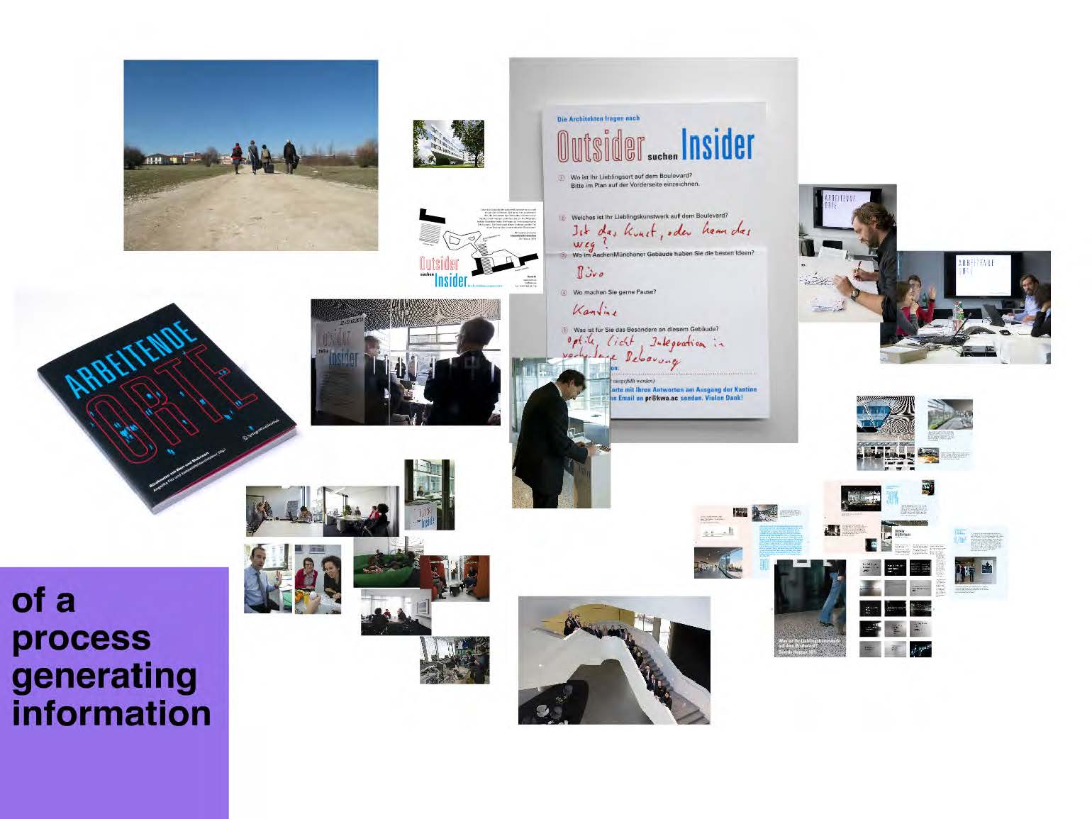
Wie macht man ein Museum zugänglich für Kinder? Am besten indem man mit Kindern zusammenarbeitet: sich mit ihnen unterhält, sie beobachtet, gemeinsam mit ihnen Ideen entwickelt, Prototypen baut, testet und mit ihrer Hilfe verbessert. Dieser “Human Centered Approach” ist schon lange gängige Praxis in Architektur und Produktdesign, nur in der deutschen Museumswelt setzt er sich erst langsam durch.
Die Museen bieten zwar viele Führungen und Workshops für Kinder an, aber die Chance dabei von seinen Besuchern zu lernen, wird meist vertan. Die Erfahrungen der Vermittler fließen selten zurück in die Museumsgestaltung und Kuratierung. Kein Wunder – es ist einfacher ein (gefördertes) Parallelangebot zu machen, als die eigene Museumsarbeit zu hinterfragen.
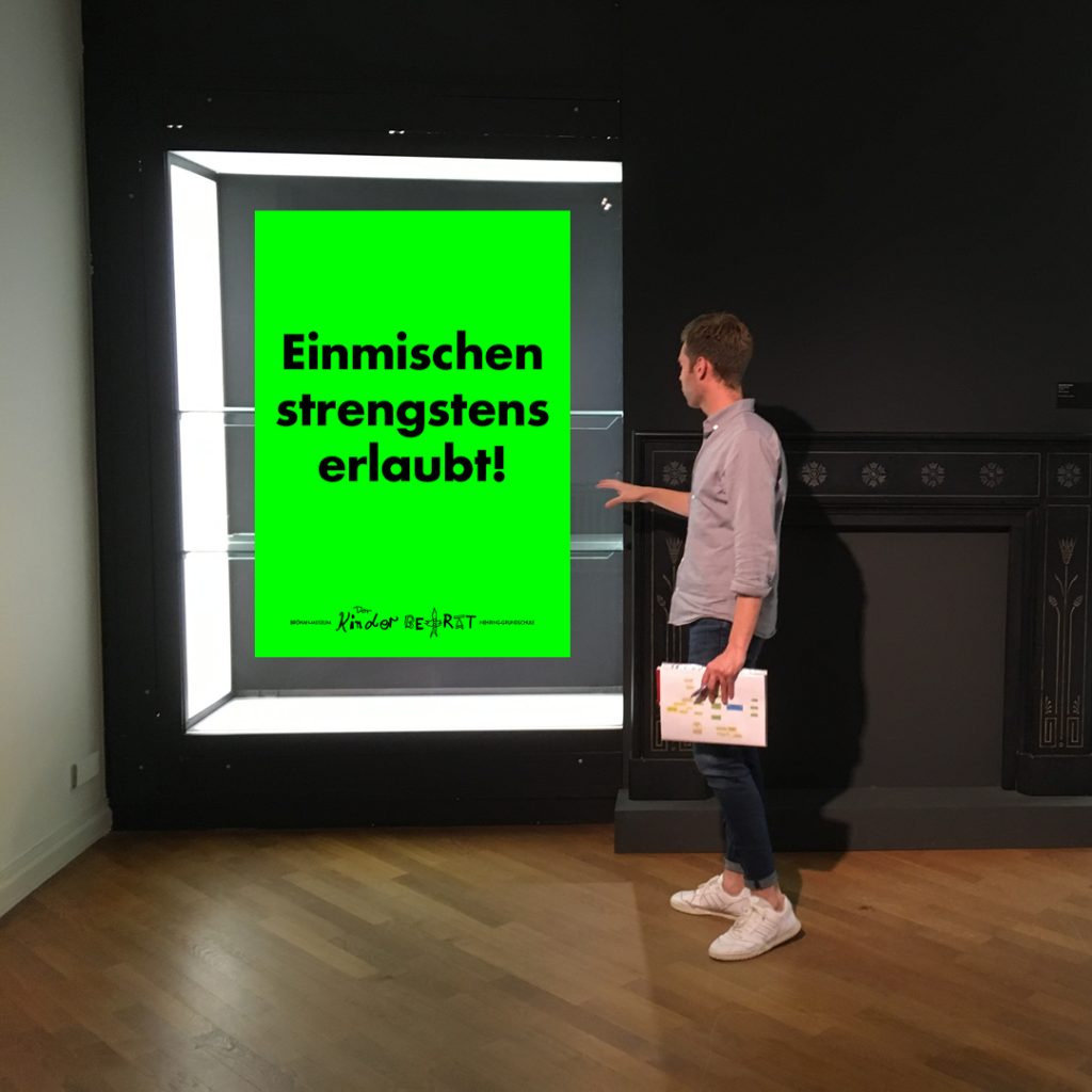
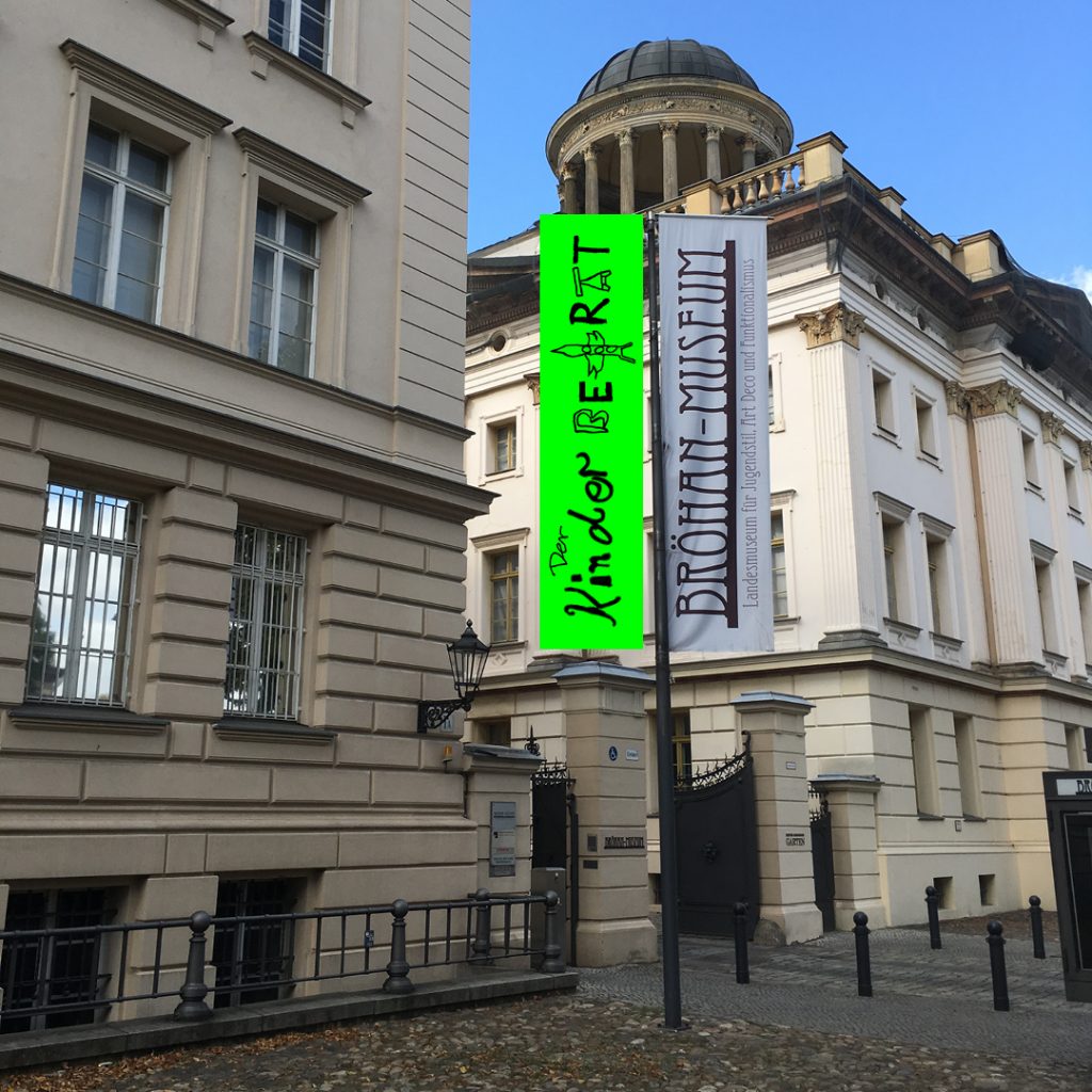
Anders das Bröhan-Museum, Berliner Landesmuseum für Jugendstil, Art Deco und Funktionalismus, das den Mut hatte zu fragen: “Wie erleben Kinder eigentlich unser Museum und was für eine Art Museum wünschen sie sich?” Unter dem Motto “Einmischen strengstens erlaubt” rief ‚Curator of Outreach’ Nils Martin Müller in Zusammenarbeit mit der Nehring-Grundschule im Sommer 2019 einen Kinderbeirat für das Museum ins Leben, und bat mich die Leitung zu übernehmen.
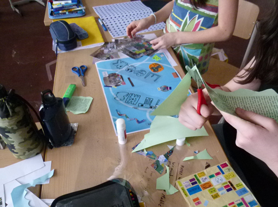
Und so hatte ich die Freude mit zwölf fantastischen Kindern aus der 5. und 6. Klassenstufe das Museum aus ihrer Perspektive zu erkunden und gemeinsam Prototypen eines zugänglichen Museum zu entwickeln. Tatkräftig unterstützt von sehr engagierten Lehrkräften, dem Museums-Team und den Kulturagenten Berlin, hat sich der Kinderbeirat dafür ein Schuljahr lang jeden Mittwochnachmittag getroffen.
Ein Museumsbesuch aus Kinderperspektive
Jede Neuausrichtung beginnt mit einer Bestandsaufnahme. Als erstes haben die Kinder, so frei und ungestört wie es die Museumsregeln (nichts anfassen / nicht rennen / nicht laut sein) erlauben, die ständige Ausstellung des Museums erkundet. Dabei baten wir sie, alles “wovon sie zuhause erzählen würden” für uns zu fotografieren.
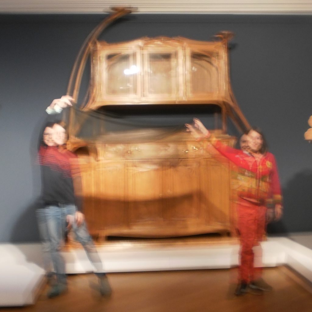
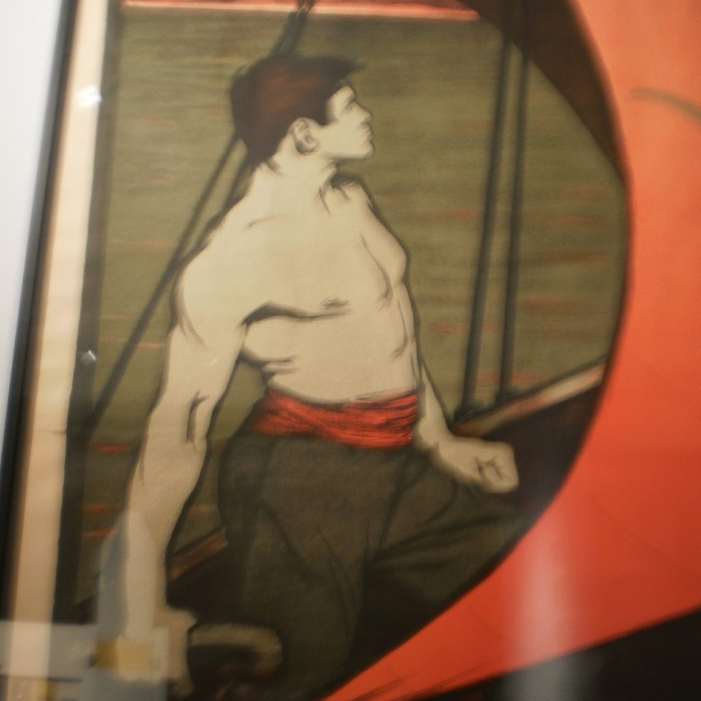
Was haben die Kinder fotografiert? Unter den 110 Fotos waren erwartungsgemäß viele große und spektakuläre Möbel (25%), wie z.b. das Seerosen-Buffet von Hector Guimard und extravagante Glasgefäße (16%), die in einer hell erleuchteten Vitrine „so schön blinken“, wie ein Kind es ausdrückte.
Überrascht hat uns die große Anzahl der „Bilder von Bildern“ (16%). Unter den Gemälden, Grafiken, Postern, Tapeten und reproduzierte Fotos, waren besonders figurative Motive beliebt. Je mehr Text auf den Bildern, desto uninteressanter schienen sie für die Kinder zu sein; die Ausstellungstexte wurden völlig ignoriert. Sind zweidimensionale Bilder ein vertrauteres Medium? Sind die Kinder auf der Suche nach einem Narrativ? Auf jeden Fall scheinen Bilder ein gutes Medium zu sein, um Kinder anzusprechen.
Die Kinder fotografierten auch viele Dinge, die routiniertere Museumsgänger vielleicht gar nicht sehen: den Blick aus dem Fenster oder in die Spendenbox. Ein nützlicher Hinweis: Die Peripherie des Museums wird von neuen Besuchern gesehen. Können wir sie vielleicht anders nutzen? Inspiriert von dieser Beobachtung, haben die Kinder zum Beispiel eine Miniaturwelt im Museum versteckt: Willkommen in Bröhanien.
Ganz besonders beliebt war der größtenteils versperrte Blick in einen Lagerraum des Museums – vielleicht kann man Exponate auch mal verstecken? Selber entdecken macht einfach am meisten Spaß!
Die Waren im Museumsshop – obwohl im Bröhan-Museum in Vitrinen und damit nicht zum Anfassen – wurden von den Kindern genauso eifrig fotografiert wie die Exponate. Dies bestärkt meine Erfahrung, dass Museumsshops ein anregender Einstieg in ein Museum und seine Inhalte sein können. Sicherlich hätte der Kinderbeirat viele gute Produktideen für den Museumsshop.
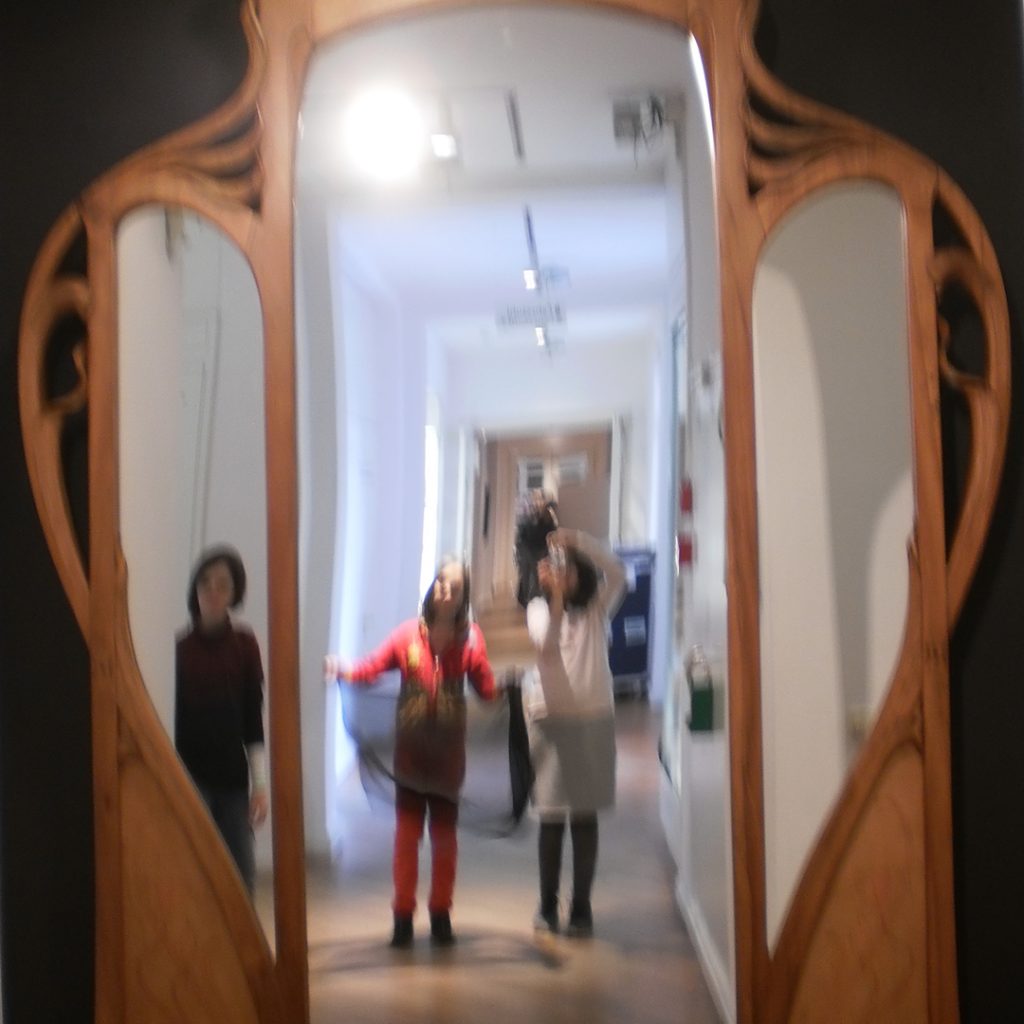
Zielstrebig identifizierten die Kinder auf ihrer Fotosafari auch das einzig interaktive Exponat der ständigen Ausstellung – der große Spiegel am Ende des langen Flurs. Der Spiegel vereint zwei mögliche Attraktionen eines Museumsbesuchs: Eine Möglichkeit zur sozialen Interaktion (gemeinsames Rumalbern) und er zaubert einen gleichzeitig in die Museumswelt hinein. Das Potential von Spiegeln im Bröhan-Museum ist ganz bestimmt noch nicht ausgereizt.
Interessant war aber nicht nur, was Kinder für fotografierenswert hielten, sondern auch was nicht: Stühle? Haben wir auch zuhause, warum sind die im Museum? Eine gute Frage, die letztendlich nach dem Konzept der Sammlung fragt, und im Bröhan-Museum vielleicht für viele Besucher klarer beantwortet werden müsste.
Einige Präsentationsorte, wie die obersten Vitrinenregale oder Tischvitrinen sind für Kinder auch schlicht nicht einsehbar. Könnte man dafür Hilfsmittel bereitstellen? Um-die-Ecke-Gucker oder ähnliches wären bestimmt ein Spaß.
Das Einordnen des Gesehenen
Wir waren sehr neugierig, wie die Kinder ihre Bilder selber einordnen würden. Während die Kuratoren die Exponate nach Stilrichtungen (z.B. Art Nouveau) oder Designern (z.B. William Morris) sortiert haben, haben die Kinder in erster Linie nach Typologien (z.B. Schrank oder Regal) unterteilt. Dabei fiel auf, dass das Vokabular für Möbeltypen sehr begrenzt ist – teilweise war selbst das Wort ‘Möbel’ unbekannt. Wäre es nicht aufregend, ein paar ausgefallene Worte wie ‘Chiffonniere’ oder ‘Sussex-Chair’ aus dem Museum “mitzubringen”? Wenn man an die Begeisterung denkt, mit der Kinder schwierige Dinosauriernamen lernen, scheint mir das kein abwegiger Gedanke.
Am zweithäufigsten wurde nach Funktionen (z.B. Wohnen oder Gebrauchsgegenstände) sortiert. Funktionalität ist ein zentrales Konzept im Design, aber die Funktion einzelner Exponate im Bröhan-Museum ist (nicht nur) für Kinder oft schwer zu erkennen. Eine Morris Sitzbank wurde z.B. als Regal bezeichnet. Andere Funktionen sind möglicherweise veraltet –wer braucht z.B. noch einen Damen-Schreibtisch? Die Funktion ist also auch ein direkter Weg zum geschichtlichen Kontext der Möbel. Vielleicht könnte man da in der Ausstellung schon mehr Hinweise geben und in diesem Zusammenhang auch gleich die Frage nach dem Stuhl beantworten?
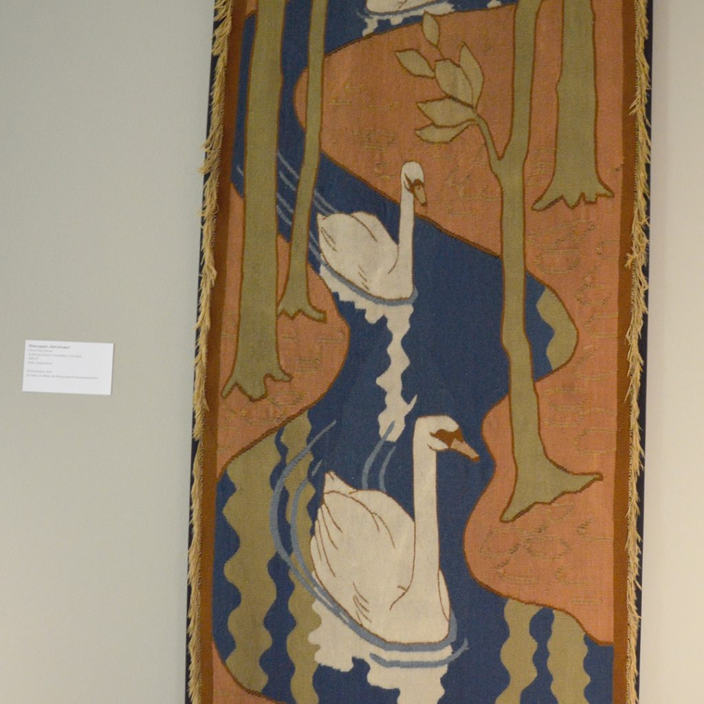
Sehr dominant waren die Motive, unabhängig von der Materialität. Die Abbildung eines Schwans auf textilem Grund wurde z.B. unter “Menschen und Tiere” eingeordnet und nicht unter “Wandbehang”. Dass Kinder sich Bilder wirklich angucken und nicht gleich in eine Stilschublade stecken, ist eine große Chance! Können erwachsene Museumsbesucher von ihnen lernen, Dinge wieder unmittelbarer anzugucken und nicht nur mit mitgebrachtem Wissen abzugleichen? Altersgemischte ‚Slow Looking Sessions’ wären da bestimmt eine Bereicherung für die Erwachsenen.
Übrigens zeigten die Kinder auch Spaß an Meta-Themen und bildeten Kategorien wie “skandalös pompös”. Man könnte sie einmal bitten die Räume neu zu benennen. Mal sehen wie zum Beispiel die jetzige Gruppe “Die soziale Frage” bei ihnen hieße?
Eigene Museums Visionen
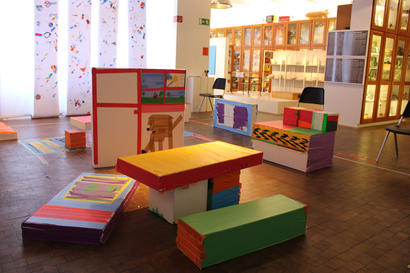
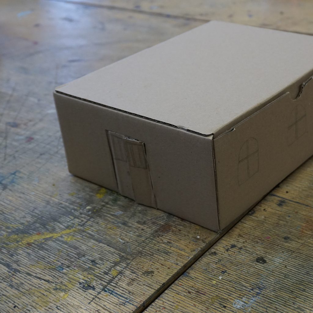
Parallel zur Erkundung des Museums, haben die Kinder in der Schule an eigenen Museen in Schuhkartons gearbeitet. Jedes Kind hat ein eigenes Thema gewählt und ein Museum nach seinen Wünschen entworfen. In der Summe haben die Kinder hier eigentlich schon eine Checkliste für ein ‚einladendes’ Museum erstellt:
- Ein Ort, an dem man sich treffen kann.
- Ein Ort, wo man zusammen spielt.
- Ein Ort, wo man etwas produziert.
- Ein Ort, wo man Dinge ausprobieren kann.
- Ein Ort, an dem man Dinge auch kaufen (mitnehmen?) kann.
- Ein Ort, an dem man etwas über sich selbst lernt.
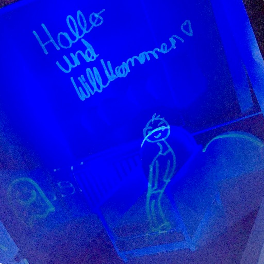
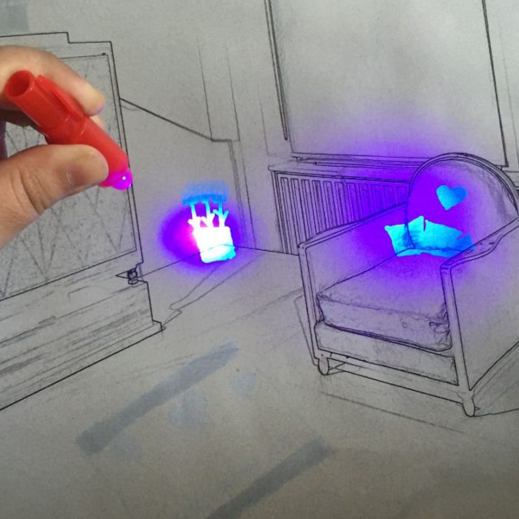
Diese Wünsche der Kinder lassen sich als Aufgaben umformulieren. Wir haben uns als erstes den Wunsch des Museums als Treffpunkt vorgenommen und gefragt: „Wenn das Museum ein Ort wäre, an dem man sich trifft und vielleicht auch übernachtet – was würde dort passieren?“ Die Kinder haben sich vorgestellt, dass sie tatsächlich nachts im Museum übernachten dürfen und mit UV-Stiften aufgezeichnet, was dort alles so los ist. Ihre Bilder sind voll von Anregungen und Vorschlägen.
Vorschläge für das Museum
Auf einem Bild liegt eine Fußmatte mit der Aufschrift “Willkommen” auf dem Boden. Besser kann man es kaum auf den Punkt bringen: Neue (und vielleicht schüchterne) Besucher wollen sich im Museum willkommen fühlen!
Auf einem anderen Bild sitzt Herr Bröhan selber in einem Sessel und begrüßt seine Gäste. Dass der Namensgeber des Museums, außer auf einer Plakette im Eingang, nicht präsent ist, hat die Kinder öfter beschäftigt. Diese mystische Figur zu nutzen um ein Willkommensgefühl herzustellen ist eine gute Idee.
In o.g. Bild erklärt Herr Bröhan seinen Besuchern auch noch, dass es im Museum nicht nur alte (im Sinne von „olle“?) Sachen gäbe sondern auch viel schönes Neues. Ein interessanter Hinweis, dass es manche Besucher abschrecken könnte, dass es den Wert von Exponaten mindert, wenn sie alt sind. Die Kinder, die eher nicht freiwillig Exponatschilder lesen, haben übrigens generell wenig Vorstellung aus welcher Zeit die ‚ollen’ Exponate sind.
Die meisten Kinder haben das Museum auf ihren Bildern eingerichtet – komplett mit Vorhängen, Grünpflanzen, Bildern, Deko Objekten, Teppichen und Haustieren. Das ist naheliegend, denn bei Möbeln geht es ja eigentlich ums Wohnen. Davon ist allerdings in der jetzigen Ausstellungspräsentation nicht viel zu spüren. Dabei ist Wohnen ein Thema, mit dem sich jeder auskennt und damit eine gute Brücke für neue Besuchergruppen.
Manche Kinder hat die besondere Atmosphäre des Bröhan-Museums angeregt, in den nächtlichen Räumen fantastische Parallelwelten zu erschaffen: Menschen und Geister leben im Museum und schreiben geheime Nachrichten an die Wände, Totenköpfe oder Kronen liegen herum, Türen führen in andere Welten und magische Bücher lassen in Geschichten eintreten. Kinder sind häufig romantisch – man denke nur an Harry Potter – und die magische Aura des Bröhan-Museums hat noch viel ungenutztes Potential.
Als nächstes wollten wir uns damit beschäftigen, wie und was man im Bröhan-Museum spielen könnte – doch dann kam Corona. Und leider musste auch der Kinderbeirat seine Arbeit einstellen. Es wäre schön, nächstes Schuljahr weiterzumachen, denn es ist noch soviel zu tun! Vielleicht überlegen wir dann gemeinsam wie man auch mit sozialer Distanz etwas im Museum erleben kann? Auf jeden Fall werden wir wieder viel voneinander lernen und hoffentlich genauso viel Spaß dabei haben!
Der Kinderbeirat ist eine Kooperation zwischen dem Bröhan-Museum und der Nehring-Grundschule im Rahmen des Landesprogramms Kulturagenten für kreative Schulen Berlin. Er wurde im Schuljahr 2019/2020 von Rose Epple geleitet.
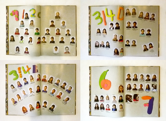
Kinderbeirat: Adem, Alma, Belma, Charlotte, Jana, Krasimira, Luan, Mannat, Mehmet, Peer, Sevim, Sophie, Teba
Bröhan-Museum: Nils Martin Müller / Curator of Outreach, Sylvia Hinz / wissenschaftliche Volontärin
Nehring-Grundschule: Sabine Brehm-Hamm / Pädagogin Unterricht, Verena Nietruch / Pädagogin Ganztag, Katharina Stahlhoven / Kulturagentin
Fotos: Kinderbeirat und Rose Epple
* Das Zitat stammt aus diesem TED Talk von Mara Mintzer: How kids can help design cities