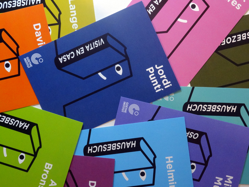
Hausbesuch – home visit – is the name of an European project initiated by the Goethe-Institut. Over a period of 7 months, 10 renowned authors from 10 European countries travelled to 17 European cities and visited 40 private homes. The writers came to eat, drink, read and enter into discussions with their hosts and subsequently reflect on their experiences. Their accounts have now been published by Berlin based e-book publishers Frohmann Verlag. Continue reading “Hausbesuch”
Tag: book design
We-Traders E-Book
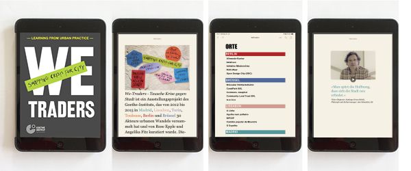
We-Traders – Swapping Crisis for City is an exhibition project of the Goethe-Institut that gathered 30 activists promoting urban change in Madrid, Lisbon, Turin, Toulouse, Berlin and Brussels from 2012 until 2015. You can read more about the We-Traders platform, that I co-curated with Angelika Fitz in this post.
To mark the end of the process, we teamed up with Vienna urban research publishers dérive and produced this e-book. It combines theory and practice of collaborative place-making and asks questions about this current urban culture’s potential for the future. You can download the free e-book We-Traders. Swapping Crisis for City from the website of the Goethe-Institut Brussels.
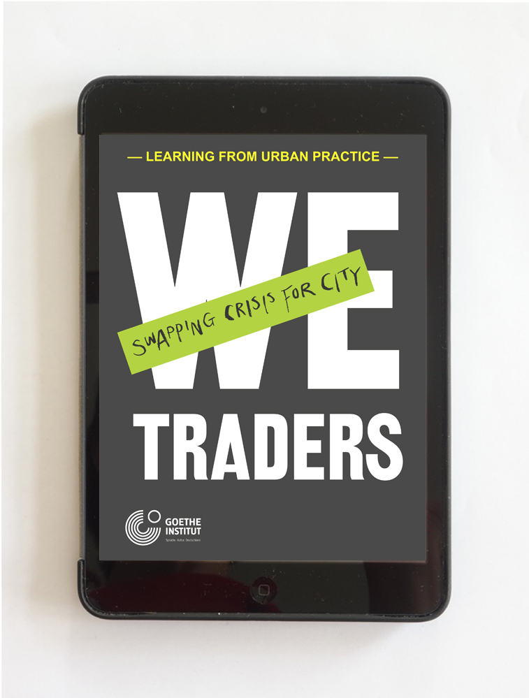
We-Traders. Swapping Crisis for City.
Learning from urban practice.
Publisher: Goethe-Institut e.V.
Co-publisher: Angelika Fitz and dérive – urban research
Concept, editing, production: Christoph Laimer, Elke Rauth / dérive
Design: Rose Apple
Programming: Scott Alexander, ringebooks.
With texts by: Julia Albani, Leonie Baumann, Sonja Beeck, Santiago Eraso Beloki, Charlotte Bonduel, Javier Duero, Rose Epple, Angelika Fitz, Julia Förster, Alain Gatti, Stéphane Gruet, Frauke Hehl, Susanne Höhn, Rolf Novy-Huy, Common Josaphat, Elke Krasny, Jessica Kratz Magri, Christoph Laimer, Andreas Novy, Lisa Parola, Luisa Perlo, Elke Rauth, Marco Revelli, Matteo Robiglio, Stavros Stavrides, Chloé Viénot
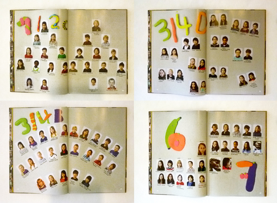
Co-Designing a Yearbook
The plan: to co-design a yearbook with a group of kids between 8 and 12 years old in a weekly workshop. Introduce them to basic principles of graphic design and give them the feeling of empowerment that comes with doing things yourself. Get the book to print.
Did it work? Yes it did! And we sure had great fun with it.
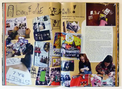
How we went about it: Over a period of four months I met up with a group of 6-12 kids in frantic 50 min workshop sessions every week. To make the layouting possible without having to teach kids a layout programm, I opted for an analogue approach: cutting and pasting with scissors and glue. We started by producing display type, backgrounds and clip-art in individual sessions and then the kids assembled the layouts on their own or in pairs. Once the layouts were finished (stuck together), they were photographed and imported as full page photos in a layout program. The kids left space for texts, working with dummy text which I took off before photographing and added in the final digital document.
Here are some impressions of our co-design process:
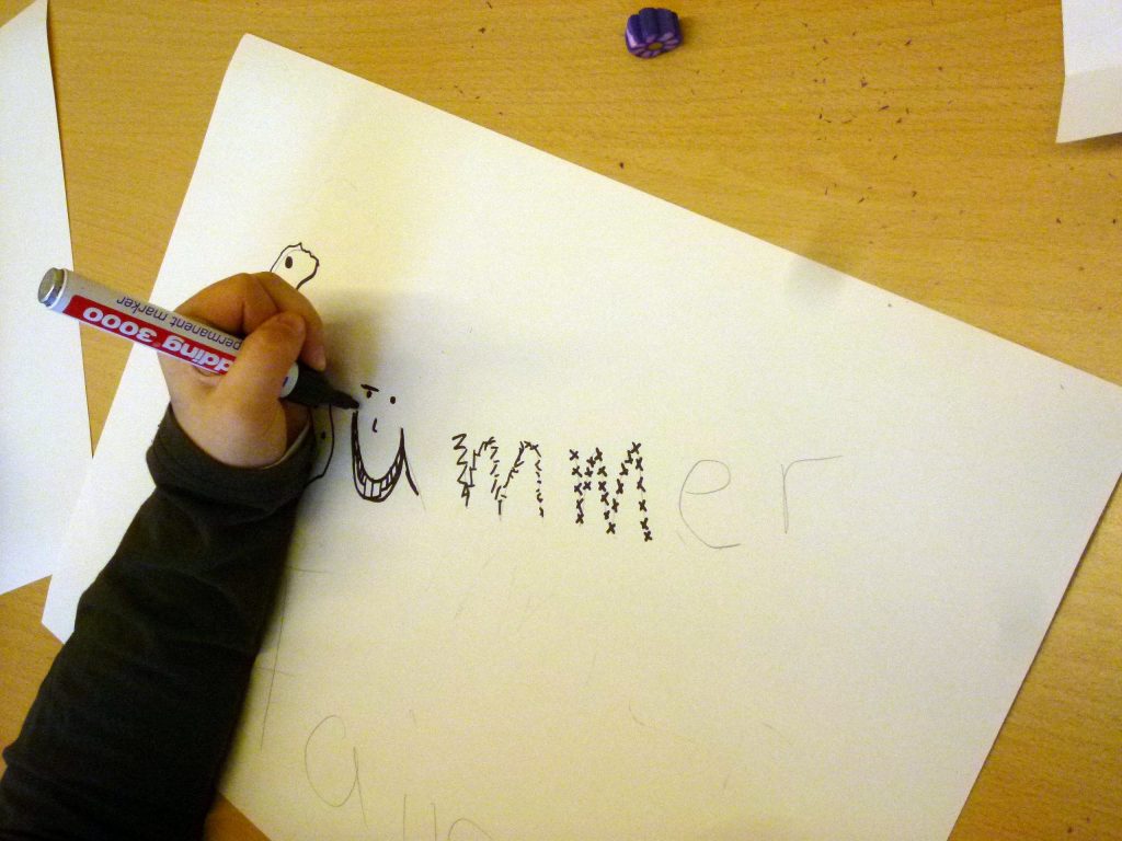
An easy way to create whacky letters: First, draw your letters simply in pencil as a guideline, then draw crazy lines in black marker around them.
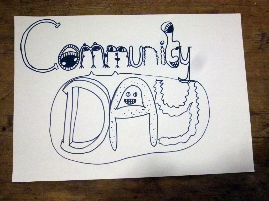
Let the marker ink dry and then erase the pencil marks.
Tadaah! Each topic gets their individual type treatment.
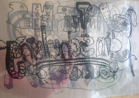
Finally we copy all display type unto see-through acetate sheets, so that we can later place them in our layouts.

We also need some background images to make the pages more lively. So we are off to a photographic pattern hunt around school.
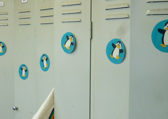
Once you start looking, there are patterns everywhere! Some seem to have come about by “accident”…
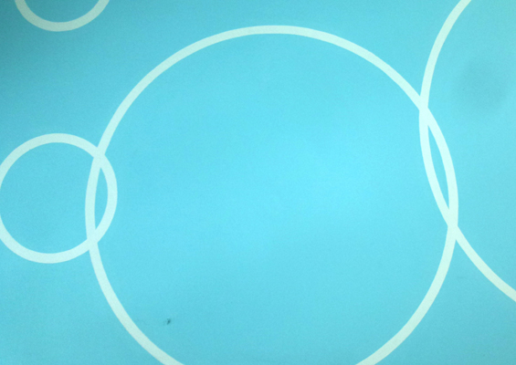
… others are found ready made!
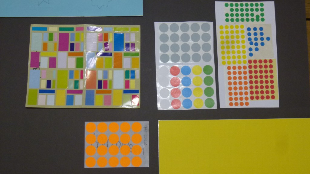
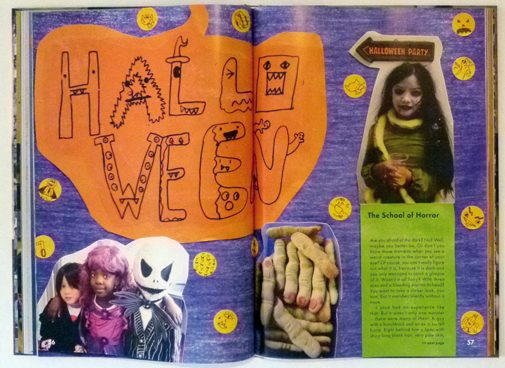
Now about some clip art to flourish our pages. Before we start, I ask the DESiGN KiDS to range their desks into one continuous line, because they will be churning out clip-art in an assembly line today. I have assembled seven sets of stickers in different sizes and colours, so that every event has a different type of sticker.
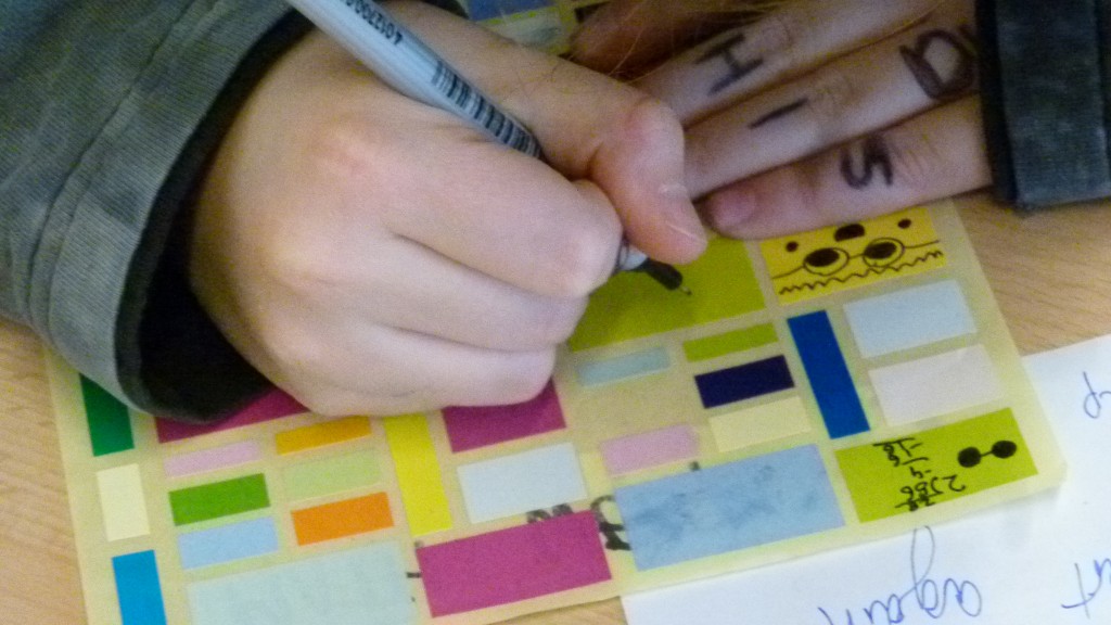
Each student gets one sheet with a different theme. I explain to them that they will have one minute for every drawing, then the timer will go off and they have to pass the sheet over to their neighbour and work on the next theme. So each group of clip-art will be assembled by the whole group. Ready? Steady? Go!
They are all clip-art professionals – of course – that is what kids are doing all day at school: doodling in their exercise books.
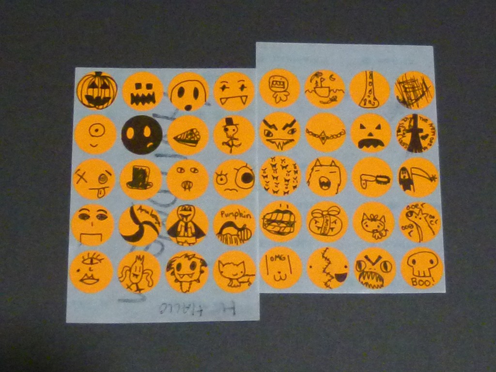
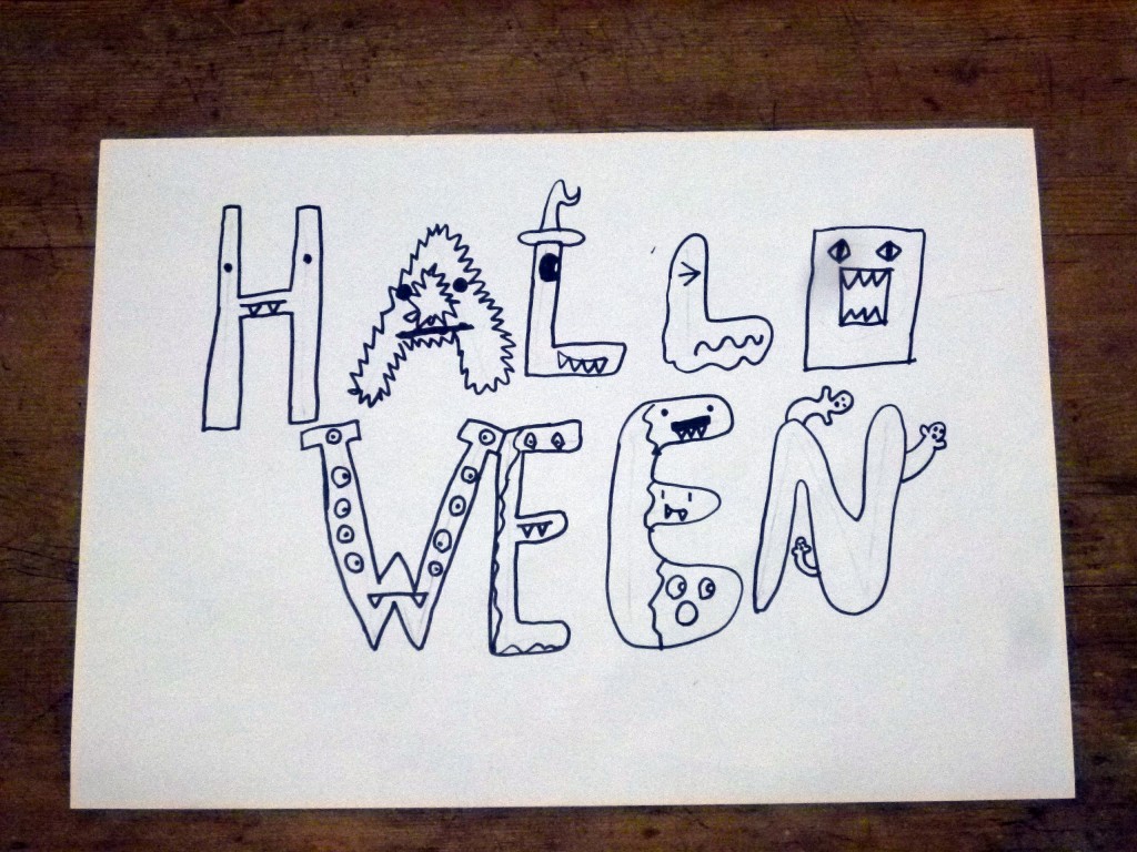
Look at these amazing Halloween clip art stickers!
Now at last, we are ready to start lay outing! All the ingredients are ready: The photos ( taken by parents and teachers) are printed out on photo paper, our backgrounds laserprinted out on A3 sheets, the clip art on stickers and our type designs on acetates. Let´s go!
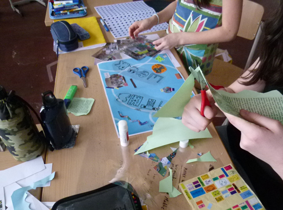
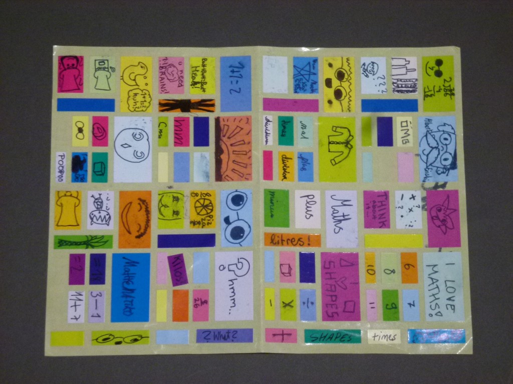
The DESiGN KiDS work in groups of two to threes on each topic. These two are busy at work on two spreads about Maths Week.
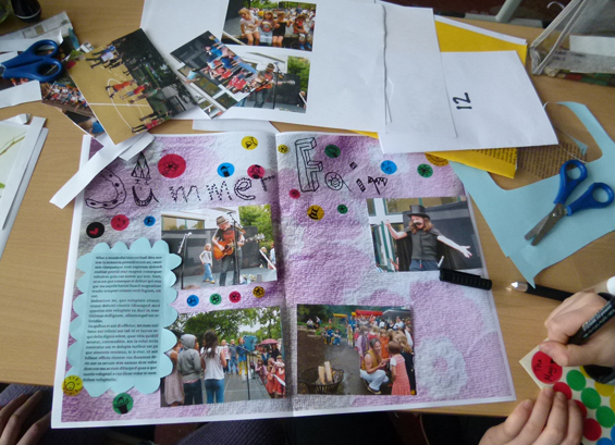
The DESiGN KiDS leave space for the final text by working with dummy text which I take off before photographing.
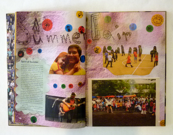
Once the layouts are finished, they are photographed and imported as full page photos in my layout program. The real text was then added by me in the final digital document.
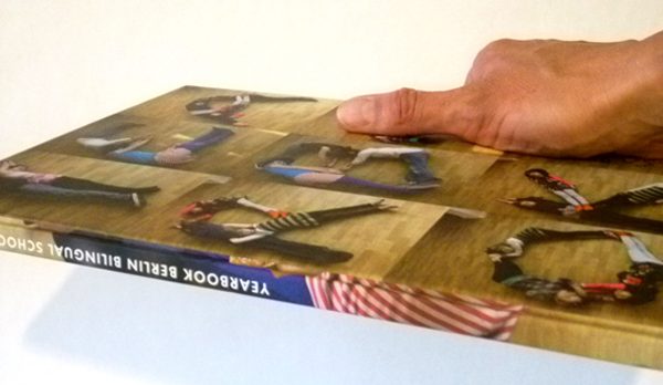
This technique works really well, the printed book has retained a three-dimensional feeling to it.
The co-designing experiment was a success: the Berlin Bilingual School Yearbook 2012 / 2013 got printed in time and quickly sold out. Apart from it being a very authentic document of a busy school year in this extraordinary school, it looks just fabulous. Thank you everybody!
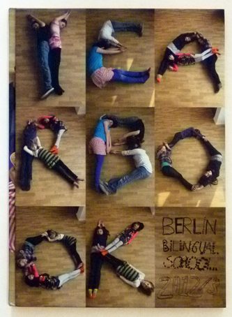
Editor: Berlin Bilingual School · Yearbook workshops, art direction and art working: Rose Epple · Design: Katy Parker, Ava Eusepi-Harris, Alice Lyall, Khela Brophy, Ruby Good, Anne Mooshammer, Kaya Weissert, Trinity Ernst, Alexander Stump, Maytagorry Linshöft, Clara Koebberling, Leonie Gagel, Zoë Kreissl, Dana Mae Westerhoff, Paula Seemann, Jody Lee Albert Arison, Clay Kryst and Griet Verweij · Photos: Nora Kryst, John MacDougall, Anne Meurer, Pictura Foto GmbH · Picture editors: Stefanie Albert, Nora Kryst · Production: Stefanie Albert, Nora Kryst, Lars Borchert · Text and editing: Lars Borchert, Cornelia Donner · Printing: Brandenburgische Universitätdruckerei und Verlagsgesellschaft Potsdam mbH
Working Places
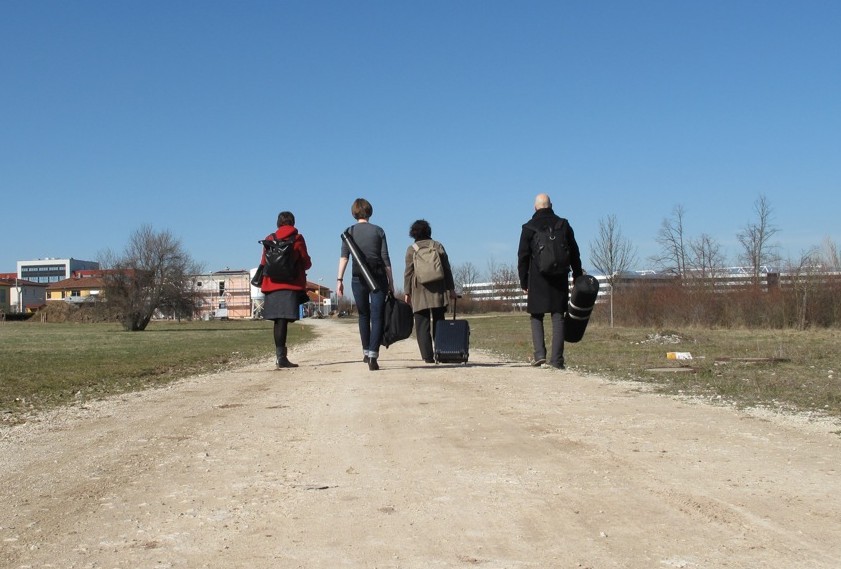
Four people on their way to work. They come from different places and they perform different functions in the editorial team of the book: the editor from Vienna, the project manager from Aachen, the designer and the photographer from Berlin. Their mission: to portray three new office buildings in book form.
All three of these buildings are by award-winning architects kadawittfeldarchitektur, who have consequently thought long and hard about what a modern office could be. Technology has changed the places where people work. Or rather, technology has enabled people to work in other places than at a desk in an office. Nowadays you can work in your bed, on the street, in your car, in the air port lounge. Given that, do people still need office buildings? The architects asked Vienna-based curator and author Angelika Fitz to join them in their discussions. She suggested that instead of “Arbeitsorte”, (places where people work), people need “arbeitende Orte” (places that work themselves), which became the title of the jointly edited book.
In her introduction editor Angelika Fitz comes to the conclusion that people still need places to come together to work. That also applied to the temporary project team, of which I was the designer. We needed a docking station for the project, and that was what we called the „Arbeitendes Buch“ (working book). You can´t see the working book in the photo, as it was still only a mental space at the time the photo was taken. It only acquired its current form in the process of bookmaking. While working on it, it served as a virtual meeting place for the architects and the editorial team. What made the working book so exciting to work in, was the fact that we also invited the users of the office buildings to share the space.
How does an invitation to participate in a process become more than mere lip serivce? To get closer to the experts of the everday working life in the buildings, the users, the working book temporarily put up tent in the actual office buildings. Under the motto: “Outsiders are looking for insiders“ we held workshops with members of staff on all levels, ranging from the faciltity manager to the CEO of the companies.

The insiders were asked to document their daily routine photographically and to come to a joint decision on where in the building the approriate place for the group photo would be. We also asked them to describe their way through the building to their individual desks. Following these verbal trails, „When you see the parrot, turn right“, we, as the outsiders, visited the Insiders to interview them about their daily experience of the space.

In addition to these individual interviews, we handed out postcards with questions about the favourite place in the buildings, likes and dislikes at the most strategical and the most popular point in every office building we visited: the cafeteria.


The results of these polls and the material collected in the workshops, the many detailed observations and comments of the users form the main part of the building portraits in the middle oft he book. In the co-working space of the book, the outsiders became moderators and editors, the insiders turned into co-authors and image makers. The portraits of the three buildings are flanked by two longer illustrated and essayistic panoramas on the development of office architecture, viewed from the angle of identity and flexibility.


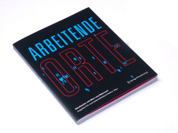
The book concludes, that office architecture is still needed, when it allows for experiences, enables appropriation and leaves a lasting impression. Three criteria that our space of the working book definitely has lived up to. Like the buildings of kadawittfeldarchitektur, the working book has generated an added value: Itself. The book Arbeitende Orte, has just been published in the Springer Verlag Wien New York. Please come inside.

Arbeitende Orte. Bürobauten mit Wert und Mehrwert
(Working places. Office buildings with added value)
Springer Verlag, Vienna, 2012, 192 pages, 293 illustrations,
editors: Angelika Fitz und kadawittfeldarchitektur
concept: Angelika Fitz, Rose Epple,
project management: Anne-Kathrin Hoehler / kadawittfeldarchitektur
graphic design: Rose Epple with Lena Panzlau / chezweitz & roseapple
editorial team: Angelika Fitz, Anne-Kathrin Hoehler, Evi Scheller, Dirk Zweering
research: Evi Scheller
authors: Rose Epple, Angelika Fitz, Stefan Haass, Kilian Kada, Klaus Kada, Dirk Lange, Jasna Moritz, Gerhard Wittfeld, Dirk Zweering
photos: Gianni Plescia
Showing Wilhelm Meister
How to exhibit literature or more specifically Goethe’s famous coming-of-age novel ‘Wilhelm Meister’ ? That was the question put to seven renowned exhibition makers at a conference in Frankfurt in 2009. Being one of the few designers in an illustrous group of mainly literature experts, I suggested to show the book as an object. The form of the text obviously being something different than the text itself, I was curious what a comparable study of different editions of the books would reveal not only in terms of design and cultural history, but possibly also about the interpretation and literary status of the novel at different times. Feeling slightly guilty for still not having read the book, I was nonetheless delighted to be invited to test and present this approach in the ensuing group exhibiton at the Frankfurt Goethe-House.
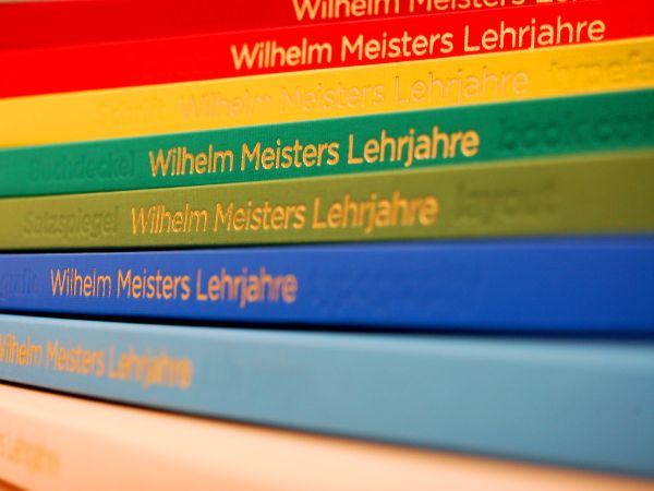
The Anna Amalia library in Weimar collects every new edition of Goethe’s works and posesses some of the original and very early editions and so was the ideal starting point for my research. I spent three delightful days in the very fine and welcoming library and examined 50 different editions of the novel, starting with the first edition from 1795 right up to a contemporary one of 2007. I weighed and measured, analyzed page layouts, identified lettertypes, compared title pages and endpapers. The findings were then organized in chronological order in nine exhibition books: The book of book covers, the book of typography, the book of layouts e.t.c..
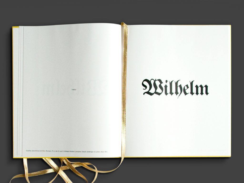


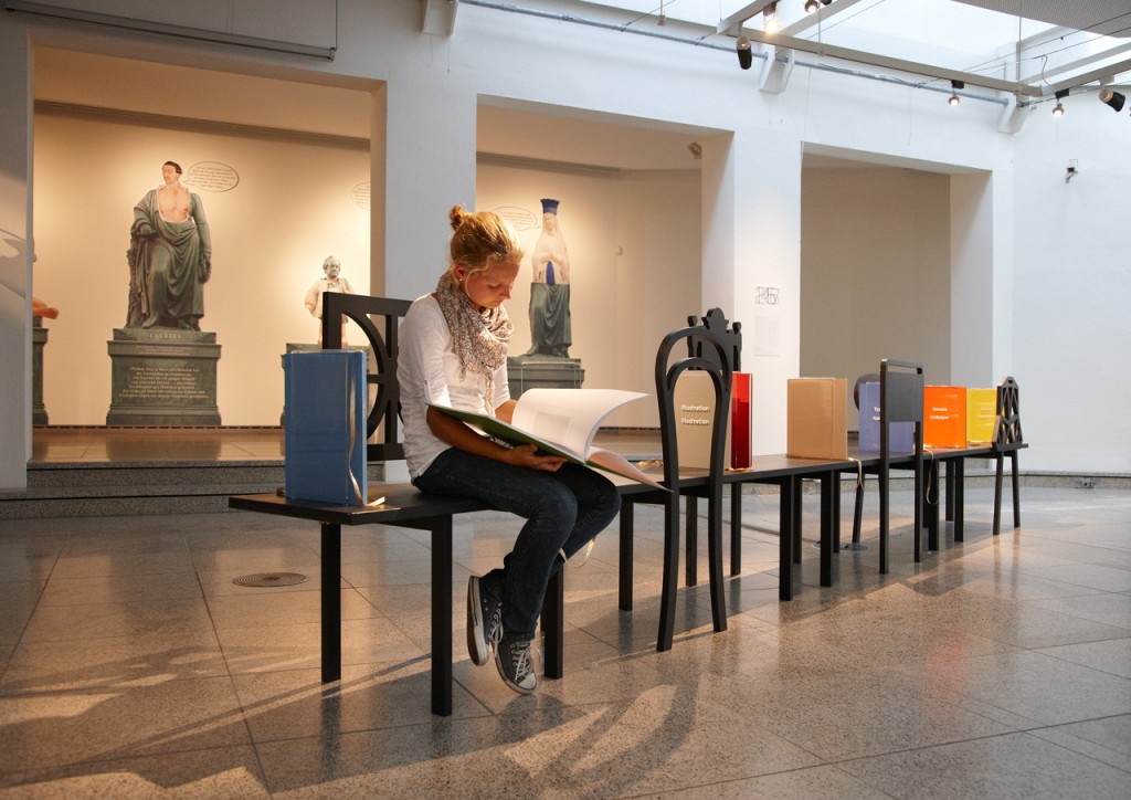
Photo: Wolfgang Günzel