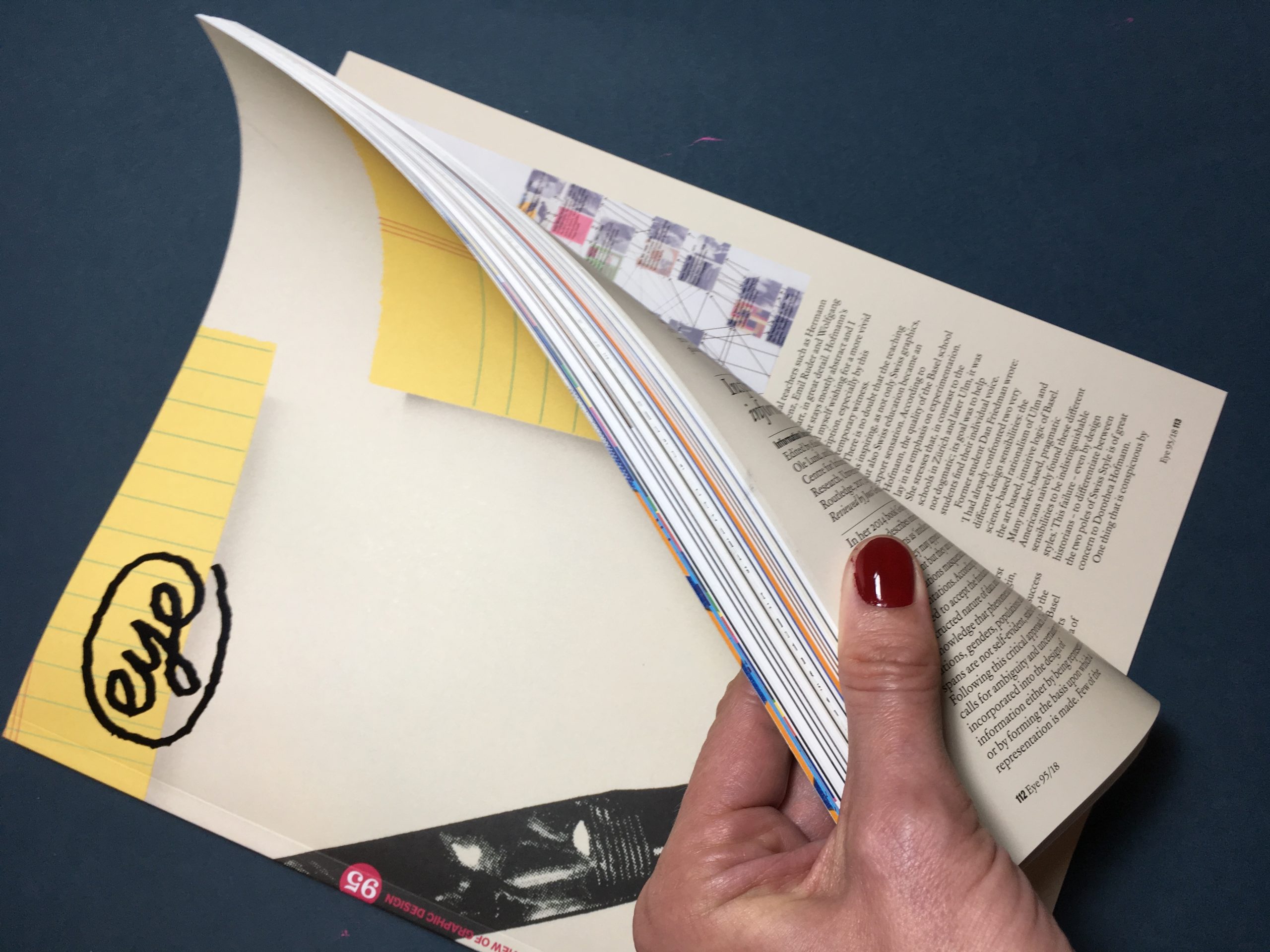
At last – Eye Magazine #95 has arrived on my Berlin doorstep. Always a pleasure to look at and read, I feel honoured to have contributed a book review to this issue. Dorothea Hofmann’s “Die Geburt eines Stils” (The Birth of a Style) examines the influence of the Basel education model on Swiss Graphic Design. Find out more at eye magazine and Triest Verlag.
Tag: design writing
Easy Language
As many Berlin expats can confirm, German is not an easy language to learn, due to its complicated grammar. What if you simplified the language in order for it to be understood by more people? This is a personal essay about my experiences with the concept of `easy language´ and the controversy it is causing in Germany. Continue reading “Easy Language”
Graphic Design in the GDR
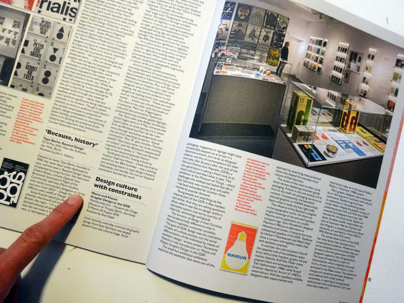
Back from holiday, I was excited to find the new Eye Magazine in my post box – with my review of the exhibition “Masse und Klasse: Graphic Design in the GDR” on page 86. If you are in Berlin and have not seen the exhibition, you still have until August 29, 2016 to visit the Werkbundarchiv – Museum of Things and catch a glimpse of the everyday visual culture of East Germany. The finissage will take place on Saturday 27 with an expert talk about GDR records. See you there?
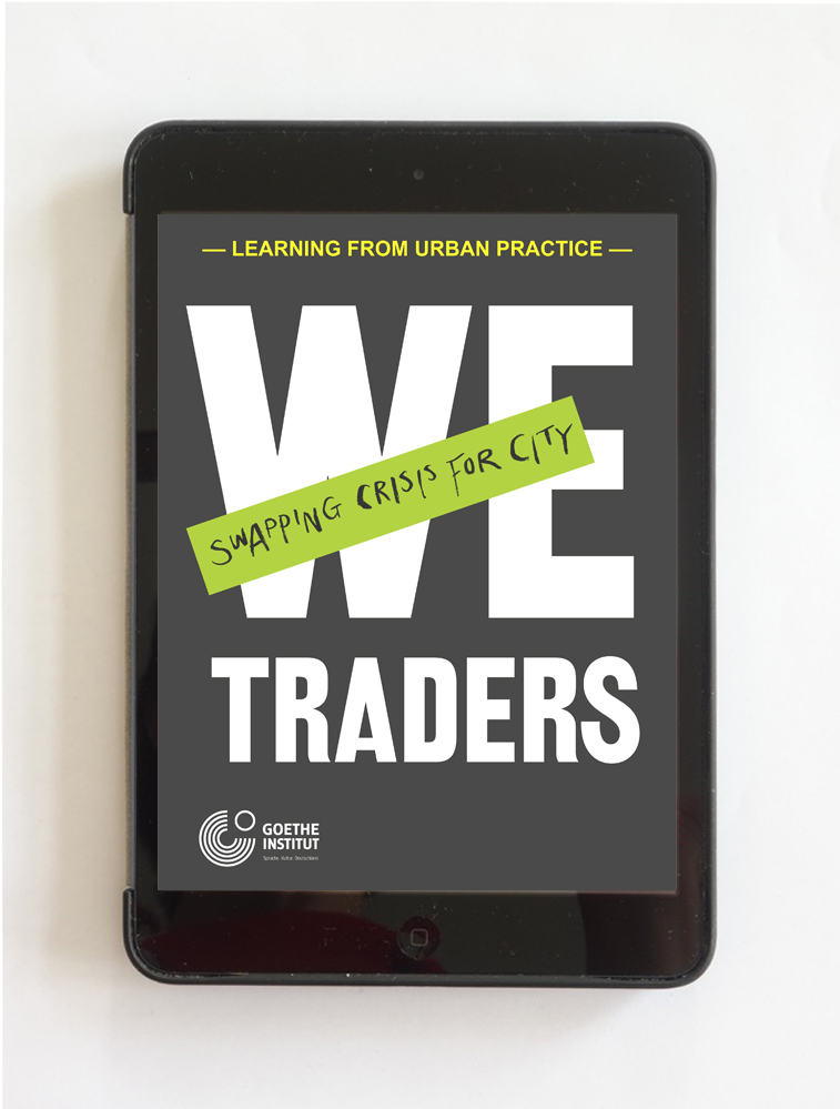
We-Traders E-Book
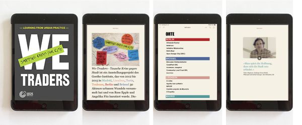
We-Traders – Swapping Crisis for City is an exhibition project of the Goethe-Institut that gathered 30 activists promoting urban change in Madrid, Lisbon, Turin, Toulouse, Berlin and Brussels from 2012 until 2015. You can read more about the We-Traders platform, that I co-curated with Angelika Fitz in this post.
To mark the end of the process, we teamed up with Vienna urban research publishers dérive and produced this e-book. It combines theory and practice of collaborative place-making and asks questions about this current urban culture’s potential for the future. You can download the free e-book We-Traders. Swapping Crisis for City from the website of the Goethe-Institut Brussels.
We-Traders. Swapping Crisis for City.
Learning from urban practice.
Publisher: Goethe-Institut e.V.
Co-publisher: Angelika Fitz and dérive – urban research
Concept, editing, production: Christoph Laimer, Elke Rauth / dérive
Design: Rose Apple
Programming: Scott Alexander, ringebooks.
With texts by: Julia Albani, Leonie Baumann, Sonja Beeck, Santiago Eraso Beloki, Charlotte Bonduel, Javier Duero, Rose Epple, Angelika Fitz, Julia Förster, Alain Gatti, Stéphane Gruet, Frauke Hehl, Susanne Höhn, Rolf Novy-Huy, Common Josaphat, Elke Krasny, Jessica Kratz Magri, Christoph Laimer, Andreas Novy, Lisa Parola, Luisa Perlo, Elke Rauth, Marco Revelli, Matteo Robiglio, Stavros Stavrides, Chloé Viénot
Mirror on the Wall
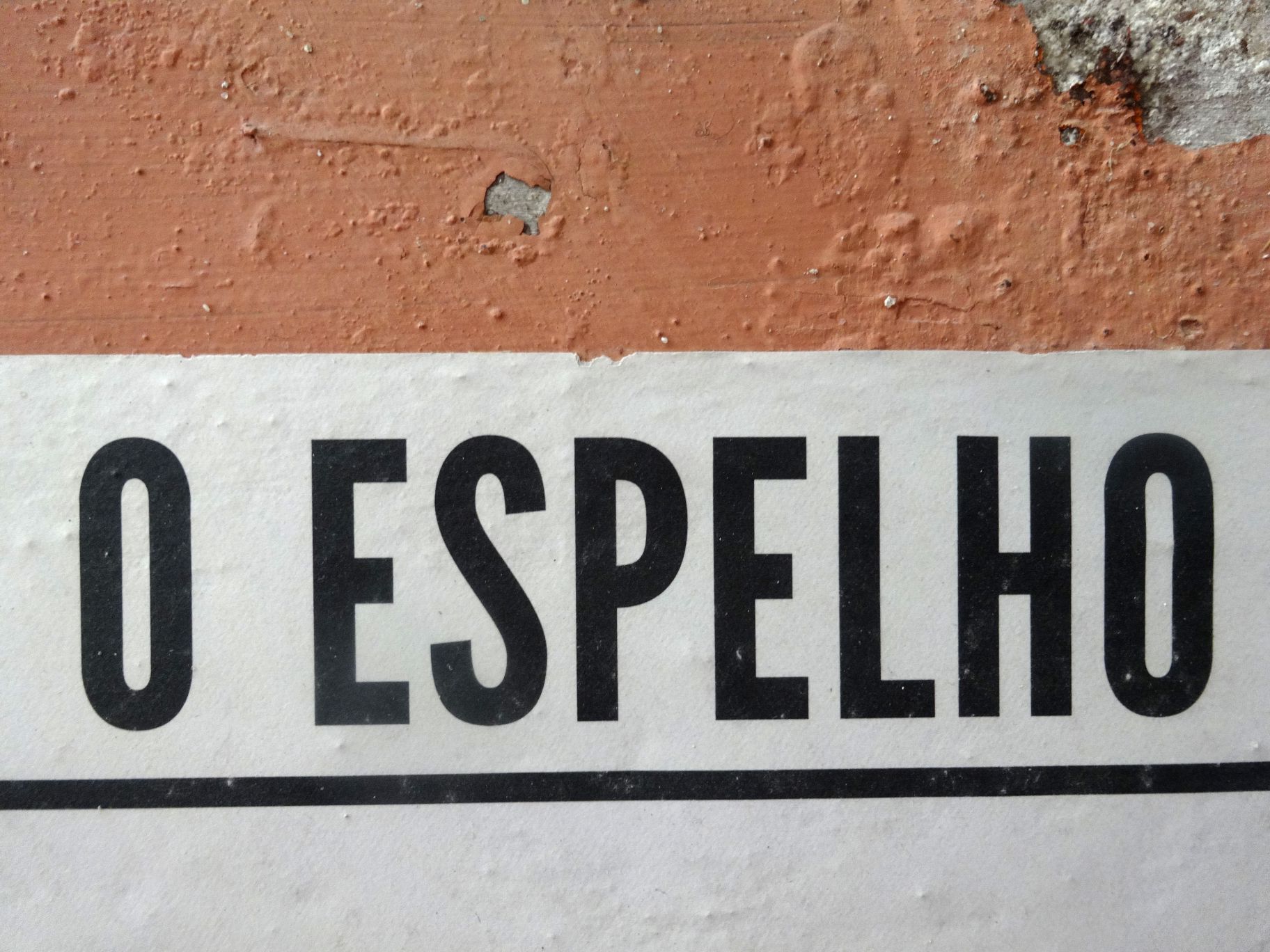
While in Lisbon for the We-Traders opening, I had the chance of interviewing Diogo Lopes, renowned Portuguese architect and one of the founders of O Espelho (The Mirror), a wall newspaper in Lisbon. The article I wrote subsequently about this exciting publishing experiment has just been published on Eye Magazine Blog.
Writing About Exhibitions
From years of trying to find the right person to write adequately about our exhibition designs, I know how difficult it is to describe the design of a room with words. In my opinion, the writer needs to accomplish three things:
- clearly state what is there to be seen
- explain in easy words how it is done
- and then you might suggest the overall impression or athmosphere it creates – but be careful with! I personally hate to be told what I am supposed to experience
I drove a bunch of clearly talented writers nuts, because I felt they were always starting with point number three, didn´t understand what the clearly brilliant strokes were in number two and as for number one, that seemed to be the most difficult task of all. I hate to upset people, so I started writing them myself. Not because I was a better writer, but, at least, I knew what I wanted to be told.
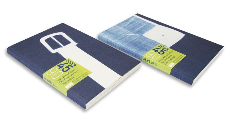
While writing a lenghty text about two Pasolini exhibitions of ours, I realized that indeed, words were quite a difficult and awkward tool compared to images to accomplish point one. This is why, when the next occasion arose and we were asked to contribute a text about the scenography of Jews 45/90, an exhibition in the Jewish Museum Munich for the catalogue, I set out to find a new form to “write” about our rooms.
And now I won´t attempt in words to describe this new form, but show you, simple as that:
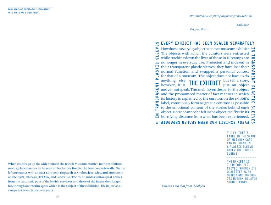
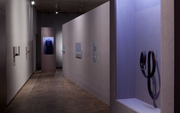
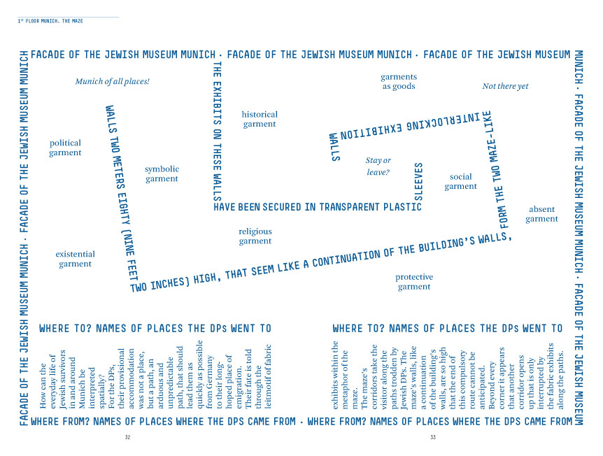
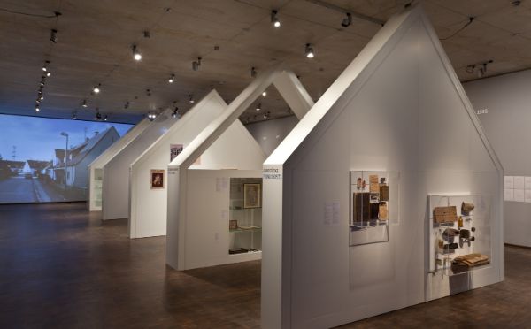
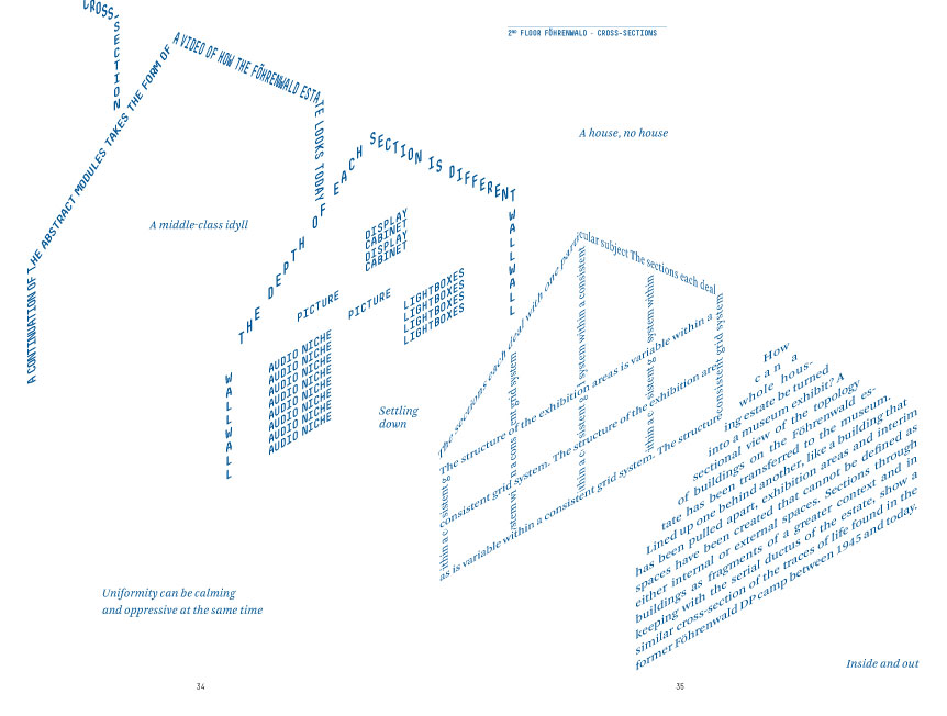
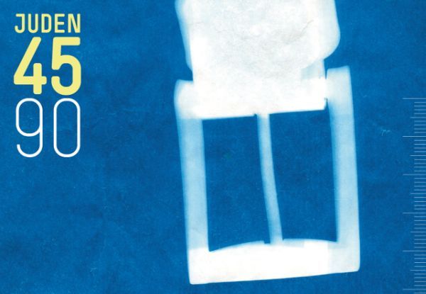
The visual essay was first published in the catalogue accompanying an exhibition in the Jewish Museum Munich.