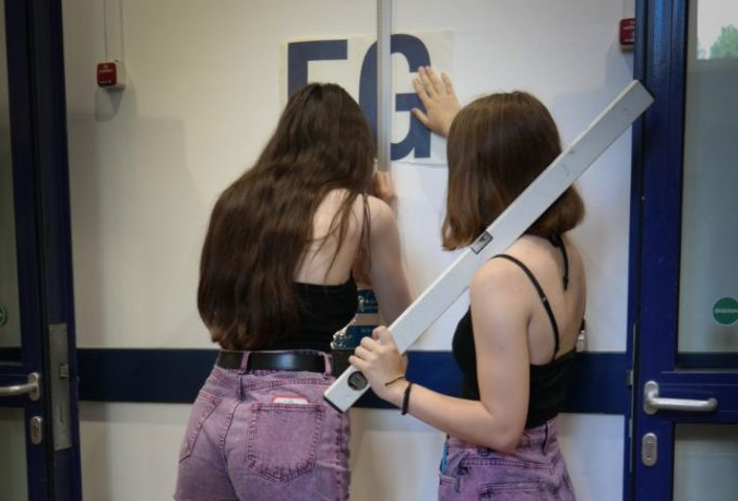
Design skills for all! Learning to take things into your own hands is useful – especially so in Berlin, where the Bauhaus Agents asked me to help a class of 10th grade students facilitate wayfinding in their school. Continue reading “Design Skills for All!”
Tag: education
Join the DESiGN KiDS!
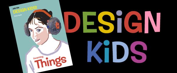
Do you want to invent things yourself? In my new activity booklet DESiGN KiDS show you how to collect, examine, transform, build and exhibit them. Continue reading “Join the DESiGN KiDS!”
Swiss Style: The Prequel
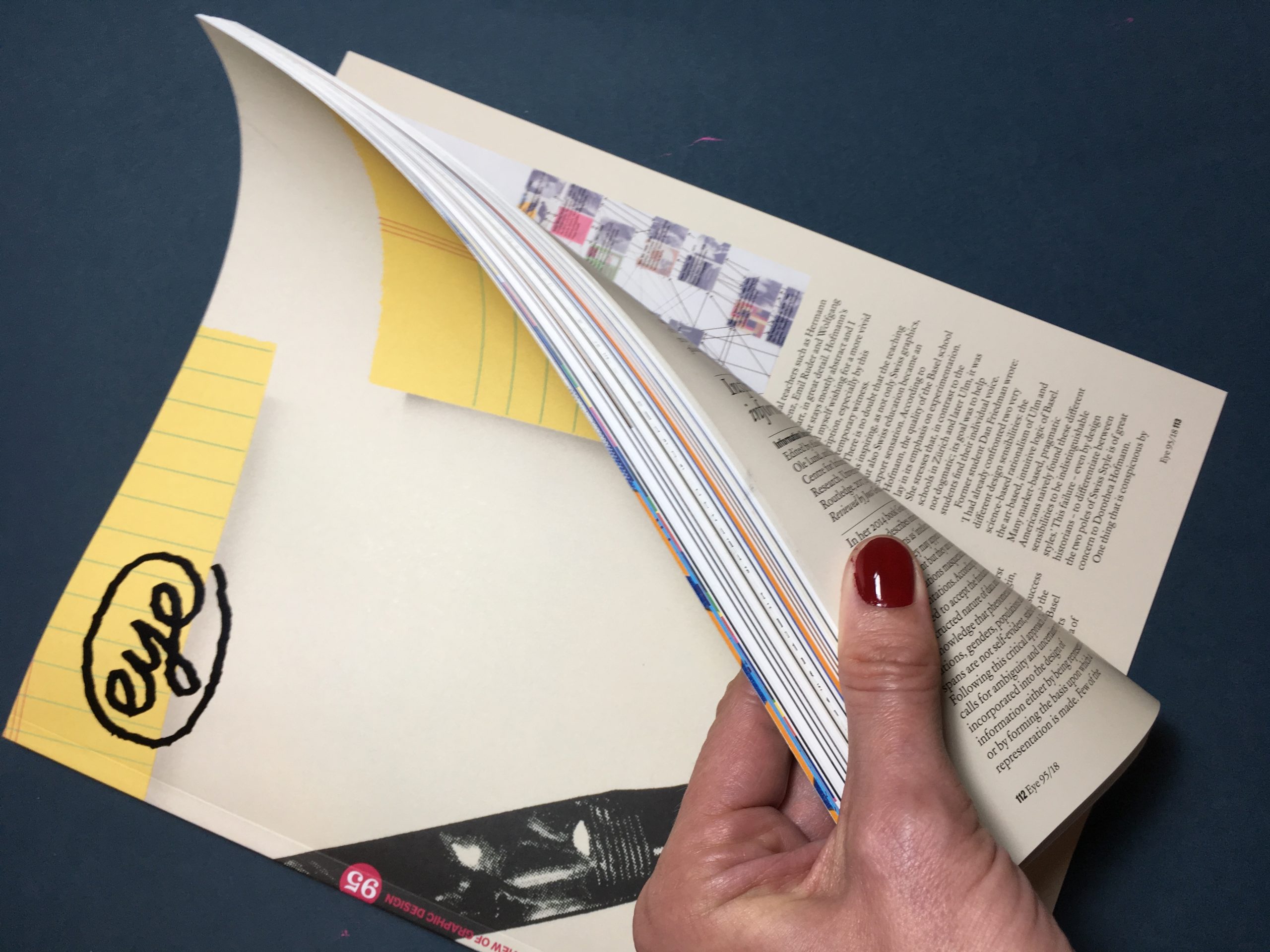
At last – Eye Magazine #95 has arrived on my Berlin doorstep. Always a pleasure to look at and read, I feel honoured to have contributed a book review to this issue. Dorothea Hofmann’s “Die Geburt eines Stils” (The Birth of a Style) examines the influence of the Basel education model on Swiss Graphic Design. Find out more at eye magazine and Triest Verlag.
How Do You Live?
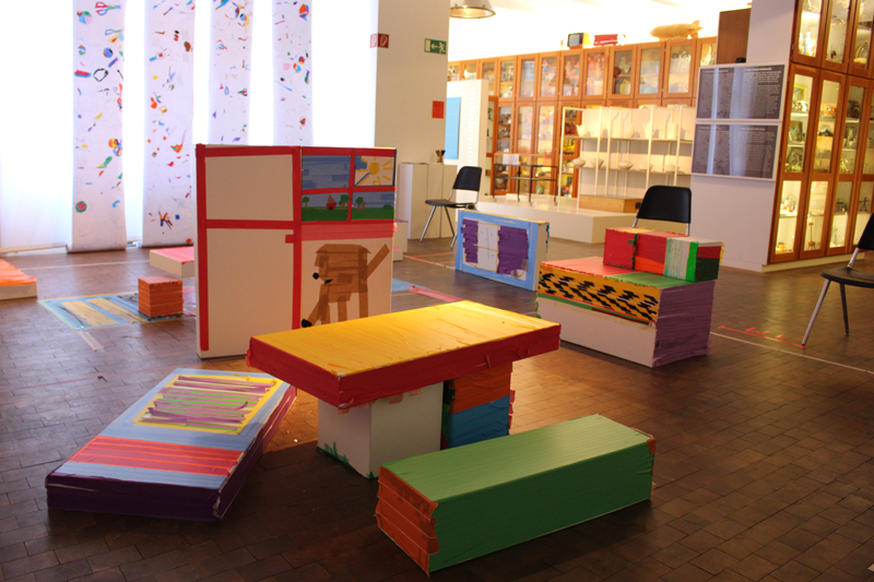
At the Museum of Things, we hosted students of Jens-Nydahl Primary School in Berlin Kreuzberg for a jolly project week. Twenty-one kids from age six to eleven drew floor plans, furnished apartments, designed wallpaper and built dream homes. Best of all – they turned our white cubes into very colourful ones! Here are some impressions of a busy week in the D.I.Y. Home Advice Centre: Continue reading “How Do You Live?”
Where to Study?
During my recent talk at Central Saint Martins College of Art & Design in London, I mentioned my sense of wonder and liberation when I came to study there. “I am feeling the same”, a young German student told me after the lecture. Like me, she had come on a scholarship and had already experienced a few years of German design education. Like me, she was dreading to go back. So what is it that makes British design education for people like me so different, so appealing?
With SINT LUKAS at Fotomuseum Antwerp
The Fotomuseum Antwerp is always aiming to further improve their visitors experience. For fresh input, they invited students from the Media and Information Design MA of Sint Lukas Brussels to explore new ways of engaging people with their collection. I had the pleasure of leading the two-day workshop on-site.
Go East: HTW Design Show
How can we make Berliners head out to the far east of their city to visit the annual design show of the University of Applied Science, better known as the HTW?
Co-Designing a Yearbook
The plan: to co-design a yearbook with a group of kids between 8 and 12 years old in a weekly workshop. Introduce them to basic principles of graphic design and give them the feeling of empowerment that comes with doing things yourself. Get the book to print.
Did it work? Yes it did! And we sure had great fun with it.
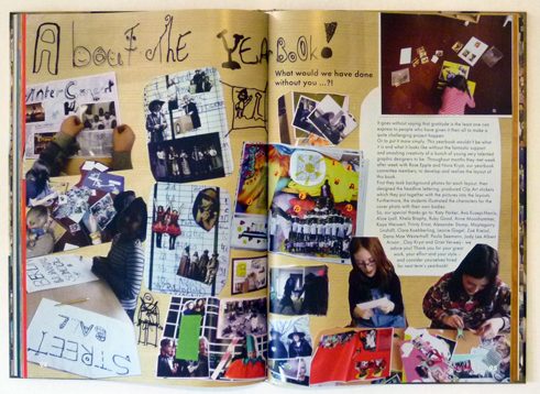
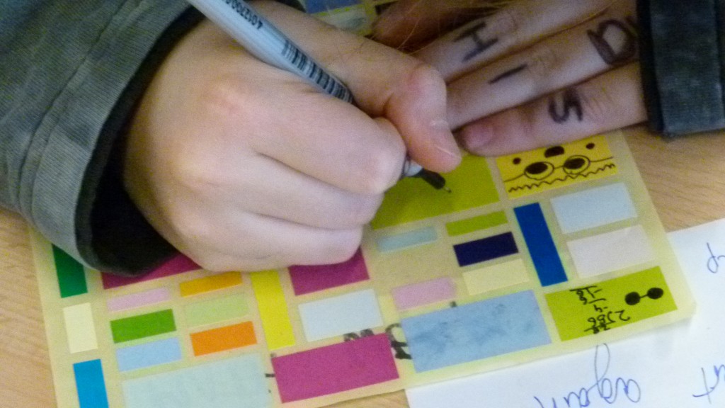
How we went about it: Over a period of four months I met up with a group of 6-12 kids in frantic 50 min workshop sessions every week. To make the layouting possible without having to teach kids a layout programm, I opted for an analogue approach: cutting and pasting with scissors and glue. We started by producing display type, backgrounds and clip-art in individual sessions and then the kids assembled the layouts on their own or in pairs. Once the layouts were finished (stuck together), they were photographed and imported as full page photos in a layout program. The kids left space for texts, working with dummy text which I took off before photographing and added in the final digital document.
Here are some impressions of our co-design process:
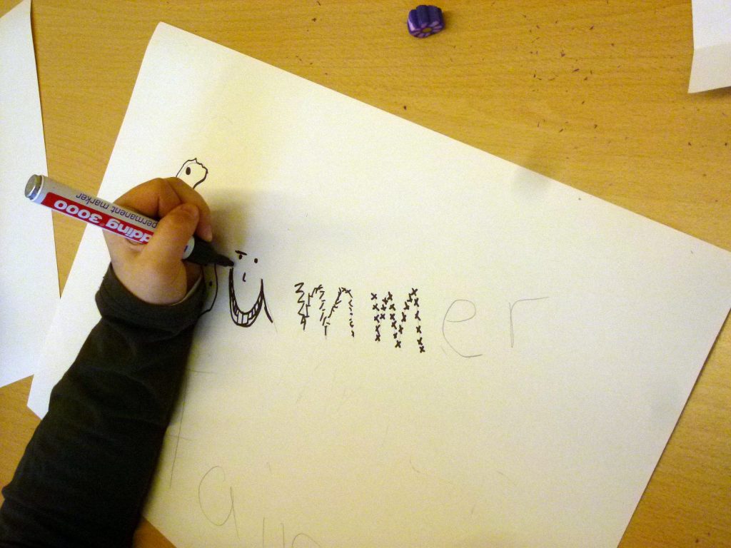
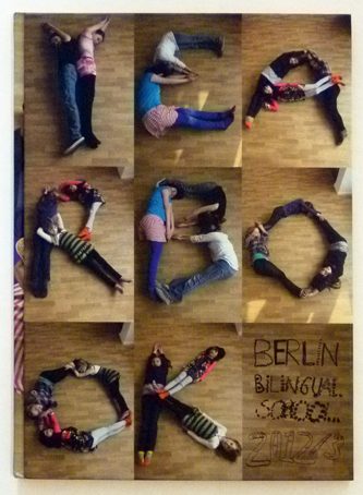
An easy way to create whacky letters: First, draw your letters simply in pencil as a guideline, then draw crazy lines in black marker around them.
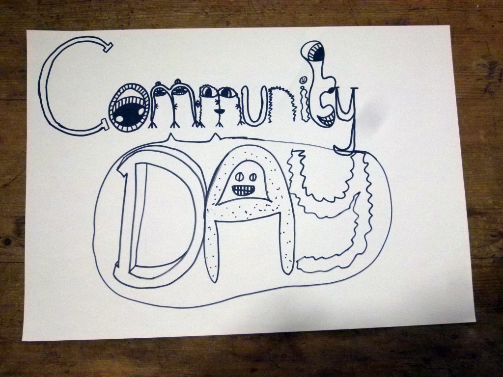
Let the marker ink dry and then erase the pencil marks.
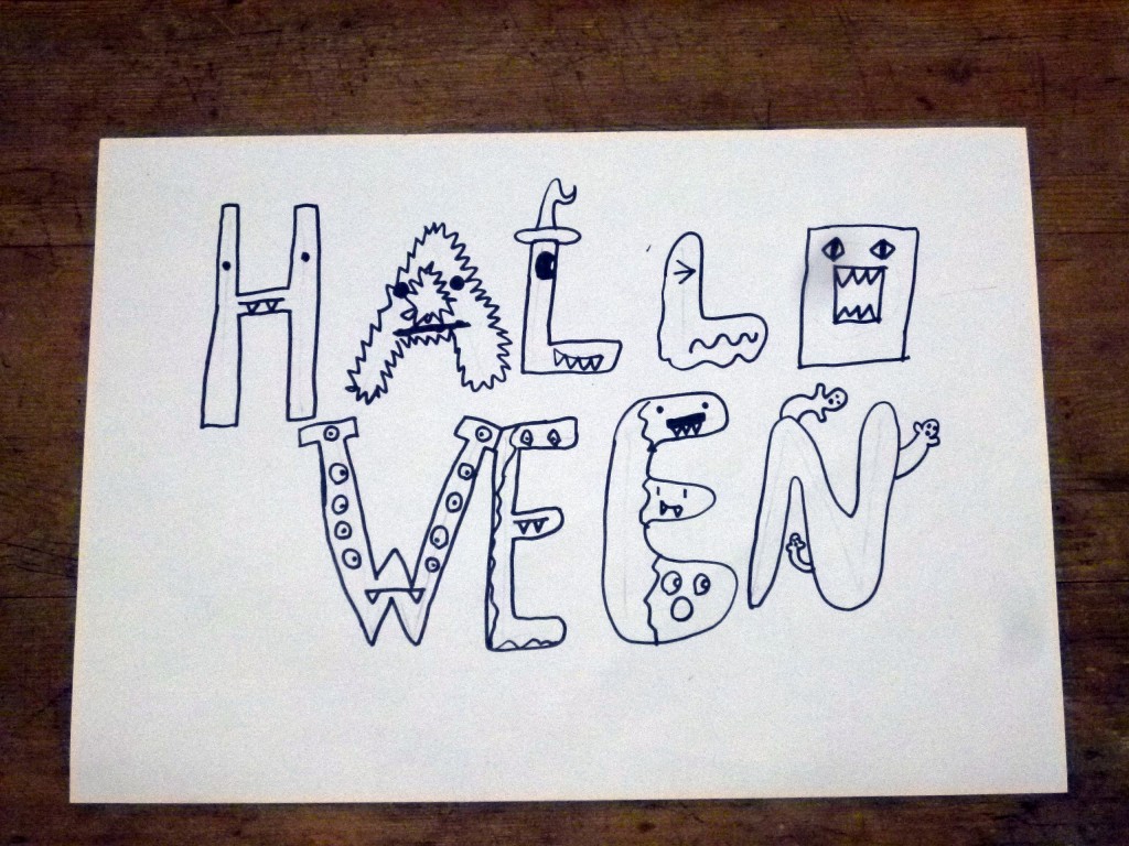
Tadaah! Each topic gets their individual type treatment.
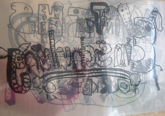
Finally we copy all display type unto see-through acetate sheets, so that we can later place them in our layouts.

We also need some background images to make the pages more lively. So we are off to a photographic pattern hunt around school.
Once you start looking, there are patterns everywhere! Some seem to have come about by “accident”…
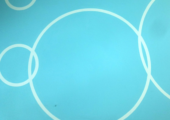
… others are found ready made!
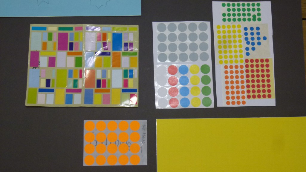
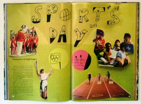
Now about some clip art to flourish our pages. Before we start, I ask the DESiGN KiDS to range their desks into one continuous line, because they will be churning out clip-art in an assembly line today. I have assembled seven sets of stickers in different sizes and colours, so that every event has a different type of sticker.
Each student gets one sheet with a different theme. I explain to them that they will have one minute for every drawing, then the timer will go off and they have to pass the sheet over to their neighbour and work on the next theme. So each group of clip-art will be assembled by the whole group. Ready? Steady? Go!
They are all clip-art professionals – of course – that is what kids are doing all day at school: doodling in their exercise books.
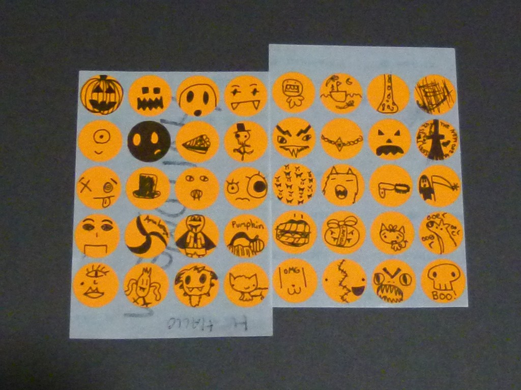
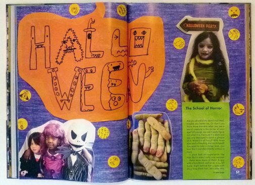
Look at these amazing Halloween clip art stickers!
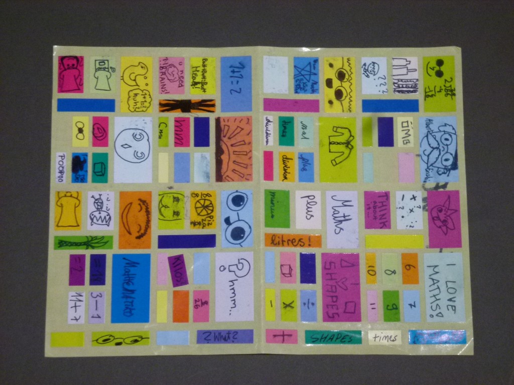
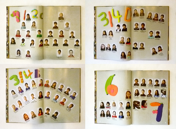
Now at last, we are ready to start lay outing! All the ingredients are ready: The photos ( taken by parents and teachers) are printed out on photo paper, our backgrounds laserprinted out on A3 sheets, the clip art on stickers and our type designs on acetates. Let´s go!
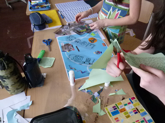
The DESiGN KiDS work in groups of two to threes on each topic. These two are busy at work on two spreads about Maths Week.
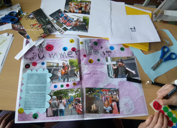
The DESiGN KiDS leave space for the final text by working with dummy text which I take off before photographing.
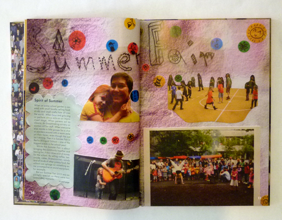
Once the layouts are finished, they are photographed and imported as full page photos in my layout program. The real text was then added by me in the final digital document.
This technique works really well, the printed book has retained a three-dimensional feeling to it.
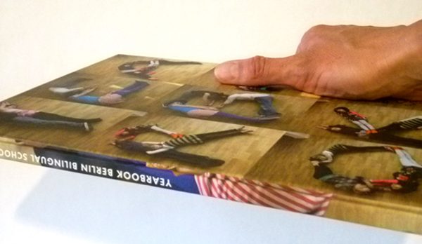
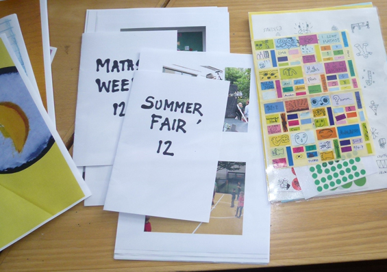
The co-designing experiment was a success: the Berlin Bilingual School Yearbook 2012 / 2013 got printed in time and quickly sold out. Apart from it being a very authentic document of a busy school year in this extraordinary school, it looks just fabulous. Thank you everybody!
Editor: Berlin Bilingual School · Yearbook workshops, art direction and art working: Rose Epple · Design: Katy Parker, Ava Eusepi-Harris, Alice Lyall, Khela Brophy, Ruby Good, Anne Mooshammer, Kaya Weissert, Trinity Ernst, Alexander Stump, Maytagorry Linshöft, Clara Koebberling, Leonie Gagel, Zoë Kreissl, Dana Mae Westerhoff, Paula Seemann, Jody Lee Albert Arison, Clay Kryst and Griet Verweij · Photos: Nora Kryst, John MacDougall, Anne Meurer, Pictura Foto GmbH · Picture editors: Stefanie Albert, Nora Kryst · Production: Stefanie Albert, Nora Kryst, Lars Borchert · Text and editing: Lars Borchert, Cornelia Donner · Printing: Brandenburgische Universitätdruckerei und Verlagsgesellschaft Potsdam mbH
Scenographic Field Studies
Brief: Find the most auratic object in the museum and make a sketch of the way it is presented.


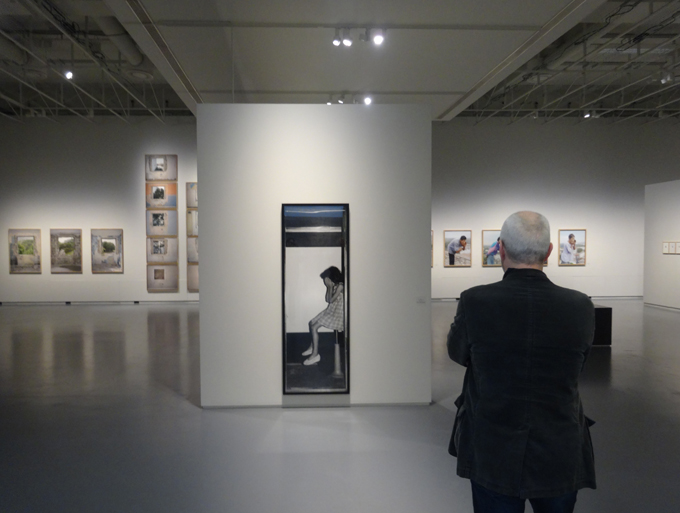
Indeed – there seems to be a consensus among students in choosing the Nofretete as the most auratic object in the New Museum Berlin, which I count as proof that something of that kind of phenomena exists. Although I personally still have my doubts…maybe the testgroup was still too small?
The seventeen students of the Technical University’s Master in Stage design and spatial composition produced these drawings as part of the data collected in three scenographic excursions. Franziska Ritter, the course coordinator, and myself devised these field trips in order to raise awareness for the different levels scenography is acting on and also because we were curious if this combination of research and education would work.
For the first trip we set out to compare two very different exhibitons about the Berlin Wall. One being the newly opened Berlin Wall Memorial along Bernauer Straße and the other the Mauermuseum Checkpoint Charlie. Each researcher had a different task on hand: counting and categorizing exhibits, following people and timing them looking at exhibits, measuring text lengths, testing orientation and navigation, listening with their eyes closed, collecting soundbites, smelling and touching the exhibition, observing their emotional reactions to the exhibits, sketching floorplans and mapping the curatorial structure. In the following round up these findings were presented and combined to a comparative study, obviously with no real scientific credibility, but packed with surprising observations that made the ensuing discussion very lively.
Would you have guessed that people spend less than one minute in front of an exhibit and maximum three minutes in a whole section? That original audio recordings score very high on the emotional scale? That a hard floor covering creates an aggressive noise and that small stuffy rooms produce smelly people? Another astonishing miscellany being that the Mauermuseum has the highest number of visitors in Berlin, although it scored very badly in the study. One student called it “a giant newspaper”, a tabloid rather, and everybody was very confused about the curatorial structure. Still, if you´ve never been there I can highly recommend it as a memorable experience – it has an endearing naiveté about it, you could say a museum brut.
On the second trip we focused on the object, comparing the display of and the attitude towards the objects displayed in the New Museum Berlin and the Museum of Things respectively. The former houses the Nofrete and yes, there is an auratic object in the latter as well. Go and visit or buy the new Lou Reed CD and you‘ll see. Again, it was so productive to work with a whole research team. Fourteens brains observing simultaenously produce indeed more data, more complexity, more controversy and more insights for everybody.
All drawings by MA students of the TU Stage Design and Spatial Composition course