Category: Author
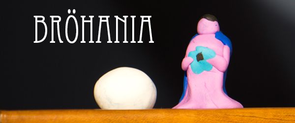
Welcome to Bröhania
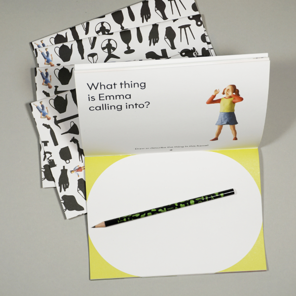
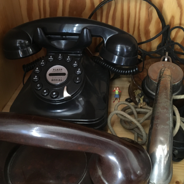
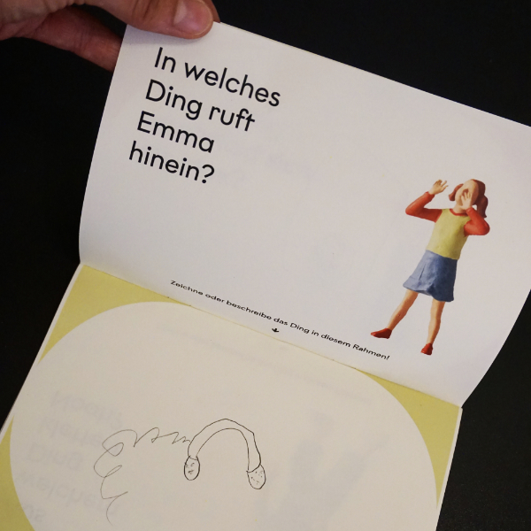
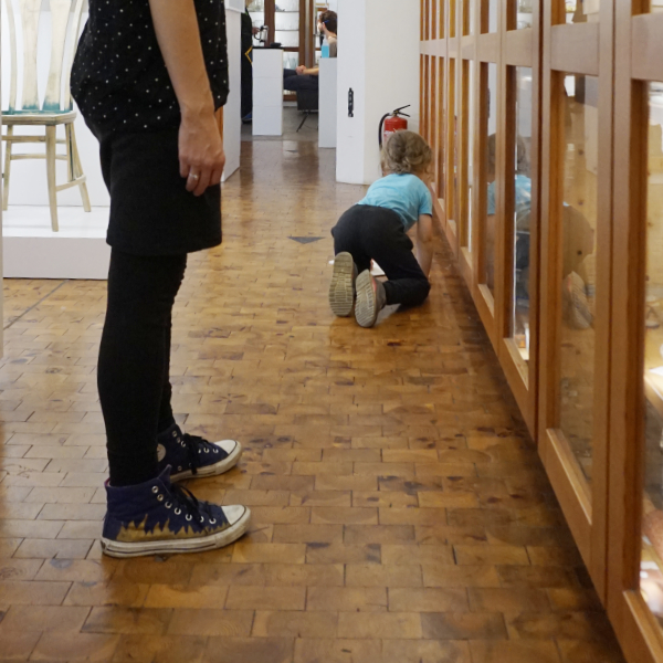
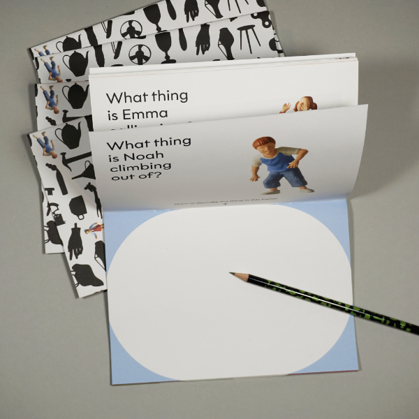
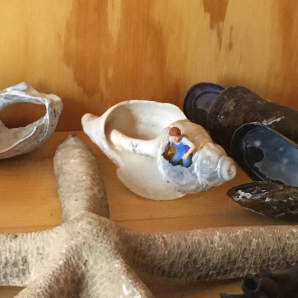
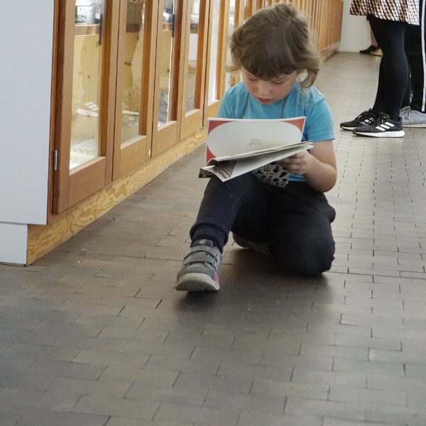
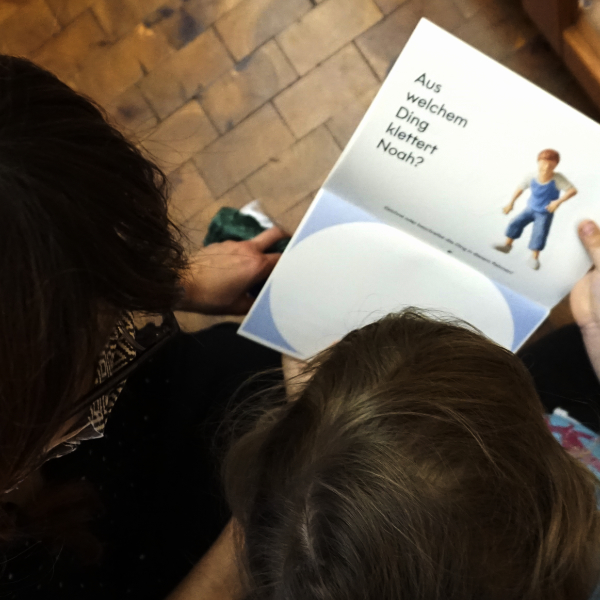
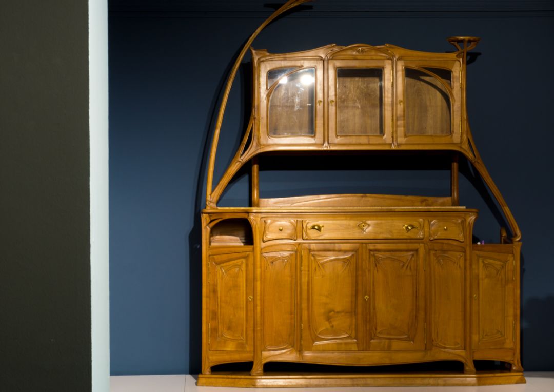
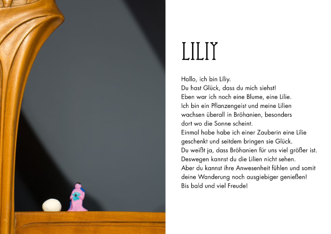
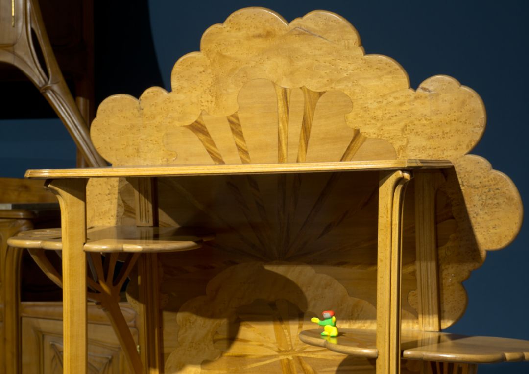
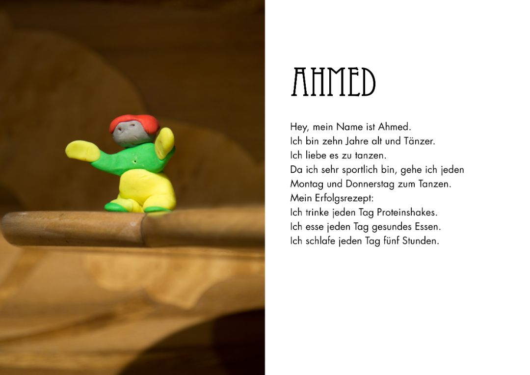
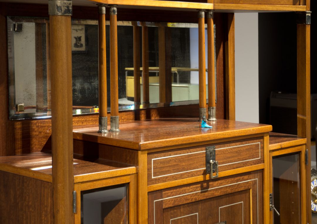
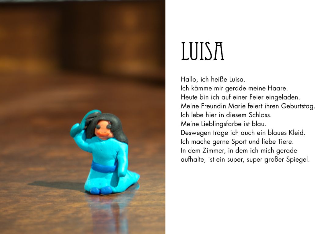
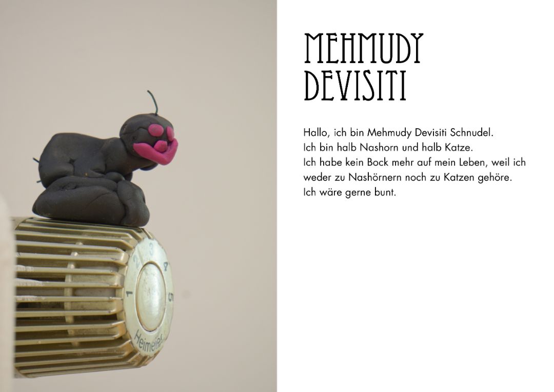
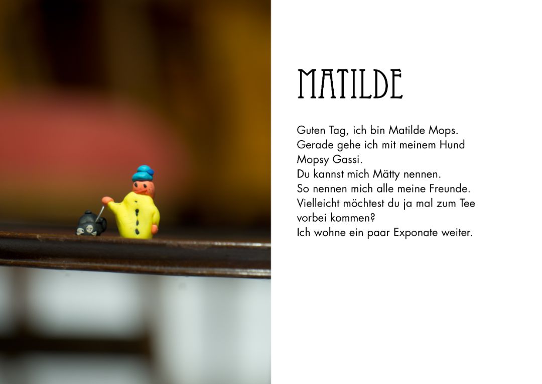
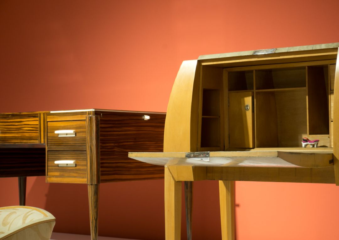
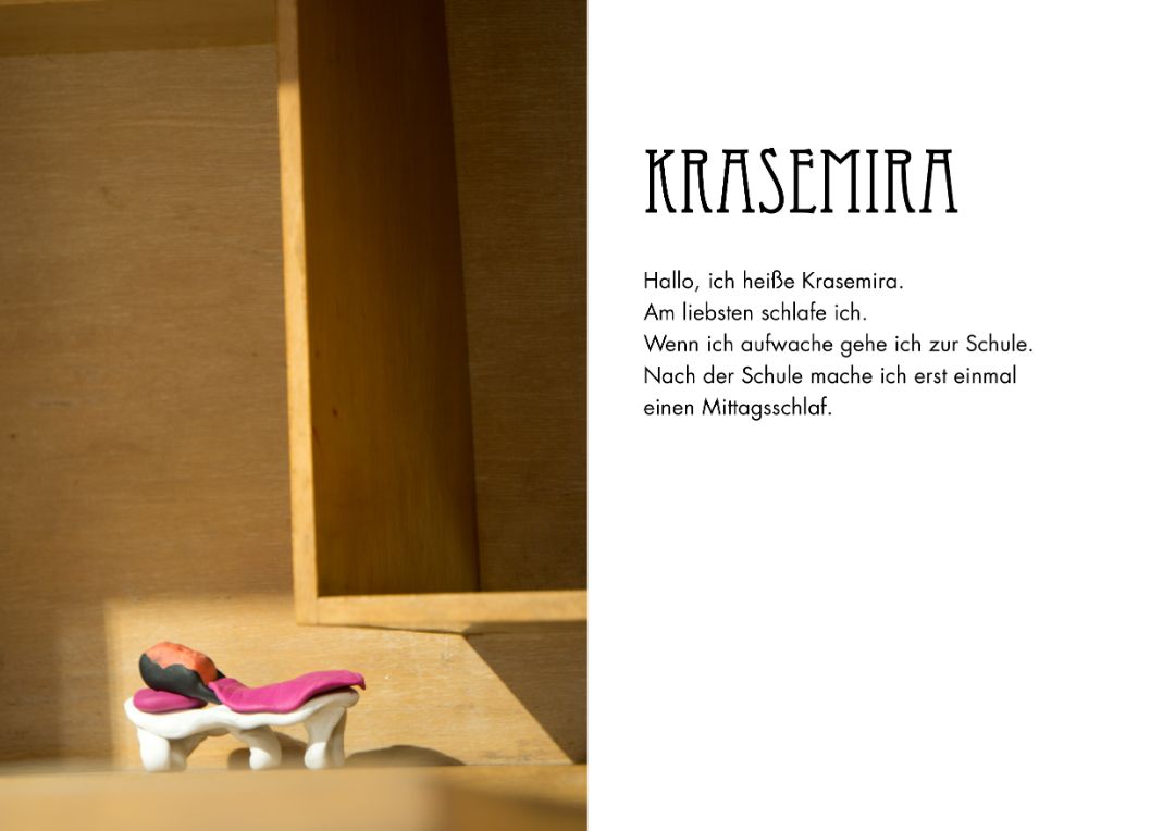
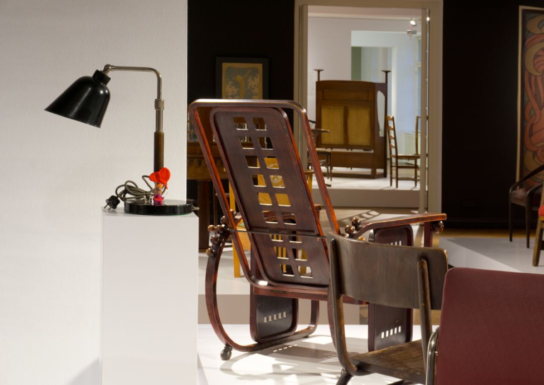
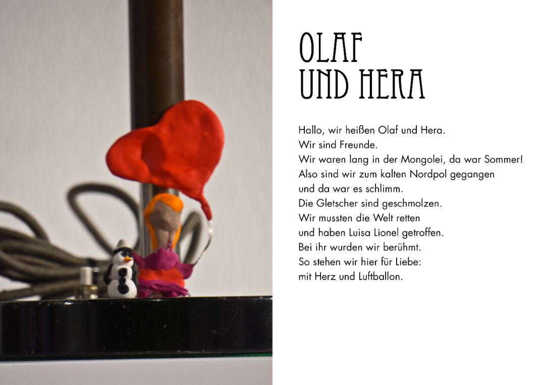
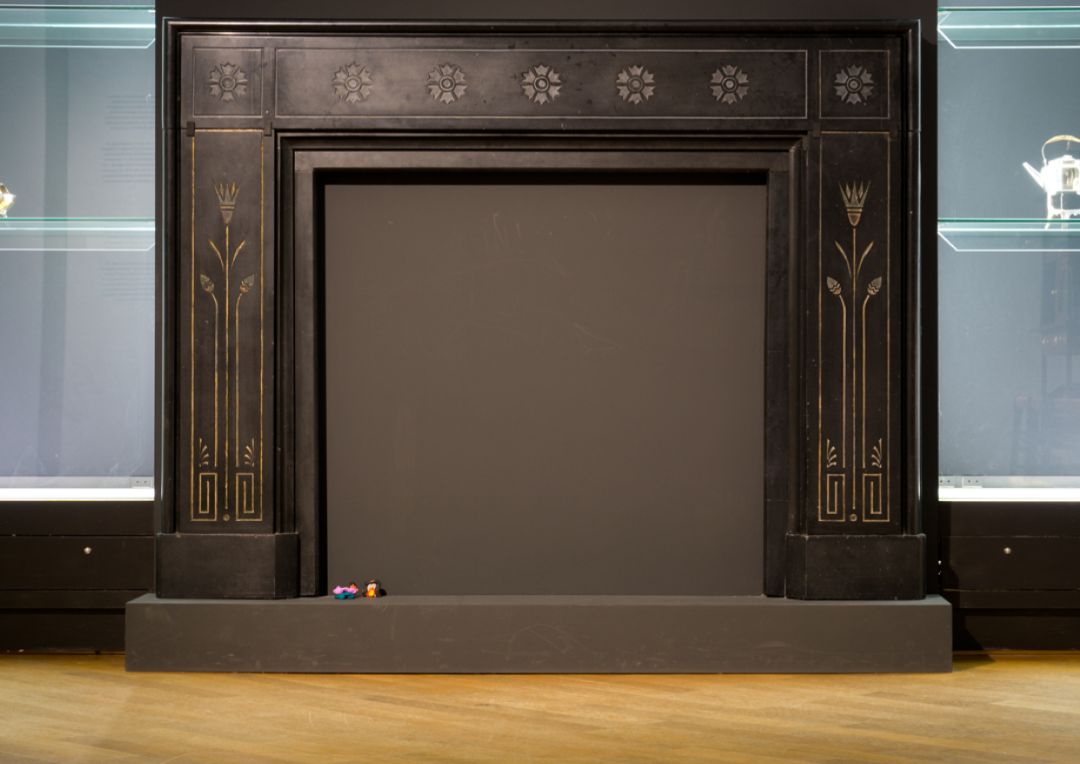
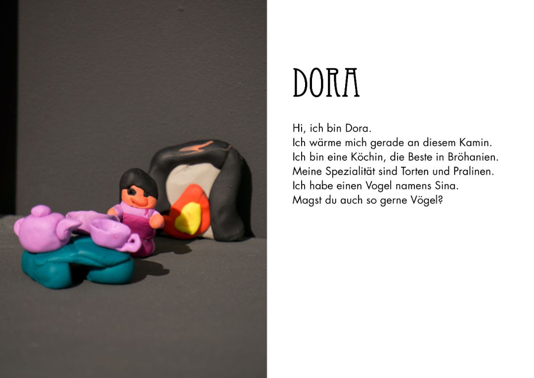
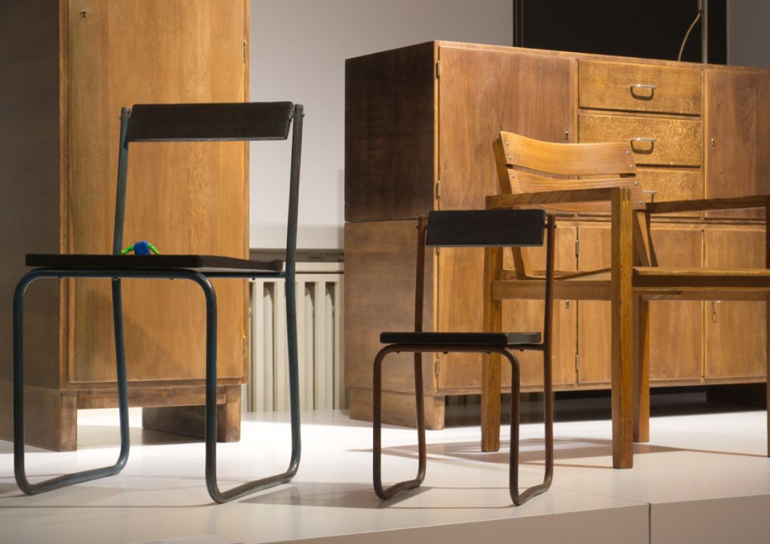
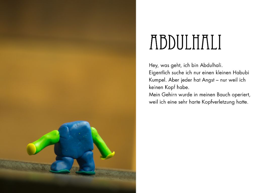
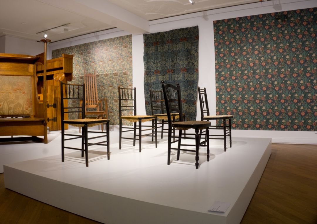
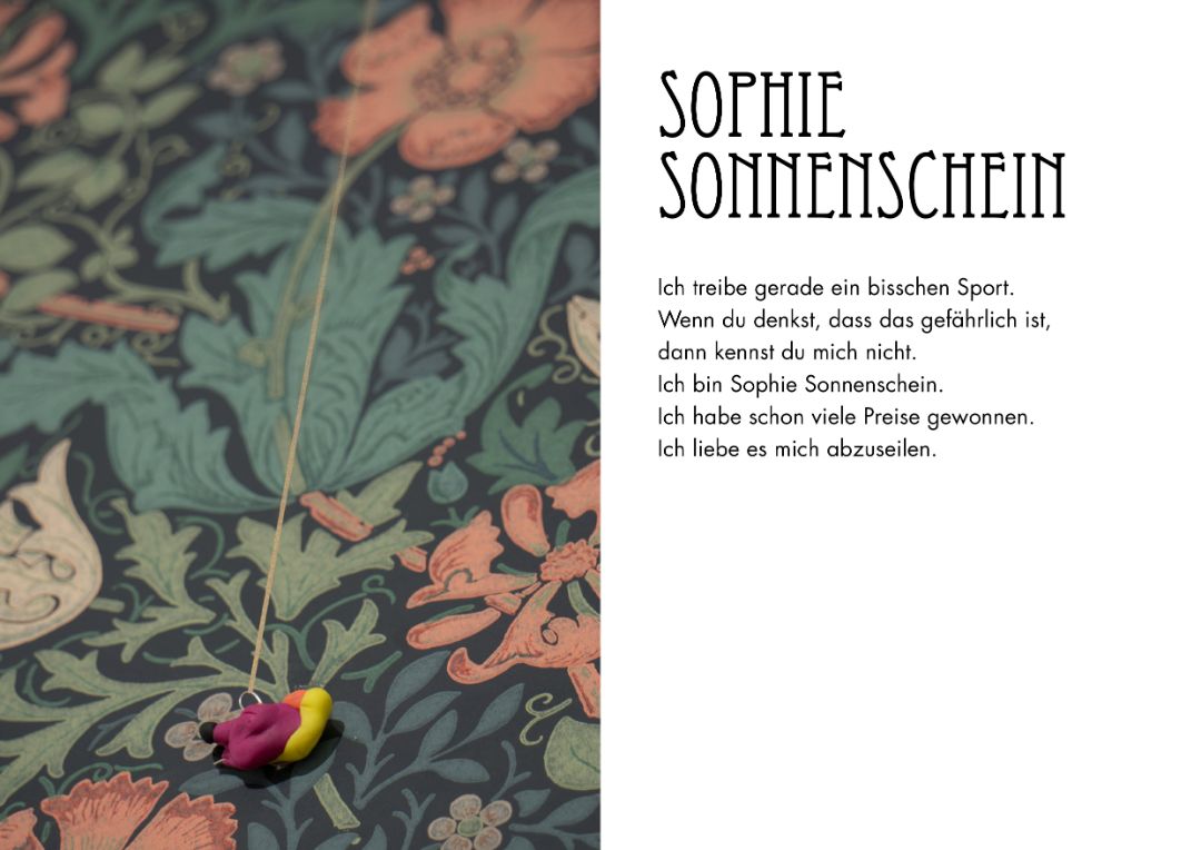
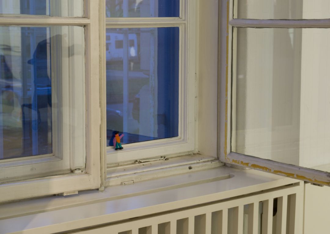
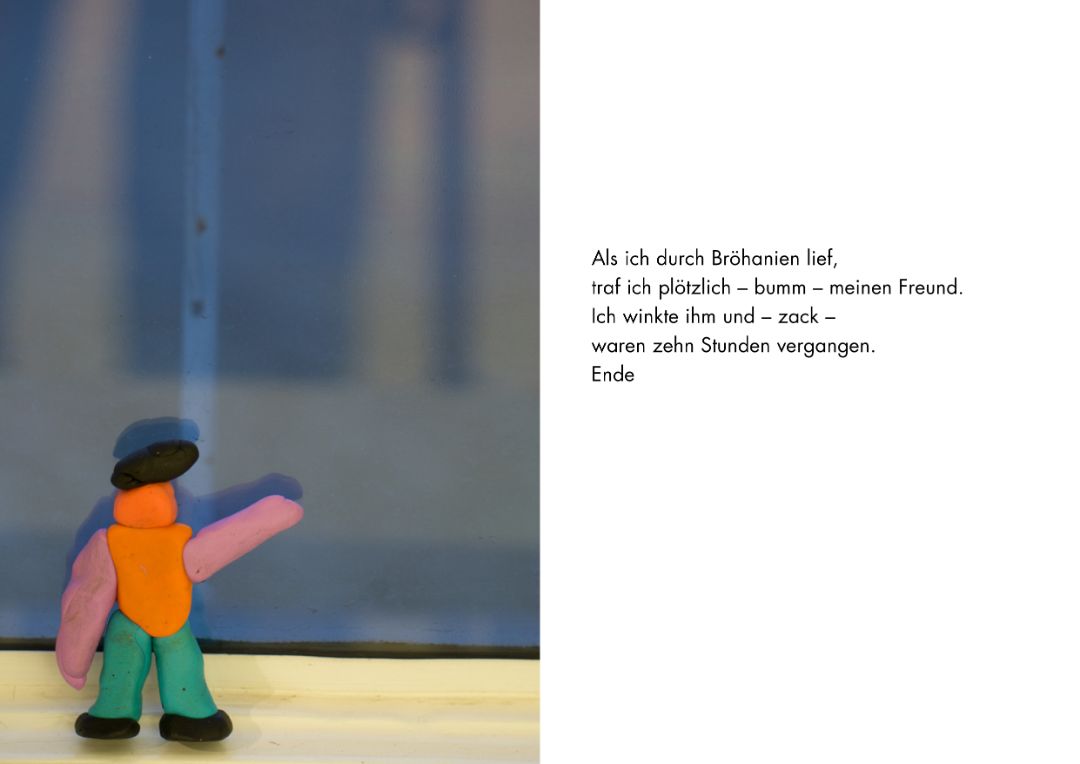
Every day lots of visitors come to the Bröhan-Museum in Berlin. Most visitors though only see beautiful old furniture and things. Good that the attentive children of the ‘Kinder Comitee’ took a closer look and discovered a whole secret world in the museum: Bröhania. The kids took time to listen to the Bröhanians and recorded their stories in a little booklet. As you can see, the inhabitants are quite a colourful bunch. Bröhania is a vast country with many different places and everybody can live the way they like. When they all come together, they always have a party. Next time you come to the museum, do not forget to look out for Bröhania!
“Welcome to Bröhania” characters and stories: Kinderbeirat
Concept, workshops, photos, layout: Rose Epple
The Kinderbeirat (transl.: Kinder Committee) is a cooperation between the Bröhan-Museum and Nehring Primary School as part of the Berlin program Kulturagenten for creative schools. During the school year 2019/2020 the committee was led by Rose Epple.
Kinderbeirat: Adem, Alma, Belma, Charlotte, Jana, Krasimira, Luan, Mannat, Mehmet, Peer, Sevim, Sophie, Teba
Bröhan-Museum: Nils Martin Müller / curator of outreach, Sylvia Hinz / scientific assistant
Nehring Primary School: Sabine Brehm-Hamm / teacher, Verena Nietruch / educator, Katharina Stahlhoven / cultural agent
Join the DESiGN KiDS!
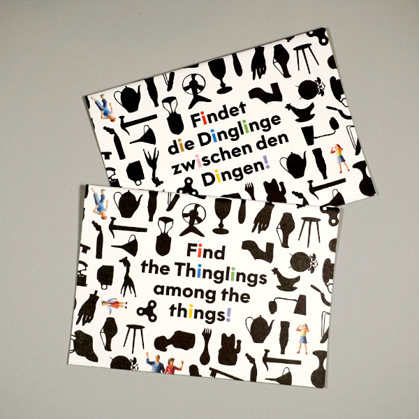
Do you want to invent things yourself? In my new activity booklet DESiGN KiDS show you how to collect, examine, transform, build and exhibit them. Continue reading “Join the DESiGN KiDS!”
Swiss Style: The Prequel
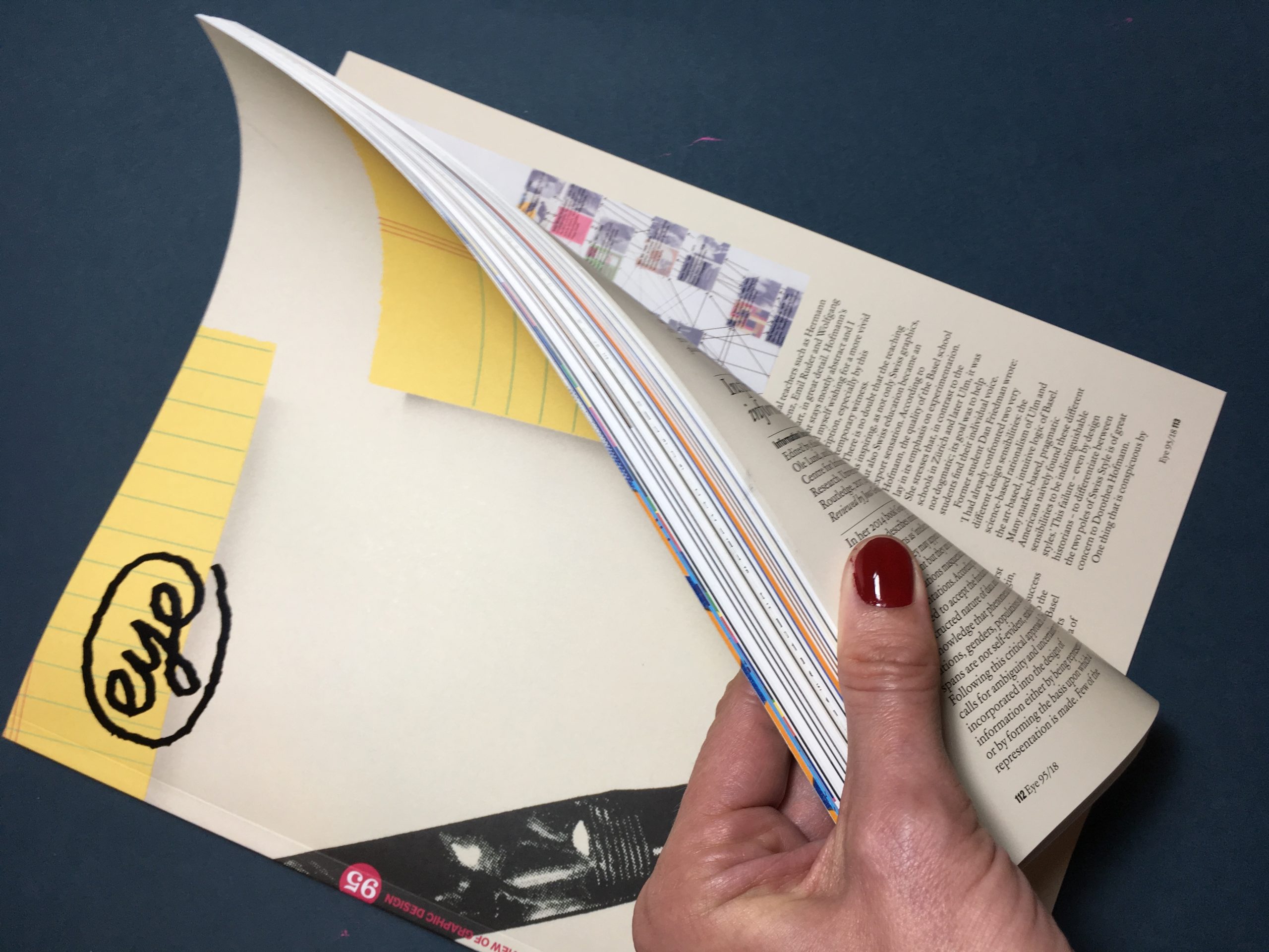
At last – Eye Magazine #95 has arrived on my Berlin doorstep. Always a pleasure to look at and read, I feel honoured to have contributed a book review to this issue. Dorothea Hofmann’s “Die Geburt eines Stils” (The Birth of a Style) examines the influence of the Basel education model on Swiss Graphic Design. Find out more at eye magazine and Triest Verlag.
Merry Christ-Mess
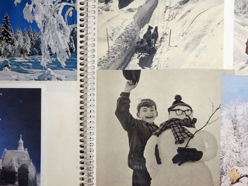
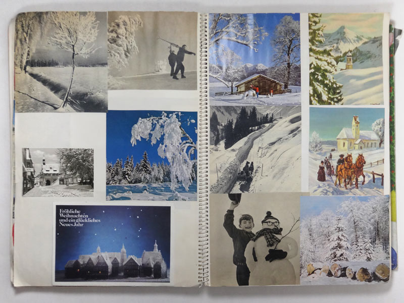
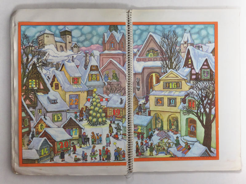
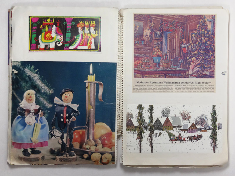
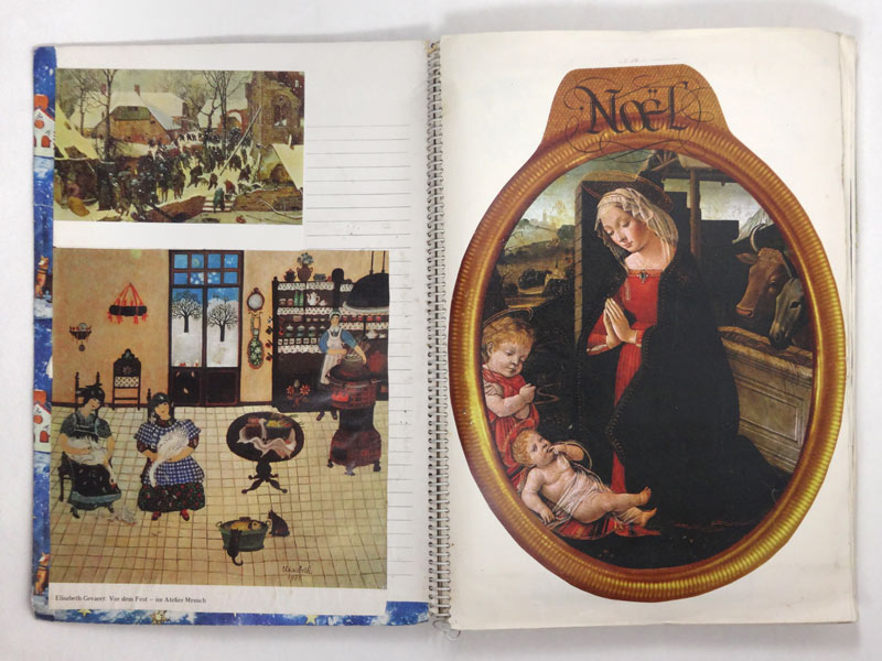
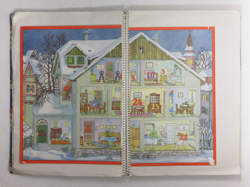
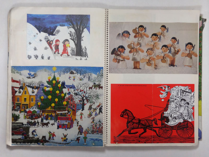
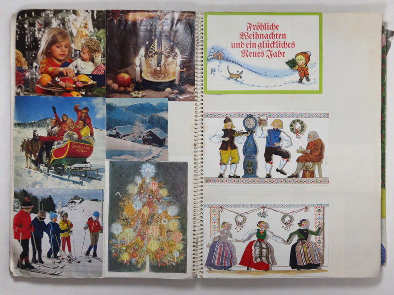
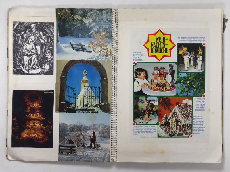
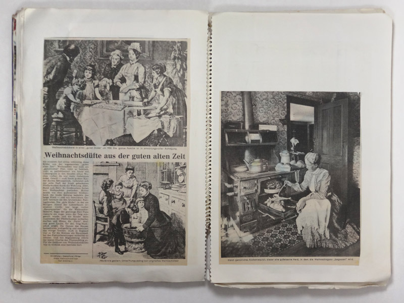
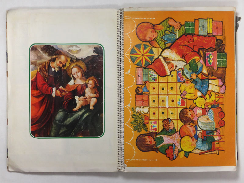
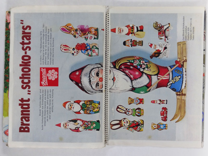
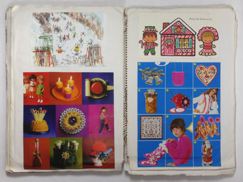
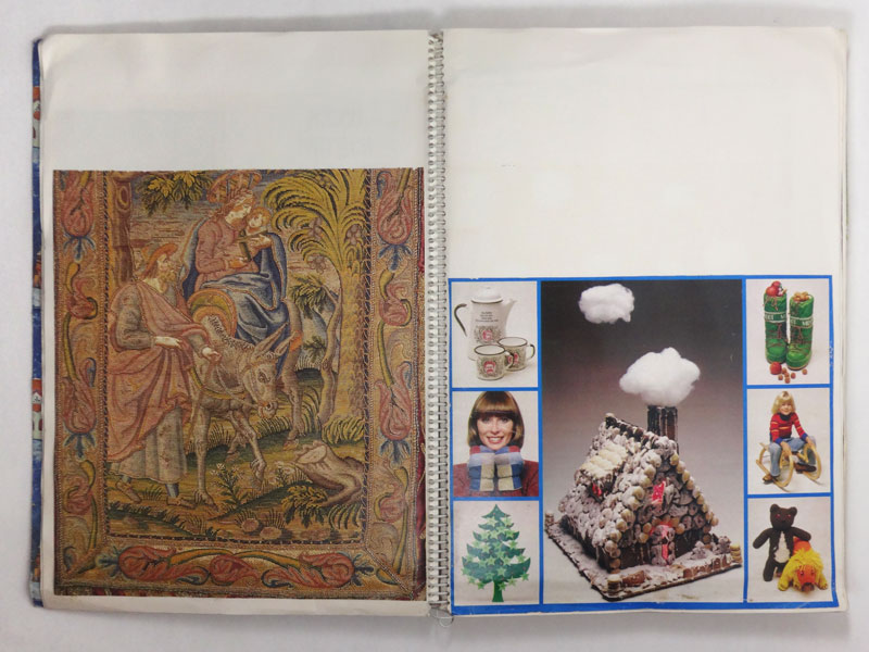
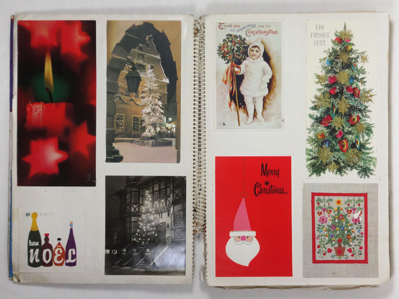
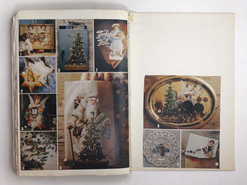
Every year on December 1, I climb up to the attic and bring down the Christmas scrapbooks. Continue reading “Merry Christ-Mess”
Easy Language
As many Berlin expats can confirm, German is not an easy language to learn, due to its complicated grammar. What if you simplified the language in order for it to be understood by more people? This is a personal essay about my experiences with the concept of `easy language´ and the controversy it is causing in Germany. Continue reading “Easy Language”
Graphic Design in the GDR
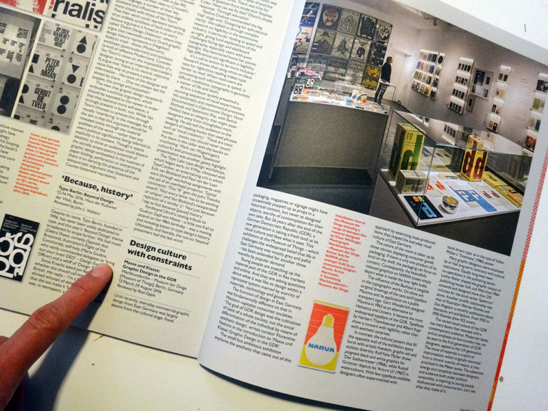
Back from holiday, I was excited to find the new Eye Magazine in my post box – with my review of the exhibition “Masse und Klasse: Graphic Design in the GDR” on page 86. If you are in Berlin and have not seen the exhibition, you still have until August 29, 2016 to visit the Werkbundarchiv – Museum of Things and catch a glimpse of the everyday visual culture of East Germany. The finissage will take place on Saturday 27 with an expert talk about GDR records. See you there?
Where to Study?
During my recent talk at Central Saint Martins College of Art & Design in London, I mentioned my sense of wonder and liberation when I came to study there. “I am feeling the same”, a young German student told me after the lecture. Like me, she had come on a scholarship and had already experienced a few years of German design education. Like me, she was dreading to go back. So what is it that makes British design education for people like me so different, so appealing?
Mirror on the Wall
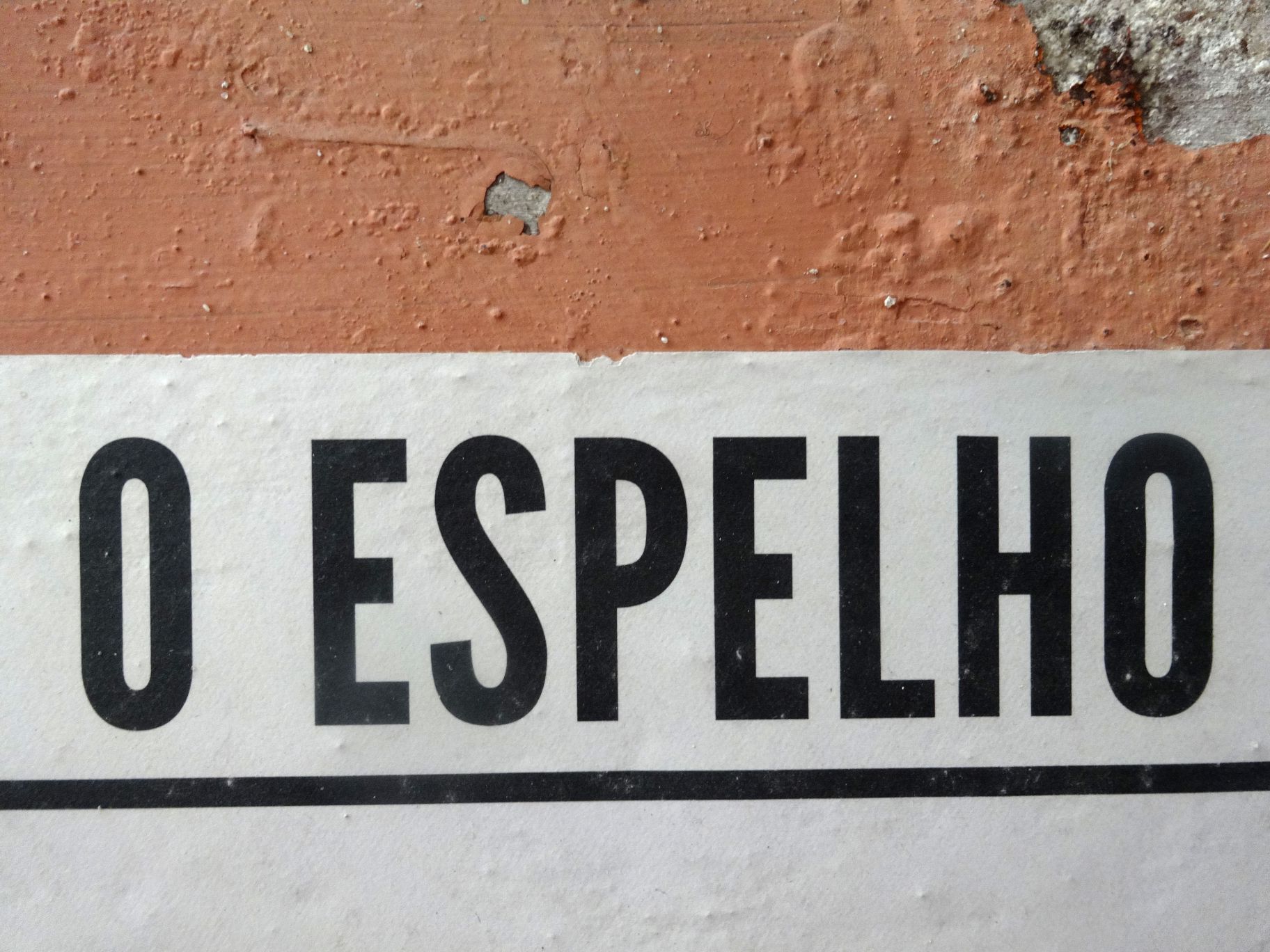
While in Lisbon for the We-Traders opening, I had the chance of interviewing Diogo Lopes, renowned Portuguese architect and one of the founders of O Espelho (The Mirror), a wall newspaper in Lisbon. The article I wrote subsequently about this exciting publishing experiment has just been published on Eye Magazine Blog.
Inter Versus Multi
Scenography is per se an area where a multitude of disciplines come to work together. In order to create a compelling exhibition experience for the visitor you have to consider space, movement, objects, words, orientation, surface, light, sound, emotions, products and the translation of physical space into printed matter and digital space. Which means that you need architects, product designers, writers, programmers, light and sound specialists and of course graphic designers, those who are good at working in real space and those who understand the intricacies of book and web design. And this list is only on the design side of things.
Rereading ‘Change by Design’ by Tim Brown, an advocate of design thinking, I stumbled across an interesting definition of the nature of team work across disciplines. “In a multidisciplinary team each individual becomes an advocate for his or her own technical speciality and the project becomes a protracted negotiation among them, likely resulting in a gray compromise. In an interdisciplinary team there is collective ownership of ideas and everybody takes responsibility for them.”
From my experience a scenographic design team often starts out as an enthusiastic inter in the ideation phase, veers into an edgy multi in the execution phase only to come together again on the home stretch to celebrate an ecstatic inter success at the opening.
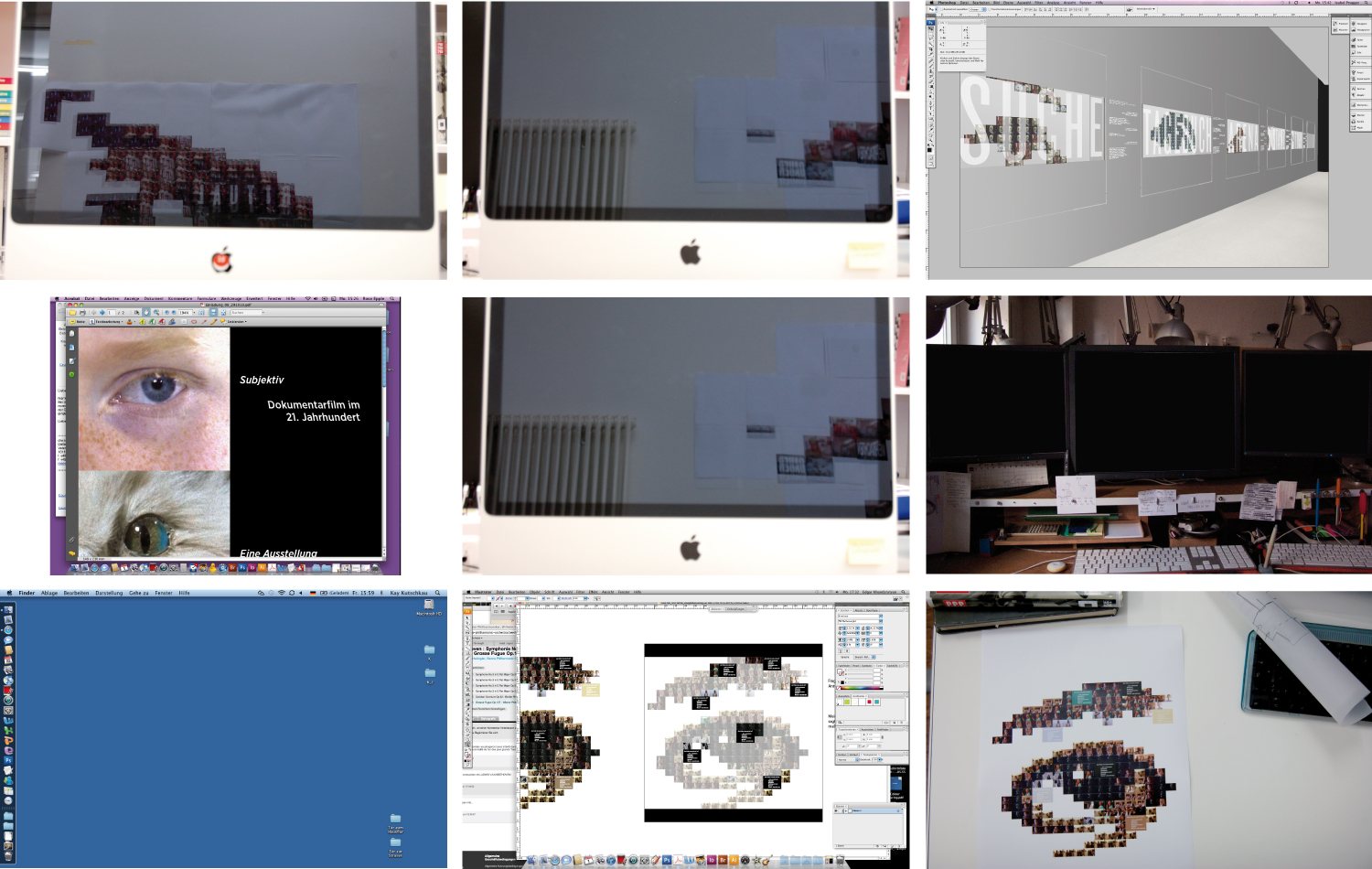
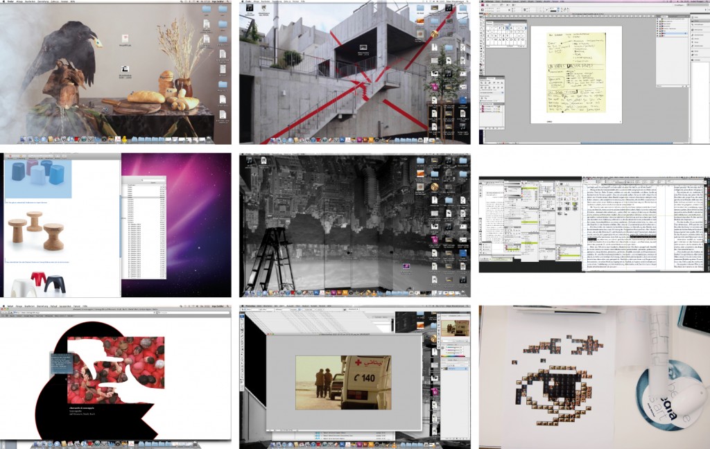
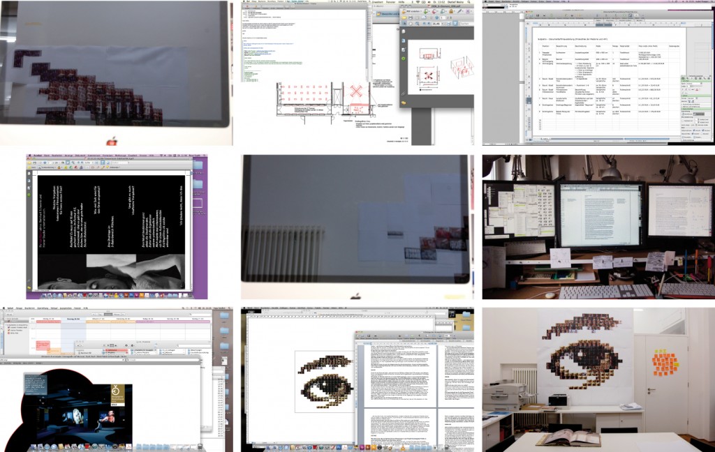
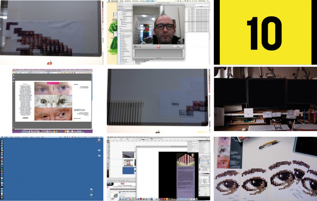
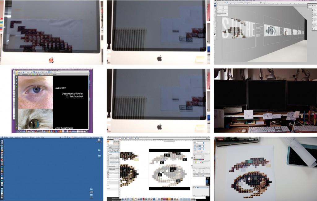
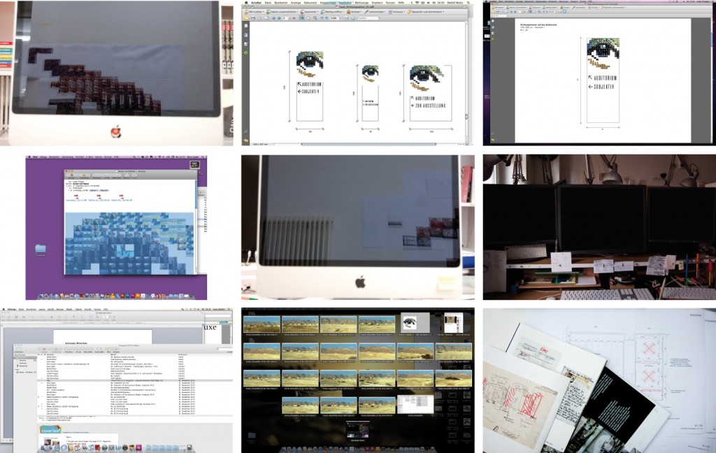
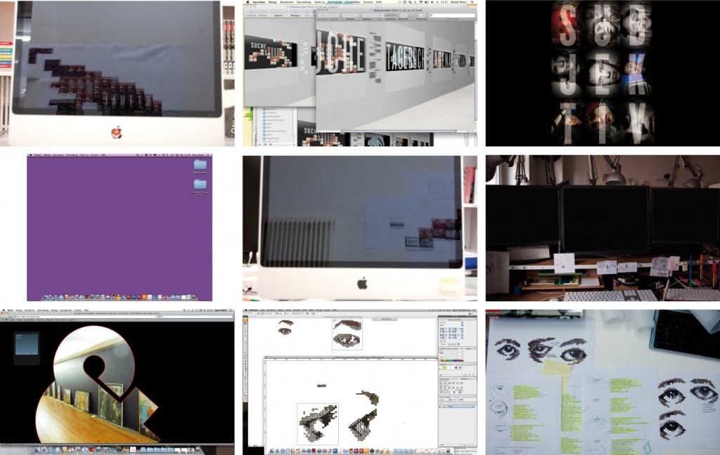
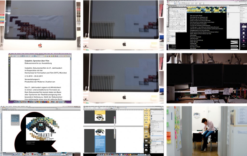
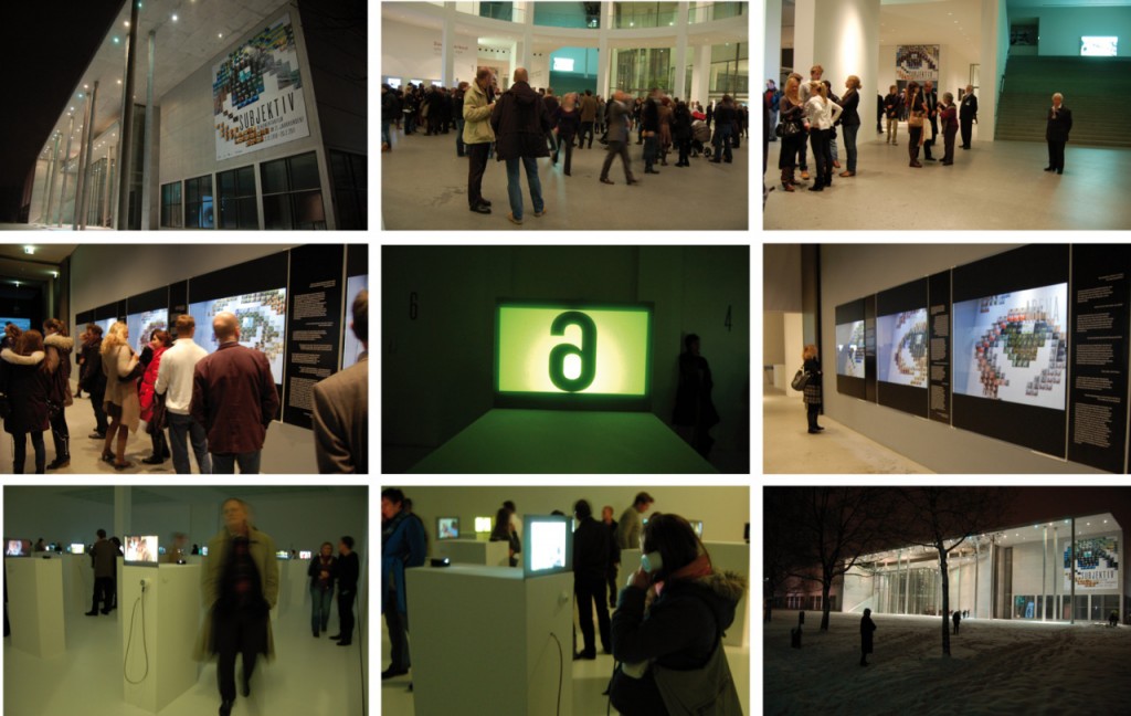
While we were working on an exhibition on documentary film, a collaboration between the University of Television and Film and the Pinakothek der Moderne, both in Munich, we (the graphic designers that is) had the idea of documenting our work on the show as a kind of meta documentary. As there was no documentary filmmaker about to do this for us, we thought of different ways of portraying the scenographic process without holding a camera. In the end, we decided that the common link between the collaborators is the computer screen. The task to collect a screenshot every day of the different team players fell to Edgar, our intern at that time, and he did a fantastic job collecting and posting them daily on a temporary Tumblr.
Here is a shortened version of what we did from October 21 to December 1 in 2010. Enjoy.
© chezweitz & roseapple · Tumblr Images and photos of opening: Edgar Khandzratyan
Writing About Exhibitions
From years of trying to find the right person to write adequately about our exhibition designs, I know how difficult it is to describe the design of a room with words. In my opinion, the writer needs to accomplish three things:
- clearly state what is there to be seen
- explain in easy words how it is done
- and then you might suggest the overall impression or athmosphere it creates – but be careful with! I personally hate to be told what I am supposed to experience
I drove a bunch of clearly talented writers nuts, because I felt they were always starting with point number three, didn´t understand what the clearly brilliant strokes were in number two and as for number one, that seemed to be the most difficult task of all. I hate to upset people, so I started writing them myself. Not because I was a better writer, but, at least, I knew what I wanted to be told.
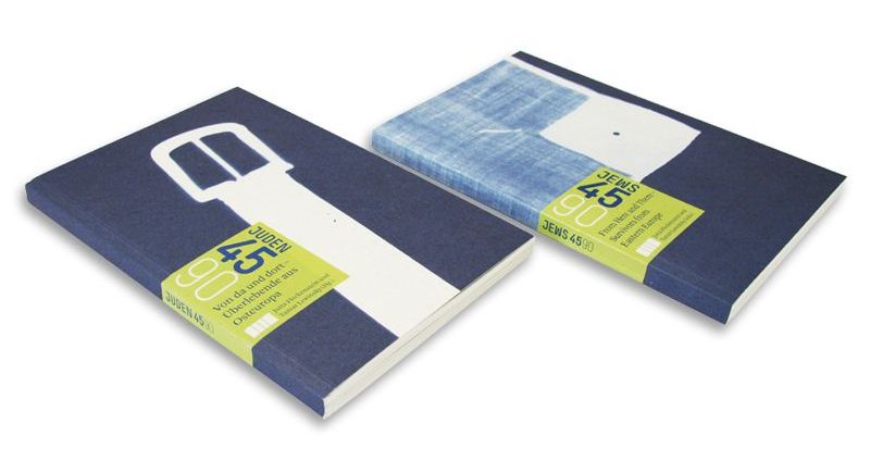
While writing a lenghty text about two Pasolini exhibitions of ours, I realized that indeed, words were quite a difficult and awkward tool compared to images to accomplish point one. This is why, when the next occasion arose and we were asked to contribute a text about the scenography of Jews 45/90, an exhibition in the Jewish Museum Munich for the catalogue, I set out to find a new form to “write” about our rooms.
And now I won´t attempt in words to describe this new form, but show you, simple as that:
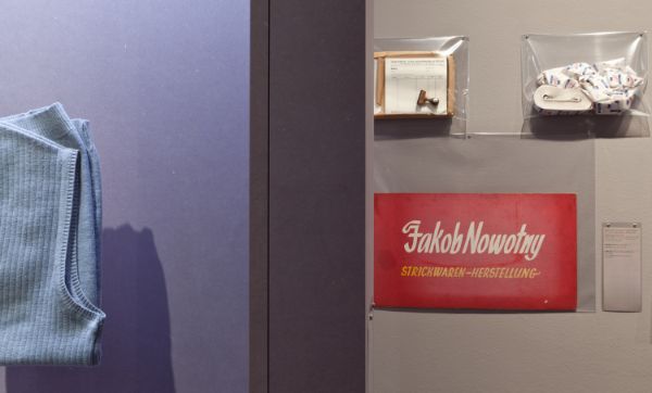
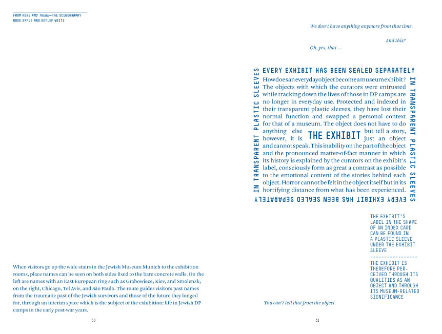
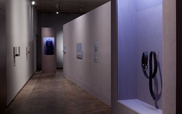
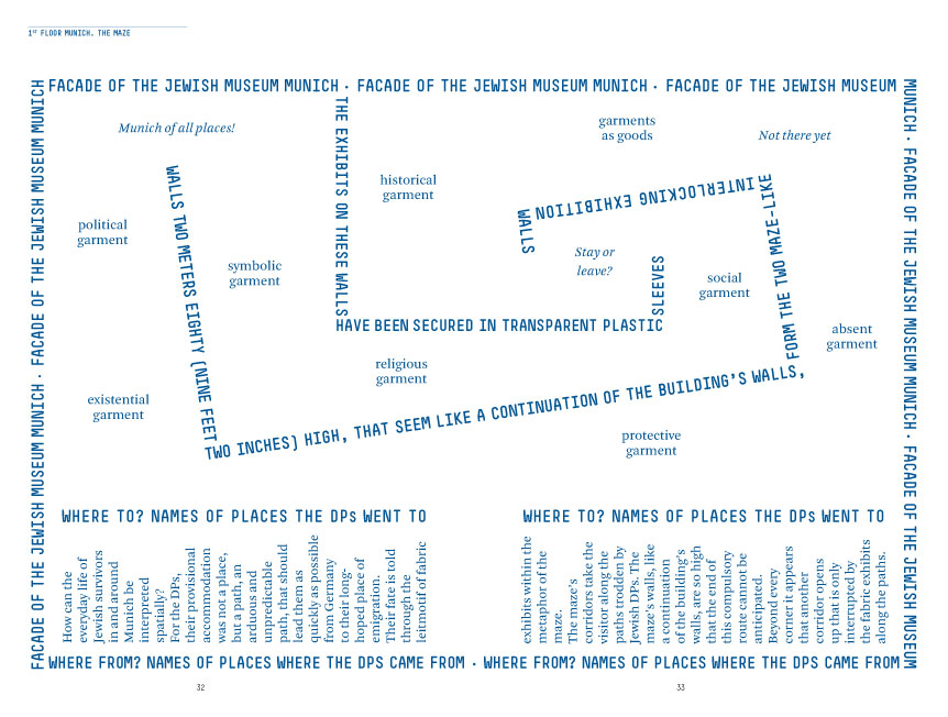
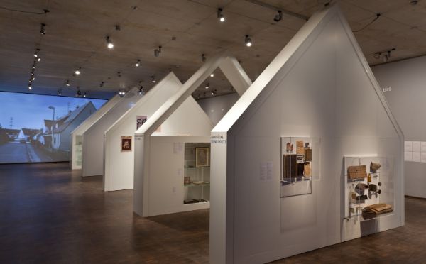
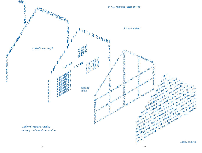
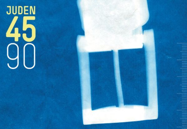
The visual essay was first published in the catalogue accompanying an exhibition in the Jewish Museum Munich.

